Quantcast
Channel: Substance Painter – 80lvl
Viewing all 507 articles
Browse latest View live

Telling a Story Through Environment

$
0
0

Sephine Cruz talked about her recent personal project The Abandoned Palace Courtyard, workflow, the importance of storytelling, modular approach benefits and lighting. Software used: ZBrushSubstance PainterMegascansUE4.

Introduction

Hello, I’m Sephine! I was born in Malaysia then immigrated to Vancouver, Canada when I was a teenager. Ever since I was a child, I loved to sketch realistic drawings of various subjects like birds and flowers. I studied Business Administration at Simon Fraser University but later on decided to pursue my real passion for visual arts.

I took a 3D modeling program at Vancouver Film School. Upon graduating from film school, I was recruited as a 3D artist at Mainframe Entertainment, a TV animation studio located in Vancouver. At Mainframe, I was fortunate enough to work on several TV shows such as Reboot and DVD movies (Casper, Barbie). After 3 years at Mainframe, I accepted a 3D artist position at Electronic Arts Canada (EA) in Burnaby, BC. During my 7 years at EA, I had worked on several game franchises such as SSX, Skate and NBA Street. At EA, I had taken on various artist roles as a Sr. Character Artist, Sr. Environment Artist, Texture Artist, and Lighting Artist. In 2010, I left EA for Capcom Vancouver (formerly Blue Castle Games) to work as a Sr. Environment Artist on the Dead Rising franchise until mid-2018.  Presently, I am heading back to EA this December 2018.

Storytelling in the Environment

A great story is the most important element in any piece of artwork. Telling this story effectively through the artwork turns it into a masterpiece and this is the approach I take when I craft an environment.

I would first come up with the theme of what I would like to show. In the case of my piece, The Abandoned Palace Courtyard, I wanted to convey the nostalgia of a place that was once grand, ruined through war and decayed through time. I researched and collected numerous photographs of abandoned castles, hotels and plazas. Some of these abandoned places were actually used as soldier encampments in World War II, which provided a strong fictional narrative for this project.

Then I took mental notes of the most striking elements that conveyed that theme of grand luxury (classical architecture with imposing columns, arched windows, stone trims, plastered brick walls). I also took mental notes of what elements needed extra detail to convey the theme of decay (broken plaster, peeling paint, cracked and broken glass) and nature taking over (wild grass and ivy). With these notes in mind, I had a direction of how I needed to sculpt the window frames, brick, stonework, columns, and trims.  I also used these notes to guide how I wanted to generate the textures and blend the materials. Finally, these notes also helped in how I wanted to compose the space, placing where the debris should be, where the grass and ivy should grow, even why there’s a hole in the ceiling.

Opting for Modular Approach

The most efficient way to undertake such an ambitious environment is to utilize the modular approach. After studying my reference photos, I listed down what main pieces (windows, doors, columns, floors, brick walls, trims) I would need to model and sculpt to give me the basic architectural structure of the courtyard.  Then I proceeded to come up with different combinations and arrangements of these modular pieces together to see how they fit and how I can reuse each piece in different ways. It’s a lot of experimentation, but the process was definitely worth it because, in the end, I was able to get the minimum number of pieces needed to create the space I wanted. After the space had been blocked out, I moved on to sculpt in the fine details.

Workflow

As mentioned previously, by choosing the modular approach and with a lot of experimentation on how I combined the modular pieces together, I found the minimum number of base models needed to create the courtyard.  This allowed me to streamline what pieces needed high-resolution sculpting for fine details. If I had sculpted everything before laying out the courtyard modularly, I could have potentially wasted time on sculpts for models that I may not have used. After determining the base models that needed sculpts, I brought them into ZBrush and started subdividing and sculpting to generate my high-resolution meshes. Using the high-to-low resolution baking process, the height maps, normal maps, and curvature maps were generated. I used these for my texture and material blending.

I paid particular attention to the aged paint by actually sculpting in the bumps and crevices of the peeled paint in ZBrush. The resulting height map from this sculpt allowed me to blend in the paint, stains, wood grain, scratches, and dirt textures in Substance Painter.  This results in uniquely composited albedo, roughness and normal maps for the windows.  Paying close attention to my photographic reference gave me clear targets to shoot for. One thing to note about my textures is that although I had generated height maps, I did not use them for displaced tesselation because I wanted the base models to be game-performant.


Materials

I use a layered material approach to the larger modular pieces such as the walls and floors. This means that the wall surfaces has several material layers containing different textures for plaster, brick, concrete, dirt. To blend these together I used different vertex channels (RGBA) to paint in grayscale masks that work in combination with the height maps of each layer to determine how much each layer is showing through.  This flexibility gave me a lot of control over the final look of the materials. Also, since each material layer was PBR-compliant, the layered material was also PBR-compliant and responded very predictably to the lighting.

Lighting

When working on lighting, I did lots and lots of experimentation with the directional light intensity, UE4‘s lightmass settings, and camera exposure settings.  I spent a lot of time iterating on the light settings and baking to get the right amount of global illumination. There is some minimal exponential height fog. To stay true to the textures’ colour I decided not to add any sort of colour-grading. Rembrandt portrait photographic lighting is the aim I was going for  because I wanted to create a sense of nostalgia. Lighting design is very important to composing an environment set. In one case, I wanted to introduce a bit more sunlight into a room, so I broke a hole through the ceiling, which also matched well with the war-torn narrative.

Foliage

The foliage (grass, ivy) are Megascans assets from Quixel. I had set a goal for myself to work on this project during the summer, but I was running out of time. I wanted to model the foliage by hand but decided that in the interest of saving time and energy, Megascans was the best choice. I had also used a couple of Megascan textures for the ground that I further altered to suit the scene. Megascans are a great resource and time-saver thanks to Quixel. However, for objects that were eye-level to the camera which I felt needed focus, I chose to create textures for them through sculpted information. In my sculpts, I exaggerated certain details in order to produce heightmaps that made the material and texture blending respond better to the lighting I had set. This close attention to sculpted detail provides the artistic touch that brings the materials to life. I guess you could say that is my way of breaking through the “uncanny valley” of digital environment art.

Advice for Learners

Here’s my advice for game developers who want to understand environment art: observe what story the environment is trying to tell. Is the environment successful in telling you that story in its composition, its details? My advice for aspiring environment artists. Keep working on your craft. Never be satisfied, stay humble, and be open-minded to learning new things. Pay attention to details. A good way to learn in my experience is by observing what others have done. If you aspire to further your craft in photorealism, study photography and watch movies with award-winning cinematography. A lot of techniques about lighting design and scene composition can be learned just by observing.

Landscape Auto Material by VEA Games is a flexible auto-painting material for Unreal Engine 4 Landscape component. When you are drawing the topology of your landscape, proper material layers are drawn automatically!

Check the full feature list

Contact VEA Games


Sephine Kuan Cruz, Senior Environment Artist

Interview conducted by Kirill Tokarev


© Daria for 80lvl, 2018. | Permalink | No comment | Add to del.icio.us
Post tags: , , , , , , , ,

Feed enhanced by Better Feed from Ozh


Production of Elaborate Ornate Japanese Props in 3D

$
0
0

Adam Nield did a breakdown of his assets with intricate ornaments made for Artstation’s Feudal Japan challenge. Software used: ZBrushMayaSubstance Tools.

Recent Projects

Before I started working on Japanese assets I’ve mostly been doing my own thing such as traveling here and there. In the most recent few months, however, I’ve been working on freelance projects for various marketplaces and people. My latest project was a Motel pack I made in UE4, as well as 1976 Dodge Van which I traveled in this summer (by the way, if anyone knows where this vehicle is now, do let me know! I miss it a lot!)

These last two projects really helped me understand where my strengths lie. I label myself as an environment and vehicle artist. I realize you’re supposed to pick one, especially in AAA scenarios – but I seriously enjoy both aspects of each discipline so I thought I might as well say that.

Concept

The last three assets I’ve made are for Artstation’s Feudal Japan challenge. I went into the project not really sure what I was going to create as Eastern designs aren’t something I usually enjoy making. I really wanted to avoid traditional Japanese tropes like Shogun armor, Katanas and so forth. There were a few ideas from the concept stage of the competition I liked, but when it came to it I wanted to differentiate myself from the rest of the submissions so I tried to be unique and individual with the pieces I created.

The Hand Mortar originated from Jens Fiedler’s concept. His submission page had some explorations into a bubble/fish-shaped design I liked more than the final piece. I’ll go more into the production of this asset later on. Make sure to check Jens’ submission page as his concept inspired me the most.

Here are the links to all my Japanese assets:

Ornamental Japanese Matchlock Hand Mortar

Set of Ornamental Japanese Boleadoras/Fundo-Kusari Throwing Weapons

Ornamental Japanese Opium Pipe with Concealed Dagger

If you want to see various production shots for this project, I documented the entire thing on the Artstation submission here. This page has tons of WIP images even from the very initial concept stage with beautiful concept models.

Working on Ornamental Elements

I’ll start with the Boleadoras. Simply put those ornaments were created using an alpha pack by JRO Tools. It contained various alphas which are great for sculpting or painting details with.

One of the things I wanted to avoid when using a pack like this was looking like I’d used an alpha pack. I started concepting with them in Photoshop trying to come up with a shape that was both appealing and original as well as incorporated traditional Japanese designs. This took quite a bit of time going back and forth from ZBrush, Photoshop and sometimes Maya to finally get a design I was happy with.

Early Concepts were intricate but still too western for the Japanese themes. (Right) The final alpha mask used in ZBrush:

The final alpha mask used in ZBrush:

Various different designs that were tried:

Eventually, I found something that clicked. The hardest part about this stage of the project was trying to find a way to cleanly deform the shape. If I projected on a sphere there were awkward projection angles that wouldn’t look great in the final product.

While subtle, the awkward projected angles would have impacted the overall end quality:

The workaround for this was to project it flat and deform it in Maya afterward using bend deformers across the whole shape.

The alpha being projected in ZBrush. A lot of cleanups was done after the initial projection:

The deformation in Maya. This helped alleviate the projection errors from working on a sphere:

As for the ornate features on the Koi Mortar, that was a lot more straightforward.

The original high poly whisker meshes:

I first modeled one individual whisker and placed it above the mouth line of the mortar. After doing that I traced a CV curve along its mouth and then attached it to a motion path. I duplicated it and placed it along the mouth until they were all roughly where they needed to be. Afterward, I went in by hand and adjusted them where required. In the final model, they are baked down onto a double sided plane with an alpha channel to maintain a low polycount.

The motion path and a single whisker:

(Left) The duplicated whiskers. (Right) The final game resolution whiskers with an alpha map:

Matchlock Hand Mortar Details

The entire front section of the Matchlock Hand Mortar was a huge learning process for me. I’m a hard surface artist but semi-organic hard surface absolutely ruin me. I wanted to work out a process of creating shapes like this that I might be able to use in the future (short of learning ZBrush even further). The way it was created was to first make all the shapes manually in Maya and have them floating as individual meshes. This gave me much more creative control within the knowledge I already knew, without spending months learning a new piece of software solution and pipeline.

The first step of the high poly mesh. Various aspects are fairly dirtily made, but the tradeoff for the time wasn’t worth focusing on for things that won’t matter further down the line. I was focusing purely on visuals at this point:

The mesh after being dynameshed and various other fixes added afterward:

After being happy with the overall forms, I took it into ZBrush and dynameshed the whole thing. This process took a considerable amount of time as I was still trying to understand different parts of ZBrush while trying to maintain a level of artistic quality I was happy with.

I actually had 4-5 different attempts at this phase, as parts of the process were causing issues later on down the line. Small things such as crevices between the scales creating huge holes in the dynameshed shape.

After various attempts I finally ended at a point I was comfortable moving on with.

The final ZBrush sculpt. This was still only half of the weapon done:

After bringing it into Maya I completed the rest of the forms using traditional sub-d modeling processes. Pretty straightforward stuff.

The high poly stock:

The completed high poly, without whiskers:

Moving on to the next step which was making a low-resolution mesh.

Hands down the hardest or most tedious part of this asset was definitely retopologizing the low poly. I’ll let this image do the talking for how painful it was. I used Maya’s quad draw tool to do the whole process though. It’s gotten quite cumbersome in recent updates, so something a bit more streamlined like TopoGun or 3D-Coat might be a better choice in the future. Sometimes you have to trudge through the boring parts before you can start having fun.

The excruciating process of retopologizing the scales. Careful planning was made to ensure it flowed correctly into the next row. Luckily, the mesh was 90% symmetrical:

The final triangulated low poly which makes up over half of the entire object’s polycount (I also think I lost the quadrangulated mesh):

I believe that the final polycount of just under 21k for the entire object is quite a nice achievement for this asset, especially given the intricacies involved with it.

Ivory Material

I’ll be very straightforward with how I created the ivory material for the Boleadoras. I used the asset library from Substance Source and brought it into Substance Painter to edit further. The base material for this was entirely done by Allegorithmic. This, as well as Substance Share, are the first two places I’ll check to see if anyone has a good starting point for materials.

I’m not ashamed to use resources like this as it only helps to speed up the process. I like to think of the end result more than trying to do everything myself. If something can help me achieve it faster, sometimes with better results than I could make myself, I’m most certainly going to use it.

Lighting

I won’t go into specifics about my lighting setups, as I don’t think I’m confident enough on my lighting skills to speak about that. I will say, however, that my biggest inspiration was physically going to a museum. I went to the British Museum in London, as they had a Japan exhibit and I found a piece of artwork that really inspired my lighting for this project. It’s funny, I was taking pictures of the box it’s presented in, not the actual artwork.

The reference for the lighting in the museum images.

If I could give any advice in general for lighting though, it’d mostly be to try and use real work examples as your base. Reference for lighting is just as important as a reference for any other part of the pipeline.

Time

Depending on the complexity, each piece took me several weeks or several days. The longest asset took around a week and a half (which was the Mortar). The shortest was the Opium Pipe which only took a few days. Admittedly, I don’t have a healthy work pattern at the moment, which is something I want to try and fix.

If you found this article interesting, below we are listing a couple of related Unity Store Assets that may be useful for you.

Adam Nield, Environment Artist

Interview conducted by Kirill Tokarev


© Daria for 80lvl, 2018. | Permalink | One comment | Add to del.icio.us
Post tags: , , , , , , , , ,

Feed enhanced by Better Feed from Ozh

Crafting a Stylized PBR Dagger

$
0
0

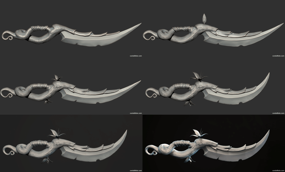
Cordell Felix gave a talk on how he sculpted and hand-painted a stylized PBR Dagger in ZBrush and Substance Painter.

Introduction

Hey everyone, my name is Cordell Felix. I was born and grew up in Orange County, California. I’ve worked on titles like God of War 4, Battlefield, Bioshock, and a few other indie titles. I’m currently a Lead 3D Environment Artist at Nexon OC in Irvine, California.

I’ve been working in the game industry for 7 years now. I got into game development because I was looking for a way to merge both video games, and art. I grew up playing games, drawing, and painting, so game development was a perfect career choice for me. During my last semester at art college in 2011, I got a job working on a Coca-Cola commercial and mobile game. Since then, I haven’t stopped pushing myself to improve.

Here is a snippet of some of my other work:

Stylized PBR Dagger Project: Concept

First off, shout out to my buddy Lonnie Harrison who designed the dagger. I was flipping through his sketchbook a few years ago and saw this dagger sketch and wanted to make it. He happily let me.

Challenges

I challenged myself to make a stylized weapon because I have been making mostly realistic 3D art since I’ve been working in the game industry. Stylized assets were always out of my skill range, so I wanted to get better at stylized art. Some of the big challenges for me on this dagger were exaggerating shapes, pushing color and light, hand-painting instead of using realistic textures, and being hard on myself to figure out why something looked bad to learn from and be better at.

Hand-painting was probably the biggest challenge for me. I’ve dug myself into a realism art hole throughout the years. I still have a ton to learn when it comes to being a skilled hand-painter. There are so many different kinds of techniques, but It really just boils down to learning the art fundamentals. If you have a good eye for form, color, value, lighting, and composition then you’ll understand better why something might look off. I’m no expert when it comes to this, as I said, I still have a lot to learn. Also, hand-painting in substance painter is difficult because the viewport won’t let you orient the model however you like. Hand-painting in 3dcoat is much easier because of the viewport model orientation.

Another challenge was learning to take a step back and evaluating the model and checking if it looks stylized enough. There was a point when I finished the sculpt, and wasn’t satisfied even though it matched my friend’s sketch. So I pushed it further until I liked it. Pushing myself and breaking out of my comfort zone was a big challenge when doing stylized. I would bend or curve a part and continue until I felt it was too much and left it.

Stylized vs. Realistic

The reason I started this project was to learn stylized PBR. This to me meant hand-painted textures, stylized shapes, and realistically rendered materials. I learned from working on this that I needed to exaggerate where I could in order to break my traditional realistic techniques. The shapes and textures needed to be pushed as much as possible, because I was going to throw realistic materials and lighting on it for the end product. Small details are part of a realistic workflow, and I had to teach myself to work simple and go for the broad strokes instead of focusing on the small details. It’s like a painting, start with the broad strokes first, then get into the smaller details. For stylized stuff, you don’t really need to do the smaller details. However, I did add some nice surface detail and small scratches on the wood.

Modeling

One other reason I created this dagger was to make a sculpt 100% inside of ZBrush, no blockout in a 3D application. I also wanted to hand-paint this in Substance Painter instead of 3D-Coat. I sculpted this dagger 3 years ago, there’s a lot I would change about the sculpt now because I’ve learned a lot since then… but that’s a different story altogether. I recently finished the textures because I wanted to revive the dead WIP and move on. I don’t usually recommend reviving dead WIP’s to people, it’s always best to just move on. For some reason, this project wouldn’t get out of my head.

I started the dagger in ZBrush with shadowbox first, this wasn’t necessary, but I wanted to learn how to use Shadowbox for fun. If I did this again, I would’ve just started with a dynameshed box or sphere and then shape it. Soon after getting the shapes done in Shadowbox, I converted them to dynamesh and started to sculpt with clay tubes to blockout the shapes on the wood handle and leather straps.

Sculpting the Wood

Most of the sculpting was done with just a few brushes. Generally, after blockout, I’ll use clay tubes to sculpt the forms, then smooth them out get a better result. Work dirty and blockout the shapes to get all forms onto the model. This workflow keeps the process fast.

Michael Vincente’s fantastic ‘Orb_Cracks’ brush is great for ANY type of stylized crack. Trim Dynamic brush will help with most surfaces to flatten them down a bit (Flatten, hpolish are fine too). I like to use a square alpha with Trim Dynamic. The ‘Dam Standard’ brush is great for sculpting leaves, it has a natural lift on the edges of the cavity for a softer feel. For the cracks, I sketched out the lines with a low intensity first to create the outline, then I would trace on top of them with a large Orb_Cracks brush and lazy mouse.

Sculpting the Blade

Most of the work on the blade was a combination of Trim Dynamic, Flatten, and Orb_Cracks. I beat up the edges of the blade with Trim Dynamic. The Flatten brush helped me polish the flat surfaces of the blade so I could then sculpt the blade surface scratches with Orb_Cracks on a low intensity. I’d also recommend checking out the Orb_Flatten brush or the MAH_edge brush, I’ll use these sometimes if I don’t like the results of the flatten brush.

For the surface detail on the blade, I sculpt a bunch of lines with Orb_Cracks, and tone it down afterward. This technique can apply to a lot of areas on the sculpt as shown on the wood. Go broad, then tone it down after.

Hand-Painting the Blade in Layers

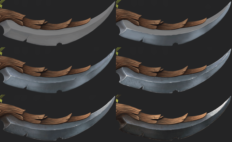
To start the base color of the blade, I blocked in some colors and highlights first in unlit mode. After the color blockout, I painted everything else on its own layer so I could use them as different roughness values afterward, or change the color whenever I needed. In the end, I learned that most of that information I painted was wiped away because of the metalness and cubemap reflections in lit mode.

At first, I tried to achieve the hand-painted look, like WoW. But you can only really achieve that feel with an unlit mode. When you have physically accurate materials, you can’t get the same look. Work in the unlit mode to make sure the colors look good and work in the lit mode to make sure the roughness and metalness look good for the end result.

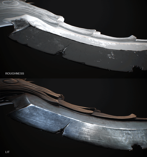
The material of the blade looks fancy mostly because of a good use of surface roughness. I used the edge wear layers I hand-painted and used them as different roughness values. On top of that, I used many types of roughness noise textures and painted them where I wanted interesting surface detail. Some of them use simple generators in Substance Painter using the curvature map.

Leather Grip

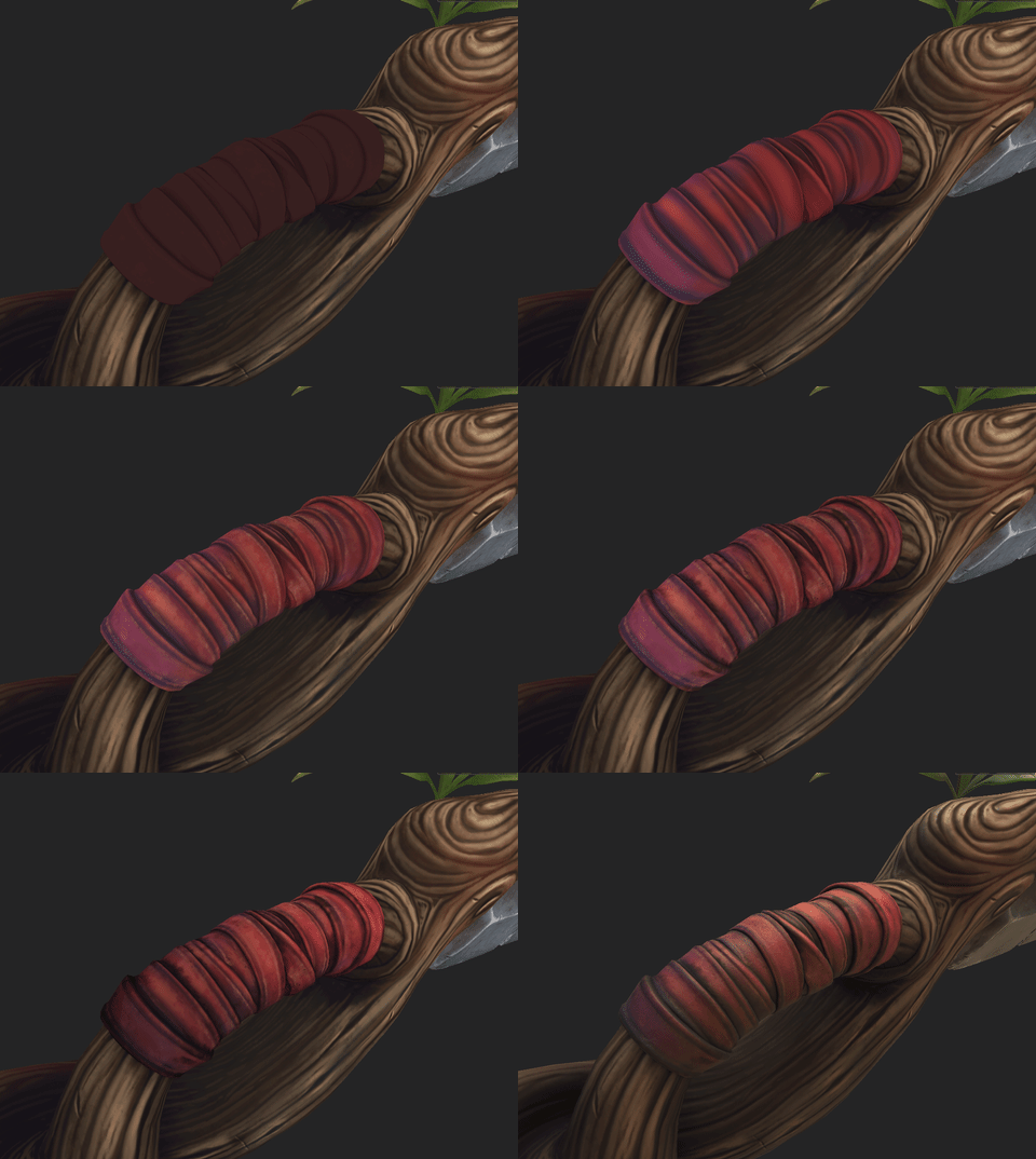
The blockout of the grip was pretty nasty. It needed some love so I sculpted a single cylinder piece and duplicated it a bunch of times to make up the wrapped grip.

The leather grip is a combination of hand-painted base colors and using the Mask Editor to quickly create edge highlights, grime/dirt, surface variation based on my baked maps (AO, worldspace, position, thickness). I also used a tileable leather height to add some surface detail to the normal map, it helped give the grip some material definition.

The Mask Editor is great to quickly add dirt or edge highlights and use that as a jumping off point to finish the texture. I try not to use the mask editor without editing the alpha afterward, you can get some unwanted results that you can just paint out yourself.

Wood Material

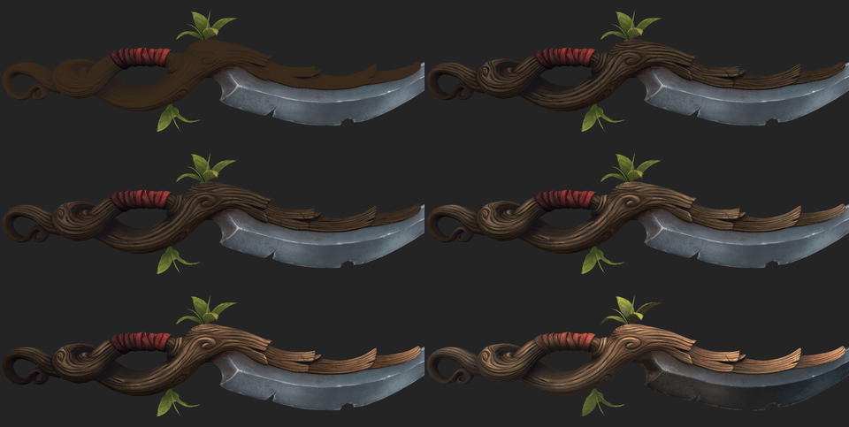
The wood took the longest on this entire project. It’s probably the most important material on here to help sell the idea of the dagger. I thought I could get away by using a couple Mask Editors and generators to finish the texturing of the wood, I was very wrong. Take your time and paint your model if you feel it doesn’t have life. Several attempts were made at painting the wood, I kept painting until it looked good. Highlights and cavity dirt played an important role here, these layers acted as the lighting which was still needed for stylized PBR. The second most important thing was the use of color, the wood was very boring when I first started and was mostly just different hues of brown. I started to add some reds, blues, and even greens in the end. Red was the color I favored the most, I used it mostly on the front of the blade to help draw the eye. To wrap it up, I used another harsh gradient along with some bright highlights on the tips of the wood sections to pull the eye forward.

Gradients

As I was learning hand-painting, I found that gradients are what help sell a model and wrap it up nicely. It’s good to lead the viewer’s eye to the important stuff and let their imagination decide how cool it looks. I purposefully darkened the dagger from back to front and kept going until I felt it was absolutely too dark, then pulled back a bit. I’m forcing the eyes to look at the front of the blade first, and then slowly lead to the back of the blade to see the rest of the model. The first read is very important. You need to catch the viewer’s eye with something cool and let the eye naturally run across the rest of the model.

Global Gradient:

Localized Gradients:

Don’t Give Up

Check out my Artstation blog where I talk about when I decided to pick up the Dagger project after quitting it for almost 3 years.

I abandoned the dagger at the texturing phase. The most important phase, and one of the main reasons I started this. When I got to hand-painting it, it was looking awful, and I didn’t really know how to make it better. I was mostly scared to work on it because I was afraid it was going to look terrible since I didn’t know what I was doing. Sometimes you forget what you have to do in order to move forward. There will always be hurdles on any project, you have to learn how to jump over each one when they come up and not give up. Reference, getting critiques from friends, finding inspiration, coffee, and learning from tutorials mostly help me.

Lessons Learned

  • Push it until you break it, then take a small step back and leave it.
  • Exaggerate when you can, even if it gets you out of your comfort zone. I still feel like I could have push more shapes on the model, and pushed the texturing further. I’ll save my learnings for my next stylized project and move on.
  • If you don’t feel confident about a certain part of your project, find more reference or watch some more tutorials. I did this plenty for the dagger.
  • Imperfections in stylized art are a part of the charm, not every stroke has to be perfect.

If you found this article interesting, below we are listing a couple of related Unity Store Assets that may be useful for you.

Cordell Felix, Lead 3D Environment Artist at Nexon OC

Interview conducted by Kirill Tokarev


© Daria for 80lvl, 2018. | Permalink | No comment | Add to del.icio.us
Post tags: , , , , , , ,

Feed enhanced by Better Feed from Ozh

Workflows for Creating 3D Game Characters

$
0
0

Saman Mahmoudi discussed the way he worked on the recent series of game characters: 3ds MaxZBrushMarvelous Designer, and Substance Painter workflows, modeling, texturing, and lighting.

Introduction

My name is Saman Mahmoudi and I’m a 3D artist. I’ve been working in both the film and game industry since 2005 on different projects including Mirror’s Edge Catalyst. I’ve been interested in art for most of my life but it wasn’t until the end of my teenage years that I started to play around in 3ds Max. Later, I studied in a few universities here in Sweden to learn how to do it the right way. We had some good teachers here and there but 3D art or art, in general, is best learned on practice and that’s how I gained most of my skills. 

Recent Goals

After working at DICE I realized that I needed to have some more realistic-looking and current-gen art in my portfolio with PBR and what not. I started learning programs such as Marvelous DesignerSubstance Painter, and XGen in order to get the results I wanted faster. I wanted to create some characters that people were already familiar with and try to do them justice, I also wanted to introduce something new but still keep the essence of the characters in one way or another like creating Zelda but having her in a different uniform than the usual ones. 

Modeling Workflows

When modeling I use 3ds Max for hard-surface and model such pieces in the traditional way. Organic models are usually started in 3ds Max as well but later reshaped and detailed in ZBrush. I tend to switch back and forth between Max and ZBrush in the beginning in order to get the right proportions and I also try to have a good topology even when working on the high poly in ZBrush.

For smaller details like pores and wrinkles, I use TexturingXYZ textures as well as extra brushes with detail alphas. I also use polypaint in ZBrush in order to get a good concept of the end result. I also try to export the model into whatever engine I’m going to present the art in as soon as possible so I can spot proportion and modeling errors. The polypaint from ZBrush can be useful here as well if it can show vertex painted materials (like Marmoset Toolbag 3).

Clothing

For the clothes, I usually use Marvelous Designer in order to get a good starting point. I don’t spend too much time in there as many adjustments can later be done in ZBrush. I then retopologize and bring the pieces into ZBrush again for further detailing. I have provided an image of this process below so that you could see my workflow. 

Textures & Materials

A well-executed model is great but a good set of texture bakes can really bring out details and shapes that might otherwise be missed. I use a set of ambient occlusion (both from xNormal and Knald), curvature maps, cavity maps, convexity maps, and translucency maps. I sometimes also use height maps for added geometry as well as specular, emissive and more for more adjustments. Some models like stylized ones benefit from color gradients when you need a brighter focal point and I use a gradient map for that. 

Substance Painter is very powerful as it considerably speeds up the work by having a great database of different materials, brushes and more which you can use to get the results that you want. Preparing the textures is key though so make sure all the maps are baked right and you won’t have to rebake too much. I also bake ID maps by using polypaint so I can assign each material to different parts of the mesh. Using polypaint/vertext paint is great as you won’t have to repaint the ID map too much if you would have to change the UVs.

Lighting

When lighting, I use a 3 point light system for most parts of my scenes: one key light (usually the sun or another strong light source), a fill light in order to bring out more details in the scene and finally a backlight. I try not to overcomplicate things but I sometimes use several lights for each of the 3 light sources in order to have more control. I also try to have a good mix of both cool and warm lights in order to bring more color to the scene as well as other colored lights for color bleeding when the GI isn’t enough.

If you found this article interesting, below we are listing a couple of related Unity Store Assets that may be useful for you.

Saman Mahmoudi, 3D Artist

Interview conducted by Kirill Tokarev


© Daria for 80lvl, 2018. | Permalink | No comment | Add to del.icio.us
Post tags: , , , , , , , ,

Feed enhanced by Better Feed from Ozh

Old Wise Woman: Character Production Tips & Tricks

$
0
0

Adrienne Lange did a breakdown of her character Wise Woman and talked about working on the face, clothes in Marvelous Designer, skin texturing, aging elements and presentation in Toolbag

Introduction

My name is Adrienne Lange, and I am a 3D Character Artist from New York. I’ve been learning 3D for about a year and a half. A few years ago, I wasn’t sure what direction I wanted to take with my career but since I have a background in 2D traditional art and have been playing games my whole life, I decided to blend the two and look into what it would take for me to learn 3D art. I started out with Youtube, Gumroad, and 80 Level tutorials, and just recently completed Game Art Institute’s Character Artist Bootcamp. My Wise Woman character was created in two months, as my final project for the bootcamp.

Wise Woman: Concept

This character comes from an amazing concept piece by Ivan Dedov made for Artstation’s “Ancient Civilizations: Lost and Found” challenge from 2017.

I found the Wise Woman concept very captivating and mysterious and wanted to challenge myself to sculpt an older face and capture the eeriness that Ivan portrayed. I like the simplicity of the clothing, as it draws attention to her face while still telling the audience so much about her character. I wanted the main focus of my 3D interpretation to be on the face as well, and for this, I compiled a lot of reference for different kinds of wrinkles and very old faces.

Modeling the Body Mesh

I started with a simple base mesh that I had made for a previous character. I first sculpted the primary forms of her face in ZBrush and then focused on her hunched pose. The pose immediately communicates her age from afar, so I felt it was important to nail it in the body mesh. Her back is very rounded in the concept, so I researched what happens to the skeletal and muscular forms when someone develops a hunched posture in real life. The shoulders drop down and the neck juts forward at a very severe angle. I imported my base mesh into Marvelous Designer to use as an avatar when creating the clothing.

Facial Features

For the high poly stage of this project, I spent the majority of my time working on the character’s face in ZBrush. I wanted her face to be exaggerated, but still realistic. I’ve struggled with sculpting faces in the past, usually failing to bridge the gap between an unfinished-looking sculpt and a convincing, realistic face. A few things, in particular, helped me to make some small improvements: using 3D scan reference and reference images, and attention to anatomy. Ryan Kingslien, Game Art Institute’s founder, suggested sculpting heads from a base sphere with a time limit of a few hours, to practice building up primary forms and establish anatomical landmarks. I highly recommend doing this as an exercise and still do it frequently. I also referred to Flipped Normals’ Youtube videos on sculpting faces in order to convincingly build up the forms of the eyelids and lips.

For building up wrinkles, I create creases using the DamStandard brush on a low-intensity setting (10-15) and then the Standard brush with a very small brush size (1 or 2) to build up along one side of the crease. Reference was very important since wrinkles are not uniform across different parts of the face. When looking at a face, the viewer’s attention typically goes first to the eyes, and since the eyes were so important for capturing the look of this character, in particular, I devoted more attention to the wrinkles around her eyes than I did on the mouth. I waited until the face was mostly complete before adding some subtle asymmetrical wrinkles to the brow and lips. I then retopologized the character in Maya. I made sure that the edge flow around the eyes followed the flow of the larger wrinkles to ensure that the bake captured all the fine details from the high poly mesh.

Skin Texturing

I textured the skin entirely in Substance Painter. Substance has added a collection of different skin materials to the default library which I used to paint in pores in different parts of the face. I used a fairly time-consuming (and not very efficient) method for painting pore detail: I would create a fill layer (height and roughness only, with roughness at .3) with a skin material, add a black mask, and then paint out the mask with a low opacity to reveal the skin detail in the appropriate areas. In the end, I had around 8 layers with different skin materials, to capture the different pore patterns of the forehead, nose, eyelids, chin, and cheeks (again, reference was crucial for this). I tested many different materials for each area, as the materials that are labeled for certain areas (e.g. Human Nose Top Skin) might not actually have the sort of skin detail you want for that area.

For color and roughness, I started with a fill layer with a base beige color and roughness of .4. The environment map you use is very important for portraying your roughness accurately. I work with Studio 02 and switch between other studio settings to get context and contrast, but some environments (such as Studio 03) will make the skin roughness deceptively exaggerated. I then added a fill layer (color and roughness only) with increased roughness and a red tone. The cheeks, eye sockets, and lips should be redder and have less roughness. I found that a roughness range of .25 (for shinier areas such as lower eyelids, lips, the tip of nose) to .7 (deepest part of wrinkles) was the best range for skin roughness. On top of these layers, there are four color-only fill layers (blue, red, yellow, green), each with a very low layer opacity to demonstrate the color zones of the face. Finally, there are three fill layers (height and color only) with pink to brown tones, where I painted over a black mask with a splatter brush to create age spots all over the face. I manually painted in some larger moles and age spots on one of these layers.

Substance’s viewport will look very different than a real-time engine, so at this point, I sent my model into Marmoset Toolbag so that I could compare between the two. Once the model was in Marmoset, tweaking the shaders to make the face look like real human skin was the greatest challenge of the whole project. After days of troubleshooting and a lot of help from the GAI bootcamp, I have a short list of mistakes I won’t make again.

  • Check your scene scale! Marmoset’s scene default is in meters, but my model was in centimeters; this had serious effects on the Subsurface Scattering, which relies on the units of the scene.

  • Check your normal map. I had to flip my map’s Y channel in Marmoset, after exporting maps from Substance Painter.

  • Don’t be afraid to switch back and forth between Substance and Marmoset, or Photoshop, to make small changes to your maps. Save many different iterations and toggle between them.

I highly recommend Saurabh Jethani’s Marmoset tutorial for guidance on how to set up the skin shader slider parameters and creating additional maps such as normal detail, cavity, and translucency maps. For subsurface scattering, I played with the sliders in the Diffusion menu until the effect is only just barely noticeable. Subsurface scattering, transparency, secondary reflection, and occlusion and cavity maps will make a very noticeable difference in the quality of skin presentation in Marmoset. My settings (below) will not guarantee a similar result in the viewport; setting up the skin is a game of trial and error and iteration.

I often look at other artists’ work and try to pinpoint what exactly sells the skin in the final renders. Some great artists I refer to when it comes to skin presentation are Magdalena Dadela, Jakub Chechelski, and Jared Chavez.

Clothes

This project was my first time working in Marvelous Designer, and it was a lot of fun. Creating the various pieces of clothing turned out to involve a lot of trial and error as I learned the intricacies of Marvelous. For pieces that involved a lot of overlapping and layering, such as the turban, I eventually abandoned trying to recreate it as it would be in real life (a single piece of cloth looped around many times) and instead created patterns that gave an illusion of the real-life construction. The turban in its final form is a three long, closed, twisted loops, pinned to a turban-shaped base mesh (made quickly in ZBrush), and fleshed out with smaller rectangular patterns of cloth to fill in the gaps and create fullness. I used the same principle for the boots.

To break up the edges of the clothing, I went into ZBrush and used the Move brush (with AccuCurve turned on) to pull out the edges of the cloth and create a layered, torn effect.

After retopology of the high poly in Maya, I created a plane to use as an alpha card for frayed threads, painted the textures on top of the UVs in Photoshop, duplicated the plane, and placed them among the edges of the clothing. In Marmoset, I used the transparency menu set to Dither and the albedo map information to make the cards transparent.

Eyes

I created the character’s eyes following Peter Zoppi’s amazing Gumroad tutorial and then added my own tweaks to the albedo map to get the clouded cataract effect from the character concept. Peter’s tutorial does an incredible job of outlining how to get that refractive effect using two meshes: one for the cornea, which is transparent but highly reflective, and another similar mesh which sits just inside the cornea, and which has albedo, normal, gloss, specular, and parallax maps.

Presentation

I wanted the renders of this character to be dramatic and mysterious, like the character herself. In Marmoset Toolbag I chose the “Mountain Sunset” pano for its strong colors and set the brightness low (.04) and the mode to Ambient Sky. This set a good base tone for the scene, and from there I could place the key, fill, and backlights to highlight the character. I start with a bright fill (selected, in the photo below) and then create lights experimentally from there. The face was the most important part to light, so there are 5 or 6 spotlights coming from different angles to highlight certain parts of the face (eyelids, wrinkles, etc.). I try to give all the lights in the scene a slight color, and to make the lights on one side of the scene warm tones (pale oranges and yellows) and the other side cool tones (light purples). This adds to the overall tone and drama of the scene. I added a fog to the scene to amplify the scene lights and add a purplish aura.

A Few Words About Toolbag

I love Marmoset Toolbag and think it is a very powerful tool for not just presentation but baking as well. I choose to bake in Marmoset because of its baking groups and the amazing paint skew and offset tools. It’s very convenient to see the preview of your bakes in real-time, and then to very quickly export them to Substance Painter or another texturing suite. Once I’m in the end stages of a project, Marmoset also helps me to pinpoint flaws in my textures that I might not have noticed in Substance and allows for very quick changes and a high level of customizability. I’m still learning about all of Marmoset’s capabilities and am constantly surprised to learn about things that I didn’t know it could do.

Feedback

This project is by no means perfect, but I did learn a lot in the process that I hope to carry into my next project. The biggest hurdle was getting the skin to look right, and it took a lot of help from peers and from mentors to figure out what was not working and why. It can be very hard to persevere when you get to the stage of a project when you have tried everything you can think of and are still flailing, and I think that is when peer feedback becomes invaluable. I fixed my biggest mistakes through research, and — when research did not work — reaching out to other artists on Discord servers or in the Game Art Institute network. I would like to go back and spend some more time texturing the clothing or tidying up the hand meshes on this character at some point, but sometimes it’s time to move on! I’m looking forward to the next character and more challenges.

If you found this article interesting, below we are listing a couple of related Unity Store Assets that may be useful for you.

Adrienne Lange, 3D Character Artist

Interview conducted by Kirill Tokarev


© Daria for 80lvl, 2018. | Permalink | No comment | Add to del.icio.us
Post tags: , , , , , , , ,

Feed enhanced by Better Feed from Ozh

Complex Modular Architecture Environment in UE4

$
0
0

Tyler Anlauf prepared a detailed breakdown of his modular environment ROME: Church of Sant’Ivo made with UE4 and 3ds Max and talked about blockout, modular assembly, lighting, post process, composition and more.

Introduction

My name is Tyler Anlauf and I am an Environment Artist at Human Head Studios in Madison, Wisconsin. We have a very talented team working on multiple titles. I have had the pleasure of working on Call of Duty: Online, Rune, The Quiet Man, and an unannounced title.

Prior to joining Human Head Studios, I was first introduced to the digital art medium in high school learning photo editing in Photoshop. Soon after, I was self-taught in 3ds Max, CryEngine, Unity, programming, and video compositing. After deciding to pursue a career in 3D, I went on to study Animation and Concept Development at Madison College, taught by industry veterans such as Ed Binkley, Jeff Dewitt, and Nathaniel Albright. I had also landed jobs and internships as an artist at Gear Learning, Field Day Lab, and Scooter Software working on mobile games, PC games, and software UI.

Chris Hartmann and Ethan Hiley of Raven Software also became mentors of mine during college. They helped sharpen my skill set by critiquing my work and refined my knowledge in AAA game art. Ultimately, I was lucky enough to earn a job at Human Head Studios right after graduation.

Below are a couple past examples of my work studying from Chris and Ethan.

ROME: Church of Sant’Ivo

In this breakdown, I will share with you my process so far on ROME: Church of Sant’Ivo, the tips I learned, the challenges along the way and how I plan to improve the scene since it’s still a work in progress.

Project Goals

The goals of this project were to refine my art pipeline, learn Unreal Engine, and improve upon my lighting, color, and compositions skills. The Church of Sant’Ivo fit my project goals with its obvious modular design and lighting, color and composition possibilities.

It was also helpful to pick a place that I resonated with and was inspiring to me. This architectural masterpiece of the early Roman Baroque period has a rich history, grand architectural language, and scale that I find intriguing. The scale also posed a challenge for time restraints, so I had to plan accordingly.

Good Reference Solves Problems Visually

Every project should start with a good reference collection. It’s helpful to collect more reference than you think you may need since it might come in handy or it could spark an idea later in the project. Without it, there may have been a missed opportunity. Additionally, it’s useful to continue finding some reference at each stage of the project and not limit yourself to your initial reference collection.

Below is an example of just some of my reference collection.

Having some way to organize reference materials proved useful to coordinate them for each stage of production. Trello, Photoshop, or simply organizing reference in folders is effective.

As a result, I found a free product PureRef to be a useful tool to do this as it is a powerful, yet lightweight program. All reference materials can be seen at once, or easily snap to full screen to view one particular image. It’s simple to organize your reference into groups or even build unique reference boards.

Even old drawings became useful for this project especially when it came designing the level and defining scale. They also gave insight into how the church and courtyard were built in the Baroque period.

Project Planning

Next, it was time to break down the modular elements of the reference and start developing the metrics of the individual assets. At this stage, I made a list of how many pieces I needed to build. I also broke down the different materials needed, and how to produce them efficiently.

Here you can start to see how massive the space really is. Notice how the woman in the hallway on the lower right is roughly as tall as the base of the window.

The scale of this project is one of the challenges which made it fun to work on.  Everything about the architecture is oversized by design, making the space feel grandiose. For example, a window here is roughly 4 times larger than an average household window. Finding basic real-world measurements to base my objects on were not applicable to this project as the scale and architecture here is so unique.

Thus, finding a reference with people in them for scale became essential. Making sure to study numerous reference images to ensure the scale of the scene was accurately captured.

Blockout

The blockout is one of the most important steps in building an environment and can be easily rushed or neglected. A solid blockout can build the foundation for success, especially if working with teams and larger projects.

There are many ways to approach a blockout, however, I found UE4’s BSP brushes worked great for this blockout. The BSP tools made this blockout a very fluid process by doing simple Boolean operations to construct the basic shapes of the environment.

Using BSP reduced the urge of adding details before a solid block-out was complete, keeping the focus on the level design and building metrics.

Below you can see how close my block-out is to the final stage of the modular kit.

Blockout:

Final Modular Kit:

Any big adjustments at this stage can be easily made with the nature of BSP.  After testing and refining my metrics in UE4, I knew that this modular kit would work with the final geometry, before detailing them in 3ds Max or similar tools.

Below is an image of the early stages of how I defined the project metrics. These went through a few iterations before the level felt right and I got them locked down.

Additionally, I did an initial lighting and composition pass to test if my shapes were working well. This also helped me prioritize which assets would get the most polish based on the camera distance.

Next, blocking out some basic materials to the scene helped me get a better sense of the mood and scale of the scene. This initial material pass also helped me understand how I would plan out my final materials and get a better sense of how many I would need.

Modular Construction

Now that the kinks were worked out of the block-out, I can use my block-out as a starting point to construct my final geometry. Since I thought about the metrics of the modular assets early, they already snapped together on the grid making, the geometry construction quick and efficient.

In most cases, BSP is not as efficient as static meshes in UE4. Therefore, I converted my BSP block-out to static meshes and then import them into 3ds Max for the final geometry construction.

UE4 makes converting BSP to static mesh easy:

The construction of the modular kit in 3ds Max started out by defining the large and medium details first and then testing them along the way in UE4.  Nothing is worse than thinking you finished an asset, then realizing you made a mistake early on. After the large and medium details are refined, I could then focus on the fine details an optimization.

After some testing, I realized I needed more pieces added to my modular kit than anticipated. Seeing this issue early on helped me save time later since I could plan for adding additional pieces.

Test early, and test often!

Since I utilized tileable textures heavily, making sure the texel density was uniform between the assets was imperative. This was achieved using a script for 3ds Max called TexTools, although there are a variety of other tools and scripts available.

Blueprints for Modular Assembly

To make production more efficient, I constructed blueprints of repeated sections of the scene. For the corridors, I had made 3 variants in blueprint shown in red, green and blue in the graphic below. Each had its own types of doors, windows, and other details. This way, I only had to update 3 sections of the corridor, instead of 48.

This saved me tons of time as the changes would ripple through the whole project in real-time. The entrance of the church has two blueprints as the middle section is unique from the rest allowing for more variation shown in purple.

Materials

I created a few materials with a combination of Substance Designer and Substance Painter. However, due to time constraints, I used Substance Source and Quixel Megascans as well. This was a huge time saver.  

I utilized master materials in this project to make editing materials faster and more efficient. Utilizing material instances from my master material, I only had to switch out the textures instead of re-writing a unique shader for each material.

The functionality I wrote into the master material allowed me to make edits to the textures like Photoshop but in real-time without leaving UE4. In addition, I could enable features like vertex painting and add detail normals if desired for a particular material instance.

To optimize the master material, static switches were used to compile only the features that are needed in each instance. This makes the material optimized in the sense that only the enabled options will be computed. Therefore, I can create basic shaders driven by constant values, or fully driven by textures with more complex features and adjustments.

Lighting

Lighting was one of the tougher challenges, but it was also one of the most rewarding aspects to work on. Good lighting has the potential to turn a good scene into a fantastic one, so it is essential to understand at least the basics.

I started off the lighting on this scene by first studying photography, film, and lighting artists, to understand how light helps craft a composition and bring life to the models and materials in UE4. I recommend watching the UE4 Lighting Masterclass, Lighting Academy by 51Daedalus, and The Art of Lighting with Boon Cotter on YouTube to start with.

Materials also play a big role in the lighting as they determine how light photons are reflected off surfaces. Be sure to double check your base colors to ensure they are as calibrated as possible to PBR standards. It’s a good idea to keep the base color maps no darker than .02 in linear space. Anything darker can start to become a black hole for light photons which produces odd lighting results.

Both the UE4 lighting masterclass and 51Daedalus make a point of this.

The lighting in this scene is rather simple. I approached the lighting here by first constructing a clean calibrated lighting foundation for my starting point, as described in the UE4 Lighting Masterclass. After my lighting is calibrated and I have a clean foundation, and I could then stray from those settings to achieve something more visually pleasing.

Normalized Lighting Setup:

One of the most important elements was my skydome as it affects the whole scene, especially the mood. I created a simple but effective material for the sky to refine its rotation and intensity. I made sure the amount of Lux emitting from my skydome was calibrated and accurate to the real world so that it reflects onto the scene naturally. This was applied to an inverted sphere surrounding the level.

The trick was to dial in a sun direction that was early to mid-sunset to help define the mood, but also made interesting rhythms of light and dark at most viewing angles; helping craft the compositions I chose.

The volumetric fog was used as a tool to enhance the mood by creating god rays. The volumetric fog color was also necessary to define as it has a large impact on the color palette and mood. Lastly, the density of the fog helped sell the sense of scale, depth, and atmosphere into the scene.

Post Process

The post process was the next tool to define the look and feel. One of my favorite features was convolution bloom as it emulates more natural and detailed blooming of light, but at the cost of performance.

I was also able to take artistic control over the shadow, midtones, and highlight colors. This was relevant to refine the color pallet and bring out the details of the scene giving a richer feel to the shots.

Don’t be afraid to spend time here. With a few small tweaks, you can dramatically shift the look and feel of any scene, adding a nice touch to the final product.

Defining the color pallet is also essential. A simple way I checked my color pallet was by doing a blur test. Simply taking one of my screenshots and blurring it in Photoshop. This makes the color pallet more visible and I can use this information to refine my color pallet to construct a better composition.

Composition

Crafting a strong composition is just as important as any other part of the project. A good composition makes the viewer’s eye flow through an image in a way that is pleasing. To do this, I had crafted shots that took advantage of the shapes my geometry created, the rhythms of light and dark from my lighting, and pockets of warm and cool hues from my color pallet to all work together with a camera angle that complements them.

To craft an interesting camera angle, I used the Rule of Thirds and The Golden Spiral as guides.

The brightest area in a scene, and where there is the most contrast is usually the focal point. To test if my intended focal point is working, I crushed the levels down to reveal the brightest, highest contrast area of my scene. Adjusting my lighting as needed to make sure the focal point reads clearly. A strong focal point also reduced some of the natural repetition of the architecture since the eye has areas to rest on.

Using the Cine Camera Actor instead of the default camera actor in UE4 was useful to get a nice composition as it allows for additional camera settings to craft a good shot. In this case, I used the 16:9 DSLR filmback setting as it gave me good results for taking these environment shots. Playing with the filmback settings can give different looks so it’s worth experimenting with them. Also adjusting the focal length can yield a more cinematic feel. For these environment shots, I tend to use a wide-angle lens. However, portrait and telephoto lenses can be good for characters or close-ups of small objects.

Next Steps

As this scene is still a work in progress, there are many areas I can still improve. With the basics well defined already, I look forward to adding details and environmental storytelling. This includes how the environment has weathered over time, and what potential conflicts happened here. This can give me the opportunity to add more props, detail models, and more richness to the materials.

Final Images:

Conclusion

In closing, I really enjoyed working on this project so far. It’s been and will continue to be a great outlet for experimenting, learning, and improving myself outside of my professional work. There is a lot to do yet, and looking back from where I had started, I’ve learned a lot from it.

The key thing I took away from this project is that it’s not about the sheer complexity of a scene, but rather first crafting a solid foundation of which complexity can be layered onto.

To view more of my work, visit my portfolio.

Thanks for reading! And thank you, 80.lv!

If you found this article interesting, below we are listing a couple of related Unity Store Assets that may be useful for you.

Tyler Anlauf, Environment Artist at Human Head Studios

Interview conducted by Kirill Tokarev


© Daria for 80lvl, 2018. | Permalink | One comment | Add to del.icio.us
Post tags: , , , , , , , ,

Feed enhanced by Better Feed from Ozh

Crafting a Sad Muse Mask

$
0
0

Arturo Ramírez also known as Limkuk talked about his Sad Muse mask design made with ZBrushMaya, and Substance Painter.

Hello again. My name is Arturo Ramírez, but everybody knows me as Limkuk. I am from the beautiful City of Morelia, located in Mexico. I’ve been working as a creature and character artist for games, movies, and cinemas for 4 years. When I got into 3D for the first time 4 years ago, I was creating cultural posters for the government of Morelia.

Read the first interview with Limkuk here:

Sad Muse: Start of the Project

All my life I really liked the tribal theme, and for me, it’s a thing that you can explore and have millions of results. When I started the Sad Muse I really wanted to create a mask that resembled Virgin Mary’s facial expression and combined both sadness and hopelessness. I drew inspiration from the old sculpts of Mary from the Renaissance.

First, I created a mood board as it helps me to see better what directions I want to take my model to in terms of sculpting, texturing, look dev and final composition.

Sculpt

First of all, I started with the head that had basic proportions.

Then I sculpted the primary shapes of the model using the basic brushes like Standard, DamStandard to create wrinkles and some hard damages, Clay Buildup and Clay to create the face construction, and H polish to create the HardSurface feeling.

For the details, I used a simple alpha that comes with ZBrush and a cloth alpha that I found on the internet and used as a global noise to obtain the fabric pattern.

The biggest challenge here was to find the right facial expression and the final look.

Eyes

The eyes were typically created in ZBrush and only have a simple brown texture with a bit of yellow. The eyeball was made in Maya with aiStandard.

I think that lighting does all the magic here. As Emmanuel “el Chivo” Lubezki said, without light, there is no film.

All the rest is achieved with very simple shading settings. The textures themselves come from Substance Painter. Remember, that if you have a great model your textures need to be as great because in the final piece all the parts will merge.

Textures

The textures themselves come from Substance Painter. For me, it’s a powerful tool to create PBR Textures, and the pipeline can be adjusted to every render settings. The displacement, AO and Cavity maps come from ZBrush while in Substance Painter I created the Diffuse, Roughness and the secondary Normal map.

Remember, that if you have a great model your textures need to be as great because in the final piece all the parts will merge. 

Wooden Mask

First I started applying the base material and found the color that I was looking for.

I applied a smart mask that worked with my cavity map to create some nice roughness.

Then I started to create the makeup. This was very important for me and I explored a lot to find good makeup that would make the face look alive.

When I was happy with the result, I continued with the worn out textures: those were simple colors with smart masks. Finally, I achieved the feeling that the mask is very old.

Rendering

For this project, I used Arnold render for Maya 17. It’s very powerful and the shading process is quite fast.

For the lighting, I used an HDRI and a simple LightRig with Keylight, Fill Light and two Rim Lights. I really like to use these settings in order to obtain a Rembrandt lighting setup.

You can learn more about Rembrandt lighting in the video by Jordan P. Anderson:

For this process, I recommend studying a lot of photography and lighting principles to understand how every light works.

The shading was done with the aiStandard. This shader is extremely powerful and I only connect the maps from ZBrush and Substance Painter. The advantage of having PBR textures is that this process is usually faster with the AI Standard Surface. I only used some Ramps to control the roughness maps.

One of the tips I give to my students: study a lot of materials and explore the real world. Walk in the streets and study how the metal, wood, plastic, water, etc. work, how the materials react to different light, reflect and refract it or not. It will help you to get a nice setup for your shaders.


Limkuk, Creature & Character Artist

Interview conducted by Kirill Tokarev


Simple River Stones by Stan Brown is a procedural material for your environments fully made in Substance Designer. The package includes a fully commented and organized graph for study and customization.

See the full description

Contact Stan Brown


© Daria for 80lvl, 2018. | Permalink | 2 comments | Add to del.icio.us
Post tags: , , , , , , ,

Feed enhanced by Better Feed from Ozh

CGMA Student Project: Modeling a Sig Sauer Gun

$
0
0

Alex Gallucci talked about his crisp Sig Sauer MPX model created within CGMA course Weapons and Props for Games led by Ethan Hiley. Software used: Maya, ZBrush, Marmoset Toolbag, Rizom 3D, and Substance Painter.

Introduction

Hi, my name is Alessandro Gallucci or Alex for short. I currently live in Italy and I’m a freelance 3D Artist. I have been doing 3D work for a few years: before that, I was studying Japanese culture and language and I’ve spent some years living in Japan. While I was there I decided to pursue a career as a video game artist. I’m currently looking for a full-time position while polishing my portfolio.

Sig Sauer MPX Project: Start

Sig Sauer MPX started when I enrolled in the CGMA course Weapons and Props for Games led by Ethan Hiley: I wanted to improve my modeling and texturing skills with a complex model. That’s why I chose the Sig-Sauer MPX: for me, it was a nice challenge to push my limits and learn from it.
The software solutions I used were Maya, ZBrush, Marmoset Toolbag, Rizom 3D and Substance Painter.

I used PureRef to gather my references, one for the main weapon and another one for the XPS sight. I tried to keep it clean, using notes to create sections for each part so I could quickly find the part I’m looking for. I also kept track of small details like engravings or marks I wanted to add in the end in order to avoid forgetting about them.

Another useful resource is the manual for the weapon, it can provide renders of the weapon, specifications, engravings/logos and even an in-depth look at some components and how they work.

The first step was establishing the right proportions and sizes. For me, the best way to do this was using the mounting interface rails. Rails are standards to allow many attachments to fit, and you can easily find the sizes of them on Wikipedia. Then I created another object scaled to the weapon length and used those two to get the correct scale for the reference in my Maya scene.

Sculpting

I spent a lot of time trying to achieve a nice blockout, having all the main forms of the final model that I could later use for both the sculpt and the low-poly mesh.

This part of the modeling was the fastest, using a lot of shapes and booleans trying to achieve the right look without worrying too much about the geometry. Just throw in shapes with the right size, make a Boolean union and fix it so it doesn’t break and let’s move on. It’s also easier to model this way since you can easily break a complex mesh in simple forms.

When the blockout was done, I proceeded to use Dynamesh in ZBrush, with Boolean to achieve mid details followed by a polishing pass.

One little touch I like to apply to my plastic surfaces is the mold line in the center. I’ve seen it in the ZBrush Presentation with Mike Climer and wanted to add it to my models too (if you are interested in it, check the video below from 1:05:00).

Something I can’t stress the importance of enough is having good smoothing on the edges. Usually what new artists try to have is a perfect 90° angle on the surfaces. While it’s realistic, when the model is looked at from afar it will get jagged and start to alias. A smoother edge will read fine even from the distance. This picture is probably something I’ve seen hundreds of times:

Detailing

The holes in the handguard were done by Boolean operations. Using the same workflow explained before, I created a mid-poly version of the holes and duplicated them. Adding some bevels I obtained a high-resolution mesh that I later used in ZBrush to dynamesh the whole model and get the holes. I repeated the process with all the pieces to obtain a clean sculpt that I reimported in Maya after the decimation.

The mid-poly was later used to retopologize the model, and I spent a bit of time trying to preserve the silhouette while lowering the polygon count and making sure that the bake was still good even on close up shots.

For other details, like the arrows on the holographic sight, I just did the inverse. I created the high-poly in Maya and then combined them using Dynamesh to obtain that merged look that seems more natural for casted pieces.

Baking

I rely on Marmoset Toolbag for the baking. Since the inclusion of groups, it became my main baker. Before I used to explode the models, moving the pieces colliding together away. In this weapon, I just made different groups for each main object, and for all the small pieces I tried to group them in clusters avoiding any intersection.

Another useful tool is the skew painting, to get nice planar details on the bake.

Be careful about the tangent space and especially the normal direction, since they can create problems in other software solutions like Unreal and Maya. The best way to test for mistakes is to bring the model with the baked maps into the engine and just see for yourself how it appears.

Texturing

Substance Painter is my preferred software for texturing, as it grants me the high quality of the result and the ability to change details fast.

To be able to see the whole mesh but also get into the occluded part, I duplicate my meshes and put them aside. This way I can both paint it separately and see the overall look.

I generally start with a base layer with some color and rough value for a material, then proceed to apply some textures that I get from Textures.com or a similar website to start obtaining details in the albedo and roughness. Something interesting I’ve learned in the course was to see past the ‘title’ of a texture. Ethan showed us how even a marble texture could produce nice effects for metals, so don’t limit yourself to look for ‘metal texture’, but experiment a lot.

Seeing the subtlety of materials is something that will help the project go really far. Even an industrial piece like a rifle is made by different components and each is slightly different. For more realism, you can slightly variate the value in the albedo, making it just a notch darker or lighter. It’s subtle but it works. Even damage can be different. The gun could use pieces from different manufacturers and the quality of the material could be different, so they will age and get worn in different ways.

It’s easy to get lots of details using generators and smart masks, but they will look too procedural in the end. Using a paint layer with a brush you can tune it down to make them more believable.

Decals

One of the first steps I do in Painter is to finalize the normal details, by creating decals and any other pattern or engraving, usually with Photoshop. These could be done in ZBrush but as I later discovered, having it on a layer in Painter gives me the ability to easily modify them if I ever need it. It’s also the part where I love to add small ‘easter eggs’ like important dates and numbers for me, or small writings.

I apply them on a fill layer with a slight amount of height, then use a mask with a paint layer to put the details on the mesh. For a nicer look, I then add a blur filter that will make them less brand new.

For the small sticker, I was lucky to find a high-resolution photo during my research phase but it can be easily recreated in Photoshop. Using some surface imperfection texture I gave it some damage and rough variation. In the end, using a dirt brush, I just removed pieces on the edges to make it worn and used.

Achieving the Best Result

Getting a crisp and neat model at the end requires a lot of time and problem-solving. I can’t really think of one phrase that could sum up all the work that each artist needs to do in order to make something look really good. For me, it’s a slow process, approached step by step and with a varying degree of frustration in the middle. I try to replicate the references exactly as they are until I am comfortable with what I’ve obtained.

Rendering

I use Marmoset Toolbag to render my props. After setting up the object and the materials, it’s just a matter of playing with lights and the skylight. I select a good HDRI texture (you can find them for free online, too).  

I set up different cameras where I’d like to render the model by duplicating and moving them. Then for each of those, I create a lighting setup, since each view requires different illumination settings depending on the details. It’s a bit time consuming at first, but it saves time when you want to go back to a previous camera and tweak the lights some more, or when you reopen the project after a long time!

For the lighting, I start with a simple 3 point light setup, then I throw in some more to get better highlights or rim lights.

Something I learned in this phase was to not overcolor my lights since the texture shouldn’t be changed too much. It’s alright to use a cold or warm light but try not to alter the base texture with different colors.

Post-processing effects should be controlled, too. It’s easy to add a lot of chromatic aberration but I prefer to use small values.

Challenges & Feedback

Perfectionism is an Achilles’ heel of mine when trying to produce a real object. I spend time and time again studying the forms, surfaces, and materials so that I can replicate it in the most realistic way possible. Setting up a time frame to complete the project forced me to get past it. The more projects you complete, the better the end result will be, so force yourself past your block.

I also understood the importance of asking frequently for feedback to improve. Aside from my mentor I often address questions to, there’s a Discord server for Weapon and Gun enthusiasts called The Armory. The admin and all the users there are really supportive and they helped me push the textures and lighting one step further so I can’t thank them enough. Jump right in with the link above, I’m sure you will find a lot of useful support in there!

If you have questions, feel free to email me or contact via ArtStation. Thanks for reading until this point, and also thanks to 80.lv!

Alessandro Gallucci, 3D Artist

Interview conducted by Kirill Tokarev


For more information on CG Master Academy and the Weapons and Props for Games course, please visit the CGMA website, or email 3d.registration@cgmasteracademy.com

The goal of the ClearCut courses is to teach you a solid workflow that is used in the AAA game industry. The first episode covers the process of creating an AAA fire hydrant from start to finish.

Check the full description

Contact Emiel Sleegers


© Daria for 80lvl, 2018. | Permalink | No comment | Add to del.icio.us
Post tags: , , , , , , , , , ,

Feed enhanced by Better Feed from Ozh


Breakdown: Sawed-Off Shotgun in Substance & Toolbag

$
0
0

Alexander Sheynin shared a detailed breakdown of his amazing Sawed-Off Shotgun made in 3ds Max, ZBrush, Substance Painter, and Marmoset Toolbag.

Introduction

Hello! My name is Alexander Sheynin, I’m a self-taught 3D artist from Tula, Russia; in 3D since 2016. Currently, I work for Dekogon Studios, creating assets for games. In this article, I’ll try to describe the process of creating my personal work “Sawed-off shotgun”.  I used 3ds Max, Zbrush, Unfold 3D, Substance Painter, Marmoset Toolbag, Adobe Photoshop, and PureRef

Idea

The original concept by Ivan Taranenko, I found on his ArtStation page. It is a personal project created for my portfolio and studying Substance Painter, so I made some changes in the design itself. Probably, it was originally supposed that instead of one there were two barrels, but in my opinion, the gun would look more organic with one barrel left, and in its size, it looked more like a grenade launcher than a shotgun. That’s why I added a 40 mm grenade to it.

All the references for my projects, I find on Google, Pinterest, and YouTube. They can be divided into 2 categories: for understanding shapes and material samples. For this project, their count is not too big, cause the project was made for personal purposes. But usually, I spend a lot of time searching for good references, how the material is worn; videos, which represent shapes and how do some mechanisms work.

Modeling

Main software I used for modeling was 3ds max. It has both a bunch of pros and cons; nevertheless, it works rather stable for me, and in combination with additions, it allows me to get the desired result rather quickly. Here is the list of scripts and add-ons that I use:

  1. Regularize edge loop – Rearranges loops in regular n-gons.;
  2. Align Pivot To Selection – quickly  sets the pivot position to selection; 
  3. Sub-object pivot – allows you to select a single component on a mesh or poly object and toggle a working pivot onto it. It works similar to a referenced coordinate system, like in Maya or Xsi;
  4. Vertex Cleaner – cleans polygonal meshes from the useless vertex, for example after the Boolean operations.

There is nothing special about my modeling techniques. I often use symmetry for planar cloning, an array for radial (holes in the barrel jacket). Almost all the edge and polygon actions are bound to hotkeys (extrude, chamfer, bridge, cap hole, connect, weld, quick slice, collapse, set flow, remove loop etc.).  Especially, I often use axis alignment. Also, such commands as a center pivot, autosmooth and harden/soften for smoothing groups creation. I use Proboolean in an instance mode, so this way it acts like Live Booleans in Zbrush. To avoid unnecessary vertices, I set the Remove Only Visible option, and remove the rest with the Vertex Cleaner script.

Blockout

Usually, you should follow the rule “from big shapes to smaller ones”, however, when you have only a side view, it is not always clear how wide the object is. Therefore, since they have 2 equal sides, I prefer to start with cylindrical shapes. All the blockout meshes I place on a separate layer, leaving only the main reference/camera/light (if it is in the scene) on default. The layer list looks like 1) 0-default; 2) blockout; 3) high poly; 4) low poly.

Blockout is one of the most important steps because at this point you define the main shape of your object.  Based on your blockout meshes, high poly and low poly will be created. First of all, the topology is important for those objects that will later become the basis for subdiv high poly meshes (grenade). For objects that will be refined in ZBrush, the topology and n-gons are less significant. The main thing here is to convey the silhouette. That’s why I increased the segment’s count in round shapes. The idea is, even from a relatively close distance, the fragment of the mesh should not look angular.

In different cases, such as topology or further mesh editing, I use 3 approaches to create various complex cuts or shape mergings. It could be Proboolean in Max, with “No Edge Removal”; either create a separate mesh for the cutout shape, export it, and perform the boolean operation in ZBrush; or make this mesh completely in a ZBrush, and then subtract it from the main object. In Max, I assign green material to subtract meshes.

In this work, I used the first method in blockout, and the second when creating a high poly.

When the modeling for this stage is done, I position the pivots, make links to separate parts of the object; check if the parts of the object intersect during transformations. And, if everything moves as it should, I come to the next step.

High Poly

The principle of modeling high poly-parts was determined by the amount of time required to create them. It was easier and faster to make a subdiv grenade because there are no major damages or scratches that would have to be sculpted on it and there is no need to export it from and import back to Max. I duplicated the mesh from the blockout layer, added an Edit Poly modifier on top of the stack, selected the edges, which would be creased. After that, I added a turbosmooth modifier with a couple of iterations and checked for artifacts.

All the other parts were exported to Zbrush.  I assigned polygroups by normal, activated dynamesh, then, first masked the edges (mask by feature – groups), after – polished the whole mesh, and  inverted the mask and applied polish on the edges (polish, polish by features or polish by crisp edges, depending on the shape of the object). With the trim dynamic, clay, planar, hpolish, orb_slash brushes, I sculpted some wear and cracks. It was easier for me to create a grid pattern in Photoshop, and then use as alpha with the standard brush in Zbrush. After all, I decimated the mesh and imported it back to max. For the naming, I used Rename Objects tool in Max.

Low Poly

It’s pretty simple, even no retopology, I just optimized the blockout meshes, removing the extra vertices and edges, and attached them to a single object. Total polycount is 19806 tris. The only important thing – is the smoothing groups. In some cases, like it was with the round part of the frame, I used a single smoothing group, while with the hard edge, It gave bad shading and visible seam after baking.

UV

Before moving to UVs, detach symmetrical and repeating parts from the model and assign them a new material. These parts will be copied from those on which I will create an unwrap and transferred to the next uv-space to leave more space for the rest. I use Unfold3D Vs 2018, very quickly, it allows you to cut seams, iron your uv-islands and automatically pack them with certain padding value. It’s interface is similar to max/maya, so it is very easy to work with. Square unwrap due to all the islands have filled the square space; uv’s of the unseen parts were scaled down.

After the uv work was done, I sent the model back to Max, cloned the repeating parts, moved their unwrap to nest uv space and attached to the mesh. Then, the model was exploded to several objects, each was named according to highpoly parts. After, I checked for artifacts, overlapping and holes, I made reset xform and export it as fbx for lowpoly and obj for highpoly. Parameters checked for fbx: smoothing groups, tangents and binormals,convert deforming dummies to bones, triangulate (in some areas it’s better to triangulate manually to avoid overlapping), preserve edge orientation.

Baking

That was the last time, I baked in painter, marmoset makes it much faster and easy.  However, it is also very simple.  Texture resolution was 8k; normal,wsm, ID, curvature and position maps were baked first with 2×2 antialiasing, then AO and thickness without antialiasing.

In this work, I had a very dense and uniform grid, so where was no distortion when baking with average normals. In cases, when this happens, I usually combine 2bakes – one I do without average normals (essentially cage) for flat edges, so that all the details are projected exactly onto the surface, and the second with average normal  for the edges to smoothly transform into each other. Then I combine these two by a mask. Also, you can temporarily increase density on the mesh (add tessellate or turbosmooth with the smoothing groups checked), bake maps, and then replace the mesh with the original one. Or, instead of wasting your time, you can use marmoset.)

During AO bake, Ignore backface parameter was disabled, because without it, the map becomes more contrast, occlusion-areas will be darker. Self occlusion – always, so that the dark traces remain on the contacting objects.

Besides, I have to mention that at the stage of baking and texturing, it is necessary to use both a model with parts exploded in different directions, and an assembled model. Exploded – in order to have access when drawing to the hidden parts (for example – a grenade in the trunk). You can replace the original lowpoly mesh through edit – project configuration without any loss.

Texturing

Each separate part of the model has its own folder, – a smart material in fact. Such an organization won’t  let  you get  lost in a large number of layers, and also will simplify their manipulation. Adding a color picker allows you to create a mask based on the ID map.

There is also a hierarchical structure within any folder. Mostly, these are “base” and “wear and tear” folders; an empty layer with Sharpen filter goes on top. In the “base” there are layers that define the base material, i.e. almost pure material, without scratches, rust and other wear. Here I use one main layer – base. This can be a pre-made material (not smart) or manually created from an empty fill layer. Next, come the color variation layers. I have never seen a uniform color in materials, so all channels, except color, are disabled. I masked them with various procedural maps, such as dirt / grunge spots / grunge shavings or with the mask builder generator. The goal here is to create a color variation in accordance with the mask of small dots or small spots. The first layer is a very small noise, then the spots are medium in size, and the last stays for large. You can put histogram scan filter to reduce the mask value. Also, you can make a similar structure for the roughness channel, if needed.

When the base material is done, I start to work on wear and tear. Here I used small scratches, edge wear, rust stains and paint leaks, small holes and so on. The principle here is: put wear where it takes place and remove it from where it should not be. That’s why I often add paint on top of all generators – to mask unwanted areas and manually bring the wear to the desired level. For small scratches or stains, I add a sharpness filter. This makes it a bit more realistic and stand out. The last layer in the wear folder is the dust.

There are so many ways to achieve the same result in Substance Painter. You can use various combinations of generators and filters or hand paint your masks. Best for me was the combination of these methods, and due to the tablet, it all becomes much more convenient. Thus, among other things, paint and blood were drawn in such a way.

Another important thing – is height and roughness. If it is metal, then I add a contrast map to the roughness channel. For everything else – different maps in the height channel. There are some paint leaks on the handle, which have a small positive height, and scuffs on the edges with the negative value. Also, if there is a rubbed corner or area on the model, then this place the bump level could be very low, or absent at all.

The smooth color transition on the barrel – is 3D distance generator. Blood is 2 identical fill layers (with different masks) with burgundy color and a low level of height and roughness. Color variation was created by BnW spots 2 map applied to the layer (add fill) in the overlay blending mode. The first layer – large accumulations of blood on the blade, the second – small splashes on the blade and the grip. Both masks consist of the mask editor generator and the paint on top.
When I was done with the texturing, I checked my model with Iray inside substance painter, with post process and effects on (antialiasing, hi-res shadows). Export config: document channels + normal+ Ao. So, we have a base color, height, metallic, mixed ao, normal, normal DirectX, roughness.

Rendering

For rendering, I use Marmoset Toolbag 3. Everything is also quite simple, but depending on the camera position, some parameters need to be changed periodically.

Here are the settings that I usually change:

To make the textures look more detailed, disable the mipmaps option. Occlusion strength parameter was picked by eye, as well as brightness and voxel scene fit. Then I start adding light sources to the scene right in the editor window. The main thing is to highlight the silhouette of your model. In the camera settings, I edited the curve, that made the image more contrast , added chromatic aberration with a small value and dof, if necessary.

The final images have png format, the resolution is more than 3000-4000 pixels on the small side. I set sampling at 100x, transparency is on.

I did not do any post-processing in Photoshop, I just added the background and my contacts.

This work took 5 days, blocking and texturing steps were the most time-consuming.

Thanks for reading this article, hope it was helpful.  If u have any questions – feel free to contact me via my ArtStation page or via email.

Alexander Sheynin, Freelance 3D Artist


© a.sergeev for 80lvl, 2018. | Permalink | No comment | Add to del.icio.us
Post tags: , , , , , , , ,

Feed enhanced by Better Feed from Ozh

250+ Hard-Surface Alpha Maps 

$
0
0

Have a look at a pack of 250+ Hard-Surface Alpha Maps by Jonas Roscinas that features more than 250 alphas made for hard-surface model detailing, texturing and sculpting. 

The set also includes handles, bolts, primitives, vents, seams, and other useful stuff. All the files can be used for commercial projects. 

Alpha Maps are 2048×2048 and 16bit of depth, in .JPG, .PSD, and .PSD formats.

Best to use with:

  • ZBrush
  • Mari
  • Substance Painter
  • Substance Designer
  • Blender
  • Quixel
  • 3Dcoat
  • 4Dcinema
  • Mudbox

You can learn more here.

Get the pack for $9+


© a.sergeev for 80lvl, 2018. | Permalink | No comment | Add to del.icio.us
Post tags: , , , , , ,

Feed enhanced by Better Feed from Ozh

Half-Life Python Revolver Remake

$
0
0

Ilya Danilov shared the details behind his remake of Half-Life Python Revolver with sci-fi elements created with Fusion 360ZBrushMoi3DSubstance Painter, and Marmoset Toolbag. The project was created within the Half-Life Challenge.

Introduction

My name is Ilya Danilov, and I am a 3D artist based in a quiet town near Moscow. I currently work as a freelancer for games and movies.

Initially, I wasn’t going to tie up my life with 3D. While I was studying at an art academy, students got a choice to do their projects in either a traditional medium (such as drawing), or in a digital medium. In the second case, you would have more flexibility to change and alter your work, – and I chose it.

Later on, I saw more opportunities to make my ideas come true, such as in the area of 3D printing. Then finally I came across Vadim Bachlychev’s work N0X-2292. I was so impressed that I decided to try working in this industry.

Half-Life Challenge

The Half-Life Challenge was a big deal to me because of the opportunity to learn something new from people I haven’t worked with before. While working on this project, we tried to help each other by giving feedback and sharing our knowledge from previous experiences, ultimately to help each other improve and make each work better.

Another reason I was very eager to work on this project was my anticipation of Half-Life 3. When I got the invitation to participate in the challenge, I didnít even think of saying no because I wanted to showcase how things could look if a chapter of HL was made today.

Python Revolver

Design

I decided to make a modern gun that was also almost sci-fi because I liked the combination of aliens and older technologies in Half-Life 2. I wanted to reflect that spirit.

I made the ref board separated into a few groups such as texture/mechanicals/design references. I recommend finding pictures with old examples of whatever you want to make, even if you don’t plan on making it look that way. Older guns have clear marks of wear and tear and with it, you will have the illustrated knowledge of how and where it wears out.

I selected several revolvers and found side views to make a collage and get a better understanding of what I had to do. After some paint-overs, I got the base shape and switched over to Fusion 360.

First Steps in Modeling

The most difficult part of the project was adapting to a new pipeline because I had little experience working with CAD. Alex Khaliman who was also previously interviewed by 80.lv offered an insight into Fusion 360. The software solution allowed me to pay less attention to topology and more on design.

First of all, I added the 2D concept into F360 as a template and made the basic shape over that. Also, understanding how it could be made by real machines and tools was useful for planning out the work stages.

Having the model done, I sent it to Moi3D because of its abilities to adjust the density of a mesh part according to its size relative to the other parts.

Additionally, I made another export and sent it to ZBrush once higher values of density were set. In ZBrush, I applied Dynamesh Master to it. You can download the plugin from Pixologic’s website.

Details

To make the details I watched videos with tags like “revolver cleaning”, “gun washing”, and “pistol disassembly” on YouTube, searched for photo references with the same keywords, and played around in World of Guns which is a useful program with a wide range of examples where you can see how guns work and are assembled.

When you know and understand how things function and how the mechanics work, you can change or replace the shapes in the way you want.

Laser

The decision to make a laser button came from a desire to emphasize the technology of the gun. Despite my standard approach, I hadn’t thought about the use and integration of it enough before I made it besides thinking about the laser’s color, power, and type.

It was the most controversial issue. I took a risk having it, and I was very glad people enjoyed this detail.

Materials

During the creation of materials, I divide the surface into separate parts like the basic matt, rust dots, dirt, and scratches. It lets me plan further when I come to Substance Painter and choose the best course of action.

Adding details layer by layer, I have a Marmoset Toolbag scene open to see the current changes in a real-time rendering environment since the same materials can look different based on lighting conditions. This approach is used by a huge number of my acquaintances.

Glow Effect

For the glow effect, I placed light sources at a great distance from the model. You can reach the same effect by using wider lamps but in this case, you would lose texture details. I like the diversity of glares caused by varying distances and different kinds of lights.

I recommend not using HDR maps because when you have your own custom lights setup, your result comes entirely from your own ideas.

Rendering

I worked in the commercial industry before, so I’m used to rendering a lot of passes to make every part look as good as possible. For this goal, I isolated the revolver into several focused groups.

After making the common view, I moved onto rendering each part with better light settings.

The main challenge was making the sight. I spent a lot of time trying to make this look well.

I made 5 layers with this design and added a mask with a glow effect to make it look like a hologram.

Conclusion

In the end, I think it all turned out well. As a final takeaway, I advise you to try and participate in art challenges with your friends and colleagues. It gives you the opportunity to learn and share your knowledge and experience with others. Also with these kinds of projects, you can work at your own pace and give yourself more time if needed to reach a better result.

Hope these tips can be useful for you, guys.

Ilya Danilov, 3D Artist

Interview conducted by Kirill Tokarev

The goal of the ClearCut courses is to teach you a solid workflow that is used in the AAA game industry. The first episode covers the process of creating an AAA fire hydrant from start to finish.

Check the full description

Contact Emiel Sleegers


© Daria for 80lvl, 2019. | Permalink | No comment | Add to del.icio.us
Post tags: , , , , , , , ,

Feed enhanced by Better Feed from Ozh

Remaking a Scene from Max Payne in UE4

$
0
0

Wojciech Chalinski talked about his Max Payne Roscoe Street Station made in UE4: grid, modeling, textures, lighting and more.

Introduction

Hi, my name is Wojciech Chalinski and I’m a student at the University of Derby, UK. At the moment I’m also hired by Bulkhead Interactive – the developer of Battalion 1944 – as an environment/prop artist. In this project, I was responsible mainly for creating buildings and props as well as set dressing levels.

I started my career from indie/not profitable modifications for the Gothic game, which gave me the opportunity to learn basics of modeling and texturing. With that knowledge, I moved forward and found Game-Artisans (unfortunately it is down now) where people shared their models and allowed everyone to texture them. It helped me to develop my skills.

Max Payne Roscoe Street Station

Start of the Project

As we all know, Max Payne is quite an old game and technology back in those days had a lot of limitations in texturing and modeling. But even with that, Remedy managed to create a believable experience in dark, atmospheric, noir environment of New York. In this particular project, I wanted to combine a few different styles. First of all, my goal was to keep the original layout of the station from the game and mix it with references of actual NYC metro I found. The reason behind it is that most of the surfaces in the game are quite boring and flat, so to get a more interesting look I had to break it down and swap it with something more realistic and complex.

I started with my moodboard by gathering references from actual game as well as references of metro stations. In this case, PureRef was really helpful.

In this stage, I tried to plan which walls, ceilings, and pillars may fit the environment and what materials I would need to prepare to make them.

Modularity & Blockout

The natural choice for me was to make the environment modular so that I could execute tweaks and adjustments fast and efficient. The first thing I had to figure out was the right scale of the modules.

With this simple trick, I knew that the height of the metro is approximately 2 times higher than the character. Obviously, it is not a very accurate method of measurement but it gives you a very rough feeling of scale and proportions.

The next step was to build the blockout based on the level from the game and split everything to basic modules. To make that, I used the Unreal 4 BSP system, which is a very efficient method to greybox the main forms and details. At this point, I also played around with lighting and post-processing to get a more immersive effect.

While planning I tried to keep all my modules with the size that’d be a multiple of 2. It helps to snap it to the grid and build levels faster (so make sure you have a correct grid size in your 3D software). However, it doesn’t mean I didn’t have any issues with snapping my modules.

Blocking out materials/colors also gives a little bit more feeling of the level so I applied basic materials from the engine content.

Another thing to do was to break down the scene into individual materials and trim sheets. Most of the references came from textures.com.

Working on the Meshes

For 90% of my props in the scene, I used high to low poly method with normal map baking. In my opinion, in most of the cases, it gives the best visual results and keeps everything quite optimized. To make my high polys, I used traditional SubD modeling combined with creasing and Hard Mesh plugin for Maya.

Hard mesh usage examples:

Floating geometry baked on a flat surface:

The A-Board I did is fully done with SubD technique. During the baking, I faced some issues with shading my low poly, especially when there are some sharp angle triangles. It is not visible in programs like Marmoset Toolbag or Substance Painter (as they are quite tolerant towards gradients and triangles on the normal map) but once I put it into the engine, it appeared.

To reduce this bad triangle/shading effect I used the legacy version of Hand-plane baker. It has a very useful way of re-calculating the tangent normal map based on vertex normals orientation and world object space normal map.

Another technique I used was modeling with Hard-Mesh plugin. This amazing plugin is a bridge between SubD modeling and live boolean + dynamesh and polishing ZBrush method. It gives the opportunity to work on your model with a non-destructive workflow.

All the inscriptions were projected in Maya which allowed reducing distortion on the model.

Even though I implemented basic spline in Unreal 4, some of the models are modular, for example, pipes. Sometimes it is just easier to make a model modular rather than try to fix all weird twists on the spline. With just 7 different pieces I managed to build the whole pipe system in my level.

Sometimes I used mid poly versions of my models like the gate. It was pointless to make every single piece in high poly so I added bevels on the edges and basic texture on it. With my vertex paint material in Unreal Engine, I added rust variation so that the repetitions on the texture were not that obvious.

I also had a fun time with designing cans and cups scattered all around the level. To achieve a believable result, I prepared a small moodboard.

I split all the meshes to parts so that I could use them separately (cans, lids etc.) with the Foliage tool in the engine.

Textures

Textures were done in Substance Painter (including normal map details). For most of the tiling textures, I used Substance Designer. In 99% of the times, I created my textures with basic nodes like tile sampler, directional warp, flood fill, etc. However, in one case, I used custom nodes called Floodfill pebbles and Density Distance developed by Adam Pasek.

It was perfect for a texture like stone rubble, because masking and making color variation was much easier, and it created nice size and height variation based on noise input in the Density Distance node.

Albedo:

Substance Designer is a must for every environment artist because all adjustments and tweaks can be done with just a few clicks. It’s definitely worth learning this software solution.

Lighting

The lighting is one of the major things in the environments and describes the mood and atmosphere of the scene. My goal was to create something between Max Payne movie and The Matrix, so these movies became my main reference.

I watched a few tutorials on how to set up lightmass correctly and during the research, I found a tutorial made by Kemal Günel, where he explains principles of lighting in Unreal 4.

Also, I’ve read a couple more articles and tutorials, and the best one, in my opinion, was Tom Looman’s blog , which refers to Jerome Platteaux‘s masterclass.

With that knowledge I tweaked a few things in my lightmass:

I think one of the best things to do is change the environment color from black to grey: it will reduce the darkness of the shadows after the bake. Also, based on the tutorials I mentioned before, you can easily increase values of light bounces without changing the baking time.

Several times I faced an issue with visible seams between my modules. The solution was super easy: just weld your meshes into one. You can do it directly in Unreal 4.

Another source worth mentioning is IES profiles:

Rectangular lights with IES profiles:

It is super easy to change the profile of your light just by drag-and-dropping it on IES slot.

All major lights are static instead of one dynamic flickering light. It was done with one simple light function material. You can find the graph below.

The texture I used was a simple cloud texture generated in Photoshop.

The last touch for the lighting was post-processing and tinting the scene with greenish color.

You can notice that I used some color grading LUT, it can be downloaded here .

A Few Words About Remakes

Most of the environments in Max Payne game seem to be modular. However, games developed nowadays push the boundaries and quality bar quite high, so it is obvious that someone responsible for a remake of the game would have to re-design most of the levels and give them more realism and more complex modules and textures. At the same time, lots of games have cover-up systems, so I guess this aspect would change the gameplay and level design in the remastered games a little bit.

Wojciech Chalinski, Student & Environment/Prop Artist at Bulkhead Interactive

Interview conducted by Kirill Tokarev

Simple River Stones by Stan Brown is a procedural material for your environments fully made in Substance Designer. The package includes a fully commented and organized graph for study and customization.

See the full description

Contact Stan Brown


© Daria for 80lvl, 2019. | Permalink | 3 comments | Add to del.icio.us
Post tags: , , , , , , , ,

Feed enhanced by Better Feed from Ozh

Tutorial: Weapon Creation for Video Games

$
0
0

Have a look at a detailed guide to weapon creation for games by Scribble Mesh. The tutorial features 30 chapters that discuss all the essential steps.

Features:

  • Real-time step by step tutorial
  • Narrated videos (HD MP4)
  • Skill Level – Beginner to Intermediate
  • 30 chapters
  • Source files provided

Software used:

  • Maya 2018
  • Zbrush
  • Substance Painter
  • Marmoset Toolbag 3

In this step by step tutorial, the artist will show you the entire process of creating a fantasy weapon from start to finish. “We will start by blocking out our concept in Maya 2018, then transition into Zbrush to define and polish our high poly model. We will then return back to Maya to create our low-poly and UV unwrap our in-game asset. Once we are done with our model, we’re going to bring it into Substance painter to bake and create detailed texture maps. And finally, I will show you how to import your model and texture maps into Marmoset Toolbag for lighting and presentation,” states the description.

Basically, you will get all the skills to create a highly detailed weapon asset for video games. You can learn more and get the tutorial for $9.75 here.

The goal of the ClearCut courses is to teach you a solid workflow that is used in the AAA game industry. The first episode covers the process of creating an AAA fire hydrant from start to finish.

Check the full description

Contact Emiel Sleegers


© a.sergeev for 80lvl, 2019. | Permalink | One comment | Add to del.icio.us
Post tags: , , , , , ,

Feed enhanced by Better Feed from Ozh

Modeling a Smith&Wesson 686 Revolver

$
0
0

Richard Lane did a breakdown of his Smith and Wesson 686 Revolver made with 3ds MaxSubstance PainterMarmoset Toolbag & UE4: high to low poly baking, metal texture workflow, rendering aspects and more.

Introduction

My name is Richard Lane, I am a 20-year-old final year 3D Art student at Teesside University. I have been studying traditional art since I was young and made the transition to 3D when I was 18. Since making this change, for over 7 months I have worked at R8 Games LTD as a Jr 3D artist and worked on many other small projects alongside university.

Smith and Wesson 686 Revolver

Project Planning

Smith and Wesson 686 Revolver started a while ago as a side project and was put on the back burner while I was working full time over the summer. However, after seeing the stunning work of Kit Grande I knew it was possible to do what I wanted.

Images found on Google had limited use to me for the internals. My fear is that I would make the exact shape that I see for each part and find nothing fitting together. It was more than making what I see. I had to understand the gun and know what happens inside the gun when someone pulls the trigger. I spent the majority of my time researching documents explaining the gun parts and their function. This was the most useful thing I did for this project, not only because each internal part’s movement was dictated by its shape, but it also allowed me to hint at the parts’ movements with the textures.


With this being said, it is essential to gather an abundance of reference before taking on a photorealistic project. This, for me, was mainly in the form of disassembly videos and documentation. After watching 100 hours of American men with mustaches disassembling and reassembling the guns, as well as an image library of the materials, I felt confident in my understanding of the gun.

Main Reference:

Modeling Process

Everyone has their own process for making high to low poly bakes. My style developed into making the model mostly in mid poly, keeping in mind the details I want to add to the high poly, but not making it difficult for me to create the low poly. The main goal at this point was no unwanted deformation on the model when subdivided. This means it needed to be quaded. Tris will change the direction the polygons flow in and can cause errors. This does not matter as much on flat surfaces, however, and you will frequently see areas where I terminate geometry on flat surfaces in the high poly. Tris can also be used for the low poly as hard-surface objects very rarely get animated to deform.

I started by adding reference planes into my 3ds Max scene. This was mainly for the purpose of being able to keep to an accurate silhouette while modeling. Modeling for this project was an iterative process and it took me quite some time to get the parts accurate. I animated each part’s range of motion and scrubbed through the animation while modeling to make sure that the changes I made to each piece still allowed it to move without clipping.

Since I use the stacked turbosmooth method for the high poly, this meant I could periodically check if the mesh was smoothing correctly. This method allowed me to use smoothing groups alongside supporting geometry to create a more even distribution of polygons across the model. The second turbosmooth uses all this generated support geometry to soften the edges of the model evenly. This, however, does not work 100% of the time and requires tinkering with it to get the desired result.

Once I am happy with the high and low poly, I collapse the stacks and prepare them for export setting up the mesh names, adding _LP and _HP suffix according to whether they are low or high poly meshes.

I create custom alphas and height maps in Photoshop to use in ZBrush and Substance Painter with photo-sourced images of the gun and, in some cases, drawing over the top of the reference image. For the grip, I stamped it on in ZBrush as I wanted to have the information baked onto the model allowing me to have access to the curvature and ambient occlusion information.

Texturing

Texturing is my favorite stage. You can tell a story with textures and can replicate any material you want. One thing to remember at this stage is that the object should be grounded in reality. Thinking of the purpose, how the user would fire the gun and how the parts interact with each other is essential.

TIP: It’s important to analyze the reference you have and inspect how the lighting is reacting off the materials. Make what you see, not what you want to see.

Metalness Workflow

  • Overlays: The first thing I do at the beginning of any texture is overlaying the generated curvature and ambient occlusion. Set the ambient occlusion to Overlay at around 50% opacity and the ambient occlusion set to Multiply at again around 50% opacity. This allows me to better see the baked information and provides a good base for texturing. This baked information can be used to assist in deriving a huge variety of effects.
  • Base materials: I set up a dark albedo and use procedural noise details to introduce uniform color and roughness variation. For this particular metal, it meant adding a grain and distorted anisotropic noise and masking it out where it’s not needed. The goal here is to recreate what you see in the reference images.
  • Edge detail: Since I opted for bare metal, I avoid using chips and edge scratches. I create a soft edge filter in the albedo to discolor the edges of the gun and help make the metals look worn and true to life.

TIP: Don’t be afraid of color. When it comes to making metals you want to use different values and colors like seen in reference images. Metals are rarely just grey.

  • Dirt pass: This stage was a full pass of the gun. I added a paint layer to the black masks in Substance Painter, erased dirt, and added scratches. Visual storytelling is my key goal at this point: make every scratch have a purpose and a reason to be there.

  • Tempering: Using a low value I introduce some colors to the edges, as you would see in a tempering process. This was especially prominent on the barrel. Though subtle, this is picked up in the reflectivity map in Marmoset nicely.
  • Stamps: Using the alphas I made in Photoshop, I use a fill layer of height information and mask it out using a black mask. I stamp the alphas onto the model and tweak the values using a levels node. Using anchor points, I add the details to my dirt layer so the dirt is picked up by the height information.

After that, I export the final texture as a packed Unreal 4 texture in the export settings of Substance Painter. I tend to use this setting even when the asset is not intended for UE4.

Rendering

When rendering in Marmoset Toolbag, I find it useful to go back to my reference and find the most eye-pleasing setup. Then, I try to replicate the lighting.

It’s important to know how your asset will look in Marmoset, as the Substance Painter viewport can be deceiving. This is why I will typically start putting my assets into the scene before finishing the textures. This allows me to tweak the materials and lighting setup to get the desired effect.

  • Placing items: I tried to place the items into the scene in a realistic manner. What helped is Marmoset’s hierarchy system, which allowed me to animate the gun in the engine.
  • Lighting Pass: My light pass typically consists of 1 key light, rim lights and a skylight to act as a fill. I also add secondary point lights to pick up on details that I want to be shown. I keep tweaking these until I get strong highlights and picking up the roughness details.

To achieve the moody renders I utilize fog within Marmoset set to black. I adjust the distance to a point where it softens the tones and creates a moody atmosphere.

My render settings:

  • Camera Settings: Set the camera to ‘Filmic (Hejl)’. This allows for a better dynamic range and picks up on more details further away from the middle grey tone. This allows you to use more realistic values with your lighting and massively helps make the rendered images pop. You also want to keep your exposure around ‘1’. This is one of the most important things I can mention about creating realistic and eye-catching renders. These are the settings I use:

  • Post Process: I do my post process pass in Photoshop using the high pass filter and overlaying it on a low opacity. I then use the sharpen filter in Photoshop to pick up on the micro details in the render.

Conclusion

This is just my workflow, and there are many ways to create and render the asset(s) I have produced. I’ve only been studying 3D art for a couple of years, so I’m sure there are many techniques and shortcuts that I am yet to learn. However, I hope this has been useful to everyone! I loved working on this project.

Thanks to 80.lv for giving me the opportunity to write an article!

Richard Lane, 3D Art Student at Teesside University

Interview conducted by Kirill Tokarev

The goal of the ClearCut courses is to teach you a solid workflow that is used in the AAA game industry. The first episode covers the process of creating an AAA fire hydrant from start to finish.

Check the full description

Contact Emiel Sleegers


© Daria for 80lvl, 2019. | Permalink | No comment | Add to del.icio.us
Post tags: , , , , , , , , ,

Feed enhanced by Better Feed from Ozh

Making of Wicker Basket from Terra Online

$
0
0

Moses Saintfleur shared a video breakdown of his Wicker Basket from Terra Online made in ZBrush, Maya, Substance Painter, and Toolbag.

“Fun walkthrough of creating a wicker basket from the MMO Terra Online. Leave comments on things you’d guys like to see me make in detail next,” states the description. Basically, there’s nothing too fancy here, but it’s a really nice example of an asset that can help you build better models.

The best part is that the artist has also shared project files. You can get them here.

Make sure to check out the artist’s portfolio here.

Some useful links:


© a.sergeev for 80lvl, 2019. | Permalink | No comment | Add to del.icio.us
Post tags: , , , , , , ,

Feed enhanced by Better Feed from Ozh


Stylized 3D Art Philosophy

$
0
0

Dylan Mellott shared his thoughts on stylized and hard-surface 3D art as well as shared some useful tips and materials for learning.

Introduction

Hello folks, my name is Dylan Mellott and I’m a Hard-Surface Artist in the Video Game Industry.

Throughout this article I’m going to be walking you through some of my overall philosophy on creating Stylized 3D Art (and some things to consider for 3D in general) but before we do that I’ll give a glimpse into my background and how I got into this Industry.

Where do you come from? Where did you study?

I grew up in a very rural village in Pennsylvania and only started to take interest in art at the very end of High-School. A mentor of mine pushed me towards furthering my education so I took the leap to go to game art school for my BSc. Even though I had a curriculum and classes, the vast majority of my practical learning took place in Art Forums like Polycount, LunchCrunch, and Ten-Thousand Hours.

Connecting with other artists online was a huge factor in my growth and eventual employment, and it’s something that I keep up with to this day.

What companies have you worked at? How did you get into the game art in general?

My first ever professional gig was working as a 3D Artist at a company called Marxent, which is a commercial AR and VR company. I modeled various household props and created tiling textures of the floor and wall tiles that you could purchase at a Home Goods store like Lowe’s or Home Depot.

While I wanted to work in the Game Industry, this job kept my skills sharp and I got to work with a lot of young and motivated individuals. I even learned Substance while working there and I was fortunate to have an opportunity like that right after school.

As I mentioned, I had my heart set on working in Games and so every day for a year I went home after my day job and worked on my portfolio. Eventually, this would pay off when I got my first Industry gig as an Associate Weapon Artist at Hi-Rez Studios. My first game was Paladins: Champions of the Realm and I’m very appreciative for my first project to have been a stylized one. On Paladins, I learned how to push shape language, look for tone variation in materials, and how to hand-paint. These skills would come to serve me to this day and on every project that I’ve worked on.

After Hi-Rez I went to work at DICE LA on Battlefield 1 and Battlefield V. It was really interesting to go from hand-painted and stylized art to immediate switch for photorealistic weapons and gadgets. Having that photoreal skillset really rounded out my overall approach to making art, and during my time there I was fortunate to be under the guidance of two stellar hard-surface artists who’d been working in games for decades. The team at DICE LA pushed my quality bar to new heights and I gained a deeper respect for every step of the 3D process.  I have a ton of appreciation for the team there and the level of fidelity they set to accomplish.


Eventually, working on both stylized and photoreal projects led me to have a great admiration of both workflows and it’s all ended up informing the artist that I am today. Ultimately, this experience took me to new territory with The Mentor Coalition where I currently mentor anyone who is interested in learning more about 3D fundamentals and how to create stylized 3D artwork.

I love working with TMC and it’s a pleasure to stand alongside great industry talent who are all putting themselves out there to help people grow.  I love to support artists in their journey and it’s been an experience I’ve thoroughly appreciated.

A Few Aspects of Stylized Art

There are a few broad principles to be aware of when it comes to making stylized art, but some of them extend to art in general. I like to break it down into three overarching sections.

  • Shape Language

This is the first and foremost element to be aware of.  This might be a term that you’ve heard fairly often, but really the essence is what sort of “feeling” you get when you look at an object.

There are many things to consider when manipulating shape language, but it’s important to keep reminding yourself about the feeling you’re trying to get across. Once you know your intent, look at objects in the natural world or other artwork that might evoke that feeling and introduce similar elements into your work.

We can use these elements to play to our viewer’s expectations (round characters being stereotypically jolly or friendly) or we can even use them to subvert our viewer’s expectations (round characters but with strong, secondary triangular components to give a sense of uncertain danger).

Take for instance the designs of Sully and Mike from the Monster’s Inc. universe and note how rounded they are. Any pointed and potentially dangerous elements have been reduced in size or rounded-off,  this lends to the idea that these characters are more inviting or safe to be around. These are the kinds of ideas we can utilize in our work to emphasize our intent.

Before moving on, I’m giving a small shout-out to silhouette here as this goes hand-in-hand with shape language and describes what the solid image of a given object is. Typically this is represented as a full-black image that shows the outline of the object in question. Silhouette provides the viewer with a sense of form at a distance. It’s a way to immediately read an object and impart how you might need to react to it. You can use shape language in tandem with silhouettes to sell your intent even further.

  • Exaggeration

Did you push or reduce your forms to exaggerate your intent? Did you use color and tone to emphasize what you want your audience or viewer to feel? What are you trying to highlight and in what way?

A favorite reference of the last two points is Moby Francke. I specifically reference his work because he utilizes the importance of readability, simplicity, iconic design elements, and intentional use of color. Notice in the references below how Francke exaggerates parts of the body, hands, head, and weapons. Combining these components makes his work stands out as being unique and captivating.

  • Gradient

Possibly my favorite part of the three overarching points. For this section, I want to specifically point towards Dota 2, as in some ways they’ve sort of standardized the idea of using functional gradients in games via their extensive art guide.

Gradient is one of those things that has a ton of utility. It can be used both in color and in grayscale, but the understanding of gradient, in a nutshell, is that it has at least two major functions in stylized art:

  • Firstly, it establishes contrast by highlighting brighter values while pushing back darker values. We can use this to draw attention to more important elements while tamping down less important ones.
  • Secondly, it establishes a layer of basic depth via value and tone variation. This can be used overall across an entire piece or only on very specific elements.

In the context of a game, the gradient can be very important for an isometric or top-down camera like you’ll find in Dota 2 or League of Legends.  It helps to distinguish characters not only from one another but also from the environment that they are in.

In the context of individual art pieces, the gradient can be used to effectively introduce simple variation. This will help to make your work appear layered, allowing you to then build upon it with a greater effect.

Before we move on to the 3D and Technical portions I want to emphasize that there is a large spectrum on how to approach stylization. Rarely will you find stylized art that doesn’t combine multiple elements of art fundamentals. I encourage you to always look at a wide range of art, and ask yourself what speaks to you!

Modeling Workflow & Philosophy

When it comes to modeling there are a lot of ways to approach how to build shapes and assets. However, what doesn’t change are basic considerations in regards to your models and your work.

One of the most essential things to remember is that your responsibility as a 3D game artist is to ensure that your work not only looks as polished as possible but is also highly optimized to perform well at runtime.

At the risk of sounding like a cranky old dude, I’ll often hear students and beginning 3D artists toss around the phrase “engines can afford so many more polygons now!” This is a bad mentality and will lead to a lot of unnecessary bloat in your models, much frustration with your work, and a lot of glares from your Tech Artists. New tools or engine updates do not afford us the ability to forget about being meticulous in our work. We must always strive to deliver our best quality at our highest degree of fidelity and optimization.

How do you work with the geometry?

When I start a new model I always keep the topology super low. I build what is essentially going to function as my game resolution mesh that I can manipulate very easily and non-destructively. It’s extremely important for me at this stage to avoid adding a ton of details or subdivisions.  I want to solve nearly all of the problems in the game resolution mesh instead of trying to solve them in the high poly later. This helps to keep the high poly process very simple and I can up-res or down-rez very easily from there.

High Poly Workflow

My high poly workflow is pretty simple. For stylized art where I want very specific control over the way my bevels read when smoothed, I usually end up doing my holding edges by hand. Sometimes I’ll use a “double turbosmooth” method in 3ds Max but usually, I’ll always go in and hand-edit it afterward. Adding edges by hand is time-consuming, but if we have simple and clean topology then it’s a snap.

When it comes to more complex operations where I might have to cut something in, I might use a boolean and fix the geo afterward. Most of the time I end up drawing vertices or lines and cutting the shape out to fit the concept or design as needed. My overall approach here is that I want as little cleanup as possible. I like to work with modifiers in 3ds Max and approach my work in layers. This lets me work in a really flexible way where I can just turn on or off elements as needed. Basically, I invest the time up front to speed up the steps later.

UVs

When it comes to UVs for hard surface, the main thing to be aware of is that you want to keep your UV edges straight where possible as this will allow you to pack your UV islands more closely. Also, bear in mind that you really only need 6-8 pixels of space between islands to prevent texture bleeding when you mip your textures down.

*If you’re unfamiliar with what Mipping is, it just references a texture that becomes progressively lower in resolution. Usually, this is used to reduce render time and is a cost-efficient way to help with memory loads.

My workflow mainly focuses around trying to keep as few UV Islands as possible.  This helps for clarity when editing UVs but also reduces the number of vertices created by splitting your UVs. Every so often you’ll need to go and add more UV splits due to erroneous shading or odd normals, but I always try to start large and break it up from there.

These days we have access to things like IPackThat and RizomUV. These software solutions are used to great effect, I personally usually end up using a mix of packing software with editing by hand afterward. I like to know what I’m getting and if there is an error I need to correct later on I know why, where it came from, and where it’s located.  I definitely encourage you to learn these tools, but having a thorough understanding of UVs first will be very important. Again, new software solutions do not afford the ability to become less meticulous!

Texturing Process

For texturing these days I use several different software choices and it’s pretty dependent on what my goals for the given project are.

Substance Painter offers a lot of flexibility in terms of non-destructive workflows and procedural materials. The catch here becomes that things look procedural out of the box and it requires a lot of hand editing and masking to really make something look unique. Overall though, it’s one of my favorite tools to use.

3D Coat and Photoshop are my go-to tools for making handpainted art. The color blending tools in 3D Coat and the ability sync to Photoshop makes the combination of these two tools a strong force in the stylized artist’s toolkit.

*One additional thing I’ll mention is interesting new tools like SoMuchDiffuse that give you some hand-painting flexibility in Substance Painter. New options like this could open new doors for the stylized 3D artist.

Stylized PBR

This is a topic that I have a particular love for. In modern games, we’ve just begun to touch the surface of what PBR has to offer, and there is still so much room for development and evolution. You could definitely say that I’m just a bit excited to see where we take stylized PBR in the future of games.

My overall approach when it comes to practical application is to do whatever it takes to make the asset look good within its own context. I know that sounds kind of broad, but ask yourself “What are the goals of this project?” My best words of wisdom are that I encourage you to experiment and to draw inspiration from many sources. Breaking convention can sometimes lead to great surprises!

Captain Ahab Details

The whale, anchor and the stripped part of the gun were a lot of fun. Painter gives great freedom to work in flexible and nondestructive manners. For these specific elements, I layered several Fill Layers together to isolate specific channels so that I may manipulate them to my needs.

First I begin by creating a Fill Layer of the color I’ll be using as my base. Then, I create a Mask on that Fill Layer where I stamp an Alpha or draw in the shape I want.

Then I simply layer on an isolated gradient and finish with a stroke layer to underline the decals.

For the Whale decal, it’s a bit more complicated but it’s a fairly similar approach.

For the outline, short of drawing an alpha by hand in Photoshop or something similar, there isn’t an easy method of approach. In this instance, I drew it by hand with pen pressure turned on so that I could get varying thickness in my lines.

From there I layer on additional elements until I match the look of the concept. As you can see from the gif below, I separate each element on to its own Fill Layer. That way I can keep my layers self-contained in case I need to make large scale edits.

Overall Advice for Learners

My best overall advice honestly is to try many different kinds of art. Every single piece of art I’ve done has informed my abilities as an individual and every style I’ve tried has in some way connected built off of previous projects. Learning how to hand-paint helped me make better realistic materials. Making realistic models helped me learn where to focus on shape language for stylized pieces.

For stylized specifics, there is a big range, but I’ll list a couple of strong tutorials below:

  • For hand-painting, the talented Yekaterina has incredible breakdowns of painting models from scratch.
  • For stylized PBR, I recommend Marc Brunet‘s introduction.

Again, I strongly encourage you to try many different methods and multiple approaches. You never know, you might just introduce the 3d community to a whole new way of approaching stylized art!

Please feel free to reach out to me directly if you have any questions or if you’d like to connect!

Contact Info

Dylan Mellott, Hard-Surface Artist

Interview conducted by Kirill Tokarev

The goal of the ClearCut courses is to teach you a solid workflow that is used in the AAA game industry. The first episode covers the process of creating an AAA fire hydrant from start to finish.

Any future updates are included and will be available for download in case they are released.

Check the full description

Contact Emiel Sleegers


© Daria for 80lvl, 2019. | Permalink | No comment | Add to del.icio.us
Post tags: , , , , ,

Feed enhanced by Better Feed from Ozh

Making a Space Girl with Blender & SP

$
0
0

Viktor Berendeev prepared a short breakdown of his character Space Girl made with Blender & Substance Painter.

Introduction

Hello, my name is Viktor Berendeev, I am a 3D artist. I started studying this profession as a hobby about 4 years ago.  At the moment, I work at kefirgames studio.

Space Girl

Reference

I really liked the idea of Jun Wang’s sketch, so I deсided make it in 3D. Actually, I wanted to make only a gun at first, but it went further.

Body Elements

The body was sculpted in ZBrush: I usually start with a dynameshed sphere and build a head.


Then, I sculpt the body and polish the details.

For retopology, I usually use Blender, for baking – Marmoset Toolbag and texturing is done in Substance Painter.

For the body material, I plugged the textures I got from Substance Painter.

The head material is based on this tutorial.

Hard-Surface Elements

Armor and all the hard-surface elements were modeled in Blender: I used a polygonal modeling technique combined with the Boolean workflow. I used Hard Ops and DecalMachine which are is amazing Blender add-ons. I really recommend them for every Blender user.

For armor material, I chose the simplest way – principled BSDF shader.

Approach to Geometry

The technique I love to use is defining the shape with low res geometry: I mark the edges that need to be sharp, drop the bevel modifier for these edges (it is super easy with the HardOps add-on), then drop the subsurface modifier. As a result, I get smooth geometry with beveled edges which I can easily manipulate.

Hair

I grow the hair with Blender’s ParticleSystem, then render it with a material for the normal map.

After that, I render it in the same frame for color variation.

For the hair card, I used the material below:

Posing

For posing the model I made a simple rig in Blender.

The Pose library allowed me to experiment with different poses, save and combine them together.

Lighting

Viktor Berendeev, 3D Artist

Interview conducted by Kirill Tokarev

If you found this article interesting, below we are listing a couple of related Unity Store Assets that may be useful for you:


© Daria for 80lvl, 2019. | Permalink | No comment | Add to del.icio.us
Post tags: , , , , ,

Feed enhanced by Better Feed from Ozh

Crafting a Forgotten Shrine in UE4

$
0
0

Ian van der Mijn did a breakdown of his Forgotten Shrine made with UE4MayaSubstance Painter, and SpeedTree for the ArtStation challenge Feudal Japan.

Introduction

Hi, I’m Ian van der Mijn and I come from the Netherlands. I graduated from IGAD, NHTV in Breda this July and after an internship and summer job at Larian Studios I am now looking for new opportunities. During my study at IGAD, I realized that props and environment art were the directions that I wanted to go. Everything inside me gets exciting when I get to work on a new prop.

The Forgotten Shrine

Project Start

At the time when my summer job ended, the ArtStation challenge had already begun and I knew that joining this competition would be a perfect way to get some exposure and hopefully find a new job. So you could say that the main reason I joined the challenge was to show the skills that I acquired over the past couple of months and, hopefully, end up with a very nice new piece for my portfolio.

The first step in setting this project up was deciding which concept I liked most. The main reasons why I chose the concept by Vincent Lebocey was because I had to implement many things that I had almost never done before, and that meant there was more room to learn and improve.

After I picked the concept I started gathering references from the internet. This was going to be the base from which I would take inspiration and build my scene.

Blocking

I looked at the concept and decided to break it down in larger parts first, starting with setting up the terrain in UE4 and blocking the scene with BSP meshes. I figured this would be a quick and easy way to get a general idea of where the scene had to go and it gave me the opportunity to place a camera and try to match the composition of the concept. BSP meshes are very simple to use and you can easily add and remove them from your scene.

I knew that the focal point of the concept was the figure standing underneath the Torii and I also figured that, since I’m not a character artist, I needed to find another way of guiding the viewer’s eye through the scene. The main idea was to use lighting to allow the first temple to be more of a focal point than the other two. This meant that I had to use different lighting than the concept and that would probably also affect the mood, which was fine by me.

Building the Assets

Building the assets was very exciting. I had experience with creating props since this is what I was doing most of the time during my internship and I felt most comfortable with this part of the project. I started by modeling individual temple pieces in Maya, exported them to ZBrush for the high poly and then back to Maya for low poly and UVs. Once I had all of these pieces done, I combined them and created the modular parts for the temple. With the temples completed, I removed a couple of faces and optimized them a bit better. I knew that the lighting was going to be dynamic so I did not bother creating lightmap UVs.

The roof of the temple consists entirely out of meshes, five different meshes to be exact. These meshes are duplicated, scaled and rotated to get rid of most of the tiling. I created a vertex paint material in UE4 so that I could then paint moss on top of the tiles. This was not the most optimized way of working but considering the time that I had, it was the way I was most familiar with.

In the meantime, I also started texturing the temples. The way I did this was by exporting the smaller, low poly pieces from Maya to Substance Painter and created the wood and roof textures. The plaster walls are a tileable texture that I also created in Substance Painter.

I knew that texturing the temples this way meant that I could not add dirt or damage on the bottom of the temple or wear and tear on the roof so I figured that this would be done with decals inside of UE4.

All of the other props like lanterns and Torri were done using Maya for base mesh, ZBrush for the high poly, Maya again for the low poly and UVs and Substance Painter for the final textures. All of the props, except for the walls that build up the base of the temples.

For the base of the temples, I started out by sculpting a couple of rocks and building them into a wall in Maya. After importing them in UE4, I figured that this did not give me the result that I wanted and switched to a tileable texture with just simple meshes. This way, the walls would be a bit less visible and blend better with the rest of the environment.

Vegetation

This was one of the scariest parts of the project since I had built a tree in SpeedTree once before, three years ago. Also, the foliage was something I had done only two times before. But nevertheless, I wanted the quality to be the same as the rest of the scene. I kept postponing the vegetation because of this and ended up with little time. But this also put me to think about quicker ways of creating the vegetation and decided to take my phone (Samsung Galaxy Note 9) and go outside to find some good reference. Once I decided which types of plants would match the Japanese setting best, I took some pictures (using a blue background is something I discovered, in the end, to work very well) and used these to create leaves and twigs. As you can see, not the best images but I made them work.

For the trees, I started from scratch in SpeedTree. It took a couple of iterations to get the desired result but I’m happy with how they turned out. I sculpted the bark in ZBrush and used pictures again for the needles.

As you can see, this is when things really started to come together. Some of the trees in the background are not as pretty as they could be. The reason for this is that I had no clue how to use LODs for them and they were pretty heavy on the scene. In the end, I used exported billboards for the background. This was a lot easier on the scene but unfortunately not as pretty.

Lighting

The lighting is a big part of pulling everything together. I used a minimum amount of props and by playing with light and shadow this does not stand out. At almost the end of the project, I completely re-did the lighting and this was a very good decision.

The lighting is fully dynamic, which allowed me to constantly play with the shadows and use this to create interesting compositions. The trees, for example, look a lot more realistic, simply because there are some shadows falling on the bark. I used one directional light, a skylight and a couple of point lights for the candles. I used the light in the candles to create a contrast between cold and warm colors.

To create a better atmosphere I used Unreal’s volumetric fog in combination with a simple fog particle system. All the lights are volumetric as well and influence the fog. The mood is very different than the concept but it allowed me to play with composition and guiding the viewers eyes.

Feedback

I think one of the biggest flaws in my project is optimisation. I must admit that the FPS count could be a little bit higher but I simply had no time to fix this for the scene, seeing that I only had five weeks to work with. In the end, I only needed to render out a video and take some screenshots so I could get away with this. Knowing that, I decided to spend more time in the overall quality of the assets and lighting.

Like I said, a lot of aspects of building this environment were new to me and this resulted in the whole project being quite a big challenge, but also an even bigger learning experience. I am already looking forward to my next project!

Ian van der Mijn, Prop & Environment Artist

Interview conducted by Kirill Tokarev

Landscape Auto Material by VEA Games is a flexible auto-painting material for Unreal Engine 4 Landscape component. When you are drawing the topology of your landscape, proper material layers are drawn automatically!

All future updates are included and will be available for download as soon as they are released.

Check the full feature list

Contact VEA Games


© Daria for 80lvl, 2019. | Permalink | 2 comments | Add to del.icio.us
Post tags: , , , , , , , , ,

Feed enhanced by Better Feed from Ozh

Making a Wooden Fizz from LoL

$
0
0

Ricardo Viana shared his process of simulating a wooden Fizz statuette in 3D using ZBrush, Substance Painter, and Unreal Engine.

Introduction

I’m Ricardo Viana, 23 years old. I’m a graduating Animation student and a 3D artist from Brazil focusing on characters. I started my journey into digital art when I was 15 y.o., searching for cool stereoscopic 3D images. Accidentally, I found myself in a blog about Blender and since that day I didn’t stop to search for new info about CG and 3D stuff. So I can say that I’m a self-taught 3D artist.

In 2015, already in the University, I joined TDZ Games as to work on the project Eliosi’s Hunt where I was the only 3D artist involved. After this, I worked at Apoema VR, a project with a mixed reality from the game studio. In 2017, the project has ended and I started to work as a freelancer.

Fizz Fanart – Bilgewater Legend

Start of the Project

I’m a huge fan of League of Legends. I’ve played it since 2014 and Fizz is my main champion in the game, so I always wanted to make fanart of it. I started working on it about 3 times, but none of those tries were real projects, just sketching and stuff.

In the middle of the past year, Riot Games announced the new champion Pyke and a few events involving Bilgewater, a region that Pyke and Fizz belong to. At that time I already felt more confident about my artwork and had some base meshes for Fizz from the past. I searched for Bilgewater and Fizz in the League of Legends database and found some great references. The fact that I was in a riverside city and always liked to look at the river, boats and ports also helped me to get into the right mindset for the project.

I published a post on ArtStation talking about this pre-production stage of the project, you can read more about the way some of the ideas appeared there.

The main idea was to make a wooden statuette related to Bilgewater legends. I wanted to achieve the most convincing design I could.

Modeling

As I’ve said previously, I already had some Fizz base I could start from:

This is just an early dynameshed model, but all the design features are already there: the 4-fingers hands, the tentacles, that fin and so on. I had to work more with the proportions and the pose, and since my intention was to make a statuette, I didn’t worry a lot about topology. I zremeshed it while it was symmetrical and separated some polygroups.

As Fizz is my champion, I’m pretty familiar with his personality and movements, so I had a lot of fun trying the poses. Fizz is known as the most slippy character in the League, that’s why he’s called “the Tidal Trickster”. I tried to make it look like he’s escaping from a complete chaos that he has started.

This is the first version:

After this, I patiently spent some time working with smaller details in his expression and pose, such as the fingers, face expression, muscle tension and hair/tentacles movements. This changed the model completely:

Detailing the Wood

My intention was to make a texture-focused work, so I made the sculpture details in ZBrush based on how I wanted them to behave during baking. I sculpted only the biggest details defining the wood texture directions with big “vertical” stripes.

To achieve this effect I used DamStandard brush with high tablet pressure parameters (Size and ZIntensity).

Also, I’ve worked with the hPolish brush to make flat shapes.

Beyond the detailing, I was testing the ClayPolish tool in the Geometry tab to make the whole model look hard and make the edges convincing.

Wood Texture

The wood was the biggest challenge in this project. In order to achieve a good result, it was extremely important to make sure that the bakes were working as perfect as they could.

After baking each part of the model I prepared the model separating each part by maskings to define the wooden fibers flow, the different color parts and the parts which were going to look “painted”, not just colorized.

To make the wood base I started by a Smart Material from Substance Share, the “Wood Beech Veined”, and worked from there changing some settings (mainly in the “Veins” mask UV and height parameters, the “Wood Fibers” Fill materials colors and UV).

Painted Layer

After setting the base wood material, I created a Fill layer coloring the whole model in blue to get this old painted feeling, followed by another Fill layer using the Curvature Map as a mask to make the edges more evident (and rougher, too).

In the “Blue” layer there’s a trick in the way I worked on the masks and the height settings.

It’s basically a normal Fill layer with the blue color, but the point is in the layers in the mask: there’s a fill in the mask which is the Curvature Map and a Level layer to invert its values. This way, the valleys look lighter and peaks darker. For the bigger parts of the model which contact with other objects more, I added another Fill layer with Thickness Map.

In order to reduce the wood height a little, don’t forget to change the material Height blend mode to Normal instead of Linear Dodge (Add), so it doesn’t mix with the Wood Base material height and makes the illusion that it’s another surface.

These two tips are the most useful ones. Every time I want to make a new surface in the model I apply them. It is important to make the masks a little bit blurry so that the height can work better with the grays. You can use a grunge Fill layer as Multiply blend mode to make some variations in the mask.

Wooden Pedestal

For the pedestal, I used the same base wood material.

The point is always setting a good Fill layer material and work the mask variation. In the handles, for example, I made the masks with a paint layer with Multiply blend mode on top of the curvature map.

This time I added something special: a Dust layer. It’s pretty simple but makes a big difference when it comes to occlusion:

Shaders

In the shaders part, there’s nothing really special: I replicated the shader workflow from Marmoset making a common Material with the textures as parameters, then creating material instances and just switching the textures.

Important note: the AO Roughness Metal textures should be set as Masks:

Lighting

In this scene, I set every object and lamp as Movable in order not to worry about the lighting and go with maximum settings.

The only tip I have here is the light scheme. I used a common HDR texture in the Skylight and 4 lamps to simulate two lights:

If you look closely you will realize that one has a warmer color while the opposite is cooler. When they mix, the light turns almost white and makes a very interesting effect.

The spotlights are a little distant and the directional lights have different rotation values making the shadows not so flat. Each light has a different intensity as well.

As for the video, it was made with Sequencer and there’s nothing special in it, just some lights oscillation and camera moving.

Afterward

If you have any questions, don’t hesitate to contact me, I will be pleased to answer. I’m all open to new projects and opportunities. See you!

Ricardo Viana, 3D Artist

Interview conducted by Kirill Tokarev

If you found this article interesting, below we are listing a couple of related Unity Store Assets that may be useful for you:


© Daria for 80lvl, 2019. | Permalink | No comment | Add to del.icio.us
Post tags: , , , , , , , ,

Feed enhanced by Better Feed from Ozh

Crafting a Stylized Japanese Character

$
0
0

Quentin Cartry talked about his stylized character made for the ArtStation Challenge Feudal Japan. Software used: ZBrushSubstance Painter, Photoshop3D-CoatMarmoset Toolbag, Maya.

Introduction

Hey! My name is Quentin Cartry. I’m a 3D artist from France, but now I live in Montreal. I started studying 3D in Paris 3 years ago, and last year I decided to go to Montreal for the last year of my 3D course. I graduated last June and made a decision to focus on Character art because that’s my favorite part. I really enjoy bringing characters to life!

Artstation Challenge Submission

Concept

When entering the challenge, I knew I wanted a stylized work. I liked the shapes and the mood of the initial concept and kept in mind that the time was limited, so I decided to avoid something too complex. This enabled me to try out different techniques until I reached the idea I had in mind. I learned quite many things working on this character.

Blockout

During the blockout phase, I tried to apply different techniques to various parts.

I started from a sphere for each different mesh and deformed the spheres with the move tool. I try to stay as low in definition as possible since my mesh is not set up yet. At this point, I focus on the future improvement of the final piece by observing the particular constraints of some areas. While doing this, I also try to visualize the future deformation in the posing phase in order to adjust my work accordingly.

Retopology

Once the blockout is done, I take each piece one by one and I retopo them in ZBrush. Thanks to that I can divide them (I crease the edges I need) and have a cleaner surface with a better wireframe than my blockout piece

I allowed myself to start the process from the beginning for many pieces, and it definitely helped me to improve the shapes and the different surfaces of the character. I often switch the current color of my sculpt to black in order to get a better overview of the shapes and force lines.

I asked for lots of feedback, and that helped me greatly. Looking at the work with a fresh eye is essential!

To know if I need to bake or retopo the detail first, I just watch if it fits into the silhouette. I tried to pay attention to the potential curving points and added edge loops to them.

Textures & Colors

First, I intended to do hand-painting. As I enjoy miniatures (like in W40k), I wanted to paint the character in the same way as if I would paint a figurine. Plus, I really wanted to push the color saturation.

In terms of software, I used Substance Painter, Photoshop, and 3D-Coat. First, I baked my character in Substance Painter, exported differents maps in 3D-Coat to project them on my model and hand-corrected them where needed. For the color blockout, I used a gradient map in Photoshop, on my cavity map and my AO. That enables to put a mask on your UV map at the same time and have better control. After that, I applied a layer of shadow and illumination (I gave the shadows several colors). Then, in Painter, I took my Albedo with the other map from the baking and started to distribute the mask with different roughness values on my model. I try different smart masks of dirt to create some interesting noise. The same thing was done with several textures for the clothes.

After a few tricks like that, I try to figure out where the model needs more visual emphasis to catch the viewer’s eye. I take my new Albedo got from Painter and export it in Photoshop or 3D coat according to the needs: when it comes to enlightening a large area I use 3D-Coat, and when it concerns a smaller area (like an edge) I use Photoshop. To my mind, a very important thing is to update your texture in the final viewer as much as possible. This will save you from unpleasant surprises.

The ‘pop’ of red color was added once I finished my albedo map in SP. I imported my albedo in 3D-Coat and painted directly on top of that in an Overlay Layer with small opacity. I did that at the end because that way it wouldn’t interfere with the initial color work.

Lighting

I knew that the light was going to hit the edges of the metallic elements, so in my albedo, I kept the colors very light without noise on the edges. With the reflectivity map in Marmoset Toolbag (which is the metal from SP) they stand out.

For lighting, I used 3 main lights plus 2 additional small lights to improve the visibility and deal with little details of the character.

For the particles, I used two colors, simple radial gradients with alpha on a plane added to the bloom effect and the depth of field to blur the particles a bit. I applied the same approach to the god rays and the gradient behind the character as it gives much control over the composition.

The HDRI is really important and has a huge impact on the character and the atmosphere. I tried out dozens of them before finally choosing one.

Quentin Cartry, Character Artist

Interview conducted by Kirill Tokarev

If you found this article interesting, below we are listing a couple of related Unity Store Assets that may be useful for you:


© Daria for 80lvl, 2019. | Permalink | One comment | Add to del.icio.us
Post tags: , , , , , , , ,

Feed enhanced by Better Feed from Ozh

Viewing all 507 articles
Browse latest View live