Quantcast
Channel: Substance Painter – 80lvl
Viewing all 507 articles
Browse latest View live

Modular Orient Express in UE4

$
0
0

Lorna Blythe shared the way she remade mysterious Orient Express from Agatha Christie’s novel in UE4: modularity, assets, glass and porcelain materials, lighting, and more.

Introduction

Hi there, thanks for taking the time to read this! I’m Lorna and I’m an aspiring Environment Artist from Sheffield, England. I have recently completed my Master’s degree and achieved a Distinction in Games Design at Sheffield Hallam University. My tutor, Dave Wilson, has been a huge help, providing plenty of constructive criticism and advice.

Murder on the Orient Express

Motivation

I like to center my projects around skills that I need to improve, or new techniques that I want to learn. For the Murder on the Orient Express project, my main goal was to learn how to create a realistic modular environment. In addition, I planned to use environmental narrative to suggest a story and split up the repetition of the scene.

First Steps

After deciding to use a trim sheet workflow, I began to consider the environment I wanted to create. I chose to combine my love of travel with my interest in the crime/ detective genre and recreate the Orient Express. Made famous by Agatha Christie, the luxury train is synonymous with mystery and intrigue.

I planned to create an accurate portrayal of the train as it would have looked in the early 1930s when Agatha Christie traveled.

Mood Boards

My initial task was to use Pinterest to save references and inspirations. I organized my board into sections such as “Lighting” or “Architecture”. After looking at my references, I settled on creating the L’Oriental dining carriage, due to its bold colors, decorative wooden panels, and overall ambiance.

Research

I visited the National Railway Museum in York to gather more reference images and learn more about the layout and style of the carriage. In the museum, there is a research area specifically dedicated to trains, and I found many books on the Orient Express. After talking to the staff, I was given an email address for Belmond, the company that currently runs the Orient Express service. The carriages have been completely refurbished to accurately replicate the style and luxury from the 1930s.

After I contacted Belmond and explained my project, they were kind enough to send me high-quality reference images and blueprints of the whole carriage, with exact dimensions of tables, chairs and the carriage itself.

Blockout

Using the sizes given in the blueprints, I was able to construct an accurate blockout of the space quickly. The challenge in this stage was splitting the carriage into modular pieces. I chose to have one panel for each window and a separate piece for the decorative art panel. This worked well initially until it came to making the ends of the carriage, where the pieces no longer fit well together. After a few iterations, I ended up slightly altering the overall length of the carriage to reduce the number of unique parts required. I also just used simple point lights to quickly provide a general start for the lighting.

Assets

As the train carriage is modular, I had to use the props to break up the repetition of the scene. This became more challenging when considering the restaurant uses the same utensils, plates, and fixtures at each table. I used the placement of these props to create more interest, for instance, some tables are neatly set while others are being cleared, and blinds are at every window, but differ in length to create variety.

There are over 30 unique assets in the scene, not including the essential items, such as tables, chairs etc.

Only a few assets are used to hint at the story. The “Poirot” assets (bowler hat, journal, newspaper, and photograph) provide the most obvious environmental storytelling. The newspaper mentions a murder suspect being freed, and another article warns about the freezing weather conditions predicted. The remaining narrative assets provide clues about the other passengers.

Complex Asset Models

Most assets were reasonably straightforward to model, but the decorative shelf and ornate table lamp were both a little more complex.

Lamp

After creating the basic lamp model, I used ZBrush to add shape and further details for the High Poly.

I used Material ID’s to add translucency to the bottom edge of the lamp while keeping the rest of the lamp opaque.

Shelves

To create the intricate edges and mesh front of the shelves, I used alphas to reduce the poly count. The cylinders were modeled along with the hooks at each end and once textured looked convincing.

Chairs

To create the chair, I made a basic mesh in 3ds Max, using the measurements from the blueprints, and then imported into ZBrush to shape and add curves. Although I spent a while sculpting, most of my time for this asset was spent texturing. I started with a base fabric material in Painter. To replicate the design of the original reference, I used a giraffe pattern as an alpha and added height detail. Although this was a good start, I didn’t feel like it was quite complete. After a bit of trial and error I found that by overlaying a Histogram Shift filter, the material appeared to react to light in the same way as velvet.

Glass & Porcelain Materials

Hand-Painting

The detailed plates were a challenge to replicate. Initially, I tried to create alphas of each shape and add in Substance Painter, however, due to the designs being handmade, the result I ended up with did not look close enough to my references. I realized the best way to texture the detail would be to hand-paint it myself. Although time-consuming, I’m pleased with how these turned out and feel like they resemble my references well. I was glad to spend the extra time to get them just right, I feel like I improved my hand-painting skills as well as attention to detail.

Glass

I found creating an effective glass material quite difficult. The final material I used was set up with a Fresnel and several Lerps to allow adjustments for opacity, roughness, and refraction. After tweaking the material instance, I was able to use the same base material for both the windows and wine glasses throughout the scene.

Fabrics

Marvelous Designer was used for creating the high poly assets for tablecloths, curtains, glove, and bucket towel. To make the curtains I created the fabric and used the Pin tool to attach it to the curtain rail. After clicking Simulate, I was then able to pin the fabric as it moved in real time to get the nice drape effect. After exporting from Marvelous, it just needed optimizing and texturing. I used this method for all fabrics in the scene.

The carpet is modular and the pattern was created using Photoshop to replicate the reference. I used a material instance to create tiling in UE4 to get an accurate scale and size. I also tweaked the brightness and tone of the image using parameters to get a closer match to the original carpet.

Challenges & Decisions

The largest challenge I faced in this project was solving the glass material and achieving realistic reflections and translucency. Once the master material was set up, I spent a long time making adjustments to the parameters to get the right balance. I had aimed to create an exterior environment for the train, full of foliage, snow, and trees, but due to the time I had left, this goal was not met. Since the environment was sparse with just the night sky and the shape of mountains in the distance, this affected how transparent I could make the windows. Too transparent and the outside space would be very noticeable, too opaque and the outside lighting would have little to no effect on the environment.

In addition, I wanted to create the illusion of rain and frost on the window pane. I used the roughness parameters to do this, but again, with the Fresnel and reflectivity, this took a while to get right.

Lighting

Lighting was one of the main areas I wanted to focus on in this project. In the blockout stage, I added basic point lights to provide a starting point for the lighting. I had several references from both the TV and movie adaptations of the book, as well as real-world photos from the actual carriage. This provided plenty of different lighting scenarios to examine and helped me narrow down the feel I was looking for.

Rather than making the lighting exactly like the real Orient Express carriage, I exaggerated certain aspects to suggest a more dramatic, suspenseful atmosphere. All natural lights use a slightly blue, cold hue and all interior lights use have a warm temperature to produce a contrast.

Using a blueprint on the wooden panel static meshes allowed me to attach lights. Once applied, this ensured that each panel used the same lighting once duplicated throughout the carriage and saved manually placing and adjusting each light. Any modifications were also then applied to each instance. This helped with efficiency and sped up the lighting process.

I used this same technique with the table lamp asset. I added a spotlight to create the general light source and added a warm-hued point light to replicate the light passing through the red material and affecting nearby objects.

The images below show a single table section with “Lighting Only”:

A large part of the final mood was created with the Post-Processing. As well as some small adjustments, I created a LUT and altered the Scene tint color to a slightly pink shade. Below you can see the before and after Post-Processing:

Reflection

I’ve really enjoyed working on this project and have learned some valuable lessons throughout the process. One of the most important things I’ve realized was how proper planning and documenting progress can help a project run smoothly. I strived to plan and allocate time prior to beginning the project as a way to improve my time-management abilities. I’ve noticed that not only is it motivational to see just how much work can be accomplished in a day, but I have been able to better predict how long tasks will take, which really helped me to stick to my schedule.

As with most projects, there are always areas to be improved, but overall, I’m pleased with my final piece and have learned so much throughout the process.

Thanks again for reading! To see the completed version of the project feel free to have a look at my portfolio.

Lorna Blythe, Environment Artist

Interview conducted by Kirill Tokarev

The goal of the ClearCut courses is to teach you a solid workflow that is used in the AAA game industry. The first episode covers the process of creating an AAA fire hydrant from start to finish.

Any future updates are included and will be available for download in case they are released. Next episodes are not included.

Check the full description

Contact Emiel Sleegers


© Daria for 80lvl, 2019. | Permalink | No comment | Add to del.icio.us
Post tags: , , , , , , , ,

Feed enhanced by Better Feed from Ozh


SD Guide: Custom Filters for Substance Painter

$
0
0

Brent Le Blanc has shared a new Designer tutorial, and you don’t want to miss it. The new one focuses on setting up custom filters in SD that can be exported to Substance Painter.

“Learn how to make custom filters in Substance Designer that can be exported and used in Substance Painter. In this tutorial I make a custom procedure in Designer that I use to make a bunch of texture variations for a medieval door in Substance Painter,” states the description. Substance Designer is an amazing tool with so many possibilities, but it might be challenging to master, so let’s learn new tricks.

Make sure to discuss the guides and share other useful links in the comments below.

Landscape Auto Material by VEA Games is a flexible auto-painting material for Unreal Engine 4 Landscape component. When you are drawing the topology of your landscape, proper material layers are drawn automatically!

Check the full feature list

Contact VEA Games


© a.sergeev for 80lvl, 2019. | Permalink | No comment | Add to del.icio.us
Post tags: , , , , ,

Feed enhanced by Better Feed from Ozh

Building an Ancient Animal Shrine in UE4

$
0
0

Peter Dimitrov provided a detailed breakdown of his Animal Shrine created in UE4, Substance, Maya, and ZBrush.

Introduction

My name is Peter Dimitrov. I am a student of Games Design at University of Central Lancashire in Preston, UK. That is where my first introduction to 3D started, almost 3 years ago. I am graduating with bachelors in a few months. Prior to that, I have quite a few years of experience working in freelance, painting and illustrating for games. I feel like my grasp of 2D is what sort of kick-started my 3D work and allowed me to get into it without too much struggle. I will talk about that relationship between the two mediums later on.

Figure 1. The Animal Shrine, main view.

The Project

The Animal Shrine is a Game Environment that I created for Artstation’s Feudal Japan Challenge. Most likely a lot of you are familiar with the competition. Participants were given a deadline of nearly 2 months to create a game level from scratch. Going into it, I knew that lots of amazingly creative people will take part and that the competition will be fierce. Also, this was the first project of such a big scale I created in 3D, so I stepped into it a bit insecure but knew that the only way to fail was if I weren’t to try.

The level was assembled in Unreal Engine. Modeling and sculpting are done respectively in Maya and ZBrush. For texturing, I created my materials in Substance Designer and then imported them to Painter. A small part of the foliage is created in SpeedTree and the mountains in World Machine. I will try to give more insight into the use of software later through the article.

Theme and Idea

The topic of the project came from Artstation itself. It is Feudal Japan: The Shogunate. Feudalism in the country was from as early as 1185 up until as late as 1868 (according to Wikipedia). I liked that, as the broad time period gave lots of freedom and lots of ideas to pick from.

Figure 2. Few books on the topic and lots of images from the Internet.

A few days prior to the start of the Challenge, I went to my Uni library and borrowed a few books on the topic. I wanted to see some images in them but also read a bit about Japanese architecture and why they created their buildings the way they did. Throughout the challenge, I would gather pictures on whatever I was making, put them on an A4 reference sheet, and keep that open at all time on my second monitor. I also did lots of stalking on Flickr, of people that visited places like Izumo Taisha – the Shinto Shrine that came to be the biggest influence on the visual style of my environment.

Figure 3. A quick GIF with a preview of some of the images I used through the process.

Main block-out and greyboxing

At the very start of the project, I started immediately with Unreal. I wanted to shape out the main place, see how it would look and feel. I didn’t want to spend any time modeling or sculpting anything, given that I didn’t know whether it was all going to look nice as shapes and silhouettes when assembled. I used the geometry brushes (BSP) that the engine provides. Instead of extruding any geometry by dragging, I used the measurements in the Brush Settings panel of each placed brush. That proved very useful in the sense that once the greybox was ready, I just took every measurement that was already set and used it in Maya. While making that first block-out in the Engine, I had placed a mannequin. That’s the dummy that comes with Unreal (you can extract it as a *.FBX from a blank 3rd person project). It gives me a sense of the scale of the place. That way, every prop created later, is using real-life measurements. That solves a lot of initial questions one might have when going into modeling and makes the whole process times easier and faster. It eliminates any guesswork which might prove troublesome.

Figure 4. First look of the project with a GIF.

When I felt comfortable with the look of the place, I started to slowly replace each BSP with props made in Maya. I deployed a modular approach, in the sense that I break up every building to small, repeatable walls, wooden foundations, and scaffoldings, and then I repeat the same props over and over again, building up the whole place.

Figure 5. Replacing BSPs with props.

Here you can see my initial sketch of the place before starting the project. Also, some notes:

Figure 6. Notes and views of buildings.

In the drawing to the left, you can see my initial idea. From the start, I had the concept of making a few buildings and showcasing the interior of them. I wanted something interesting, so I decided to go with a Geisha house and the workshop of a master calligrapher. The idea of scattering different scrolls and working materials of a calligrapher seemed very alluring to me. I really wanted to have a go at making paper posters with beautiful calligraphy. It’s an idea that I got after seeing a few old photos in some of the books I borrowed.

I quickly realized that if I were to make the exterior of everything, and then had to tackle multiple different interiors as well, I wouldn’t be able to make it in time. Not in 2 months at least. As such, I scrapped the concept of a Geisha house and left just the Calligraphers. I had some thoughts about making a garden too but quickly dropped that as well. After all, I knew I will have a go at making a shrine as well.

I included those notes in the picture, wanting to mention modularity again. I am going to share with you a mistake I nearly committed to. There are lots of other mistakes I did commit to, but let’s explore this one for now. It will probably sound basic but might prove helpful to someone out there. Look at the wooden scaffold in the picture above. As I said I had blocked that out with basic brushes at first. Those brushes were multiple, all varying in size. I went and measured each one. It came out to 12 individual pieces. I was actually very, very close, to modeling 12 individual pieces… Then I would have to texture each individually too. I quickly blocked most of them in Maya. I then decided to take 2-3 different in size into Zbrush, sculpt them and texture them after that. Just to make sure I can make one look the way I want, before committing to multiple. I was fortunate to do that, because after I did the initial two, and tested them out, I immediately realized that I can use those, rotate them, scale them around, have bits go underground, and replicate all of the scaffolding, with just those two pieces, instead of 12… Not only does this save time, but it also is amazingly more optimized for the engine, in case that this was to be an actual game. I knew to work modularly, but still nearly missed on that. As the old proverb goes – measure twice before you cut.

Figure 7. All props the scaffolding is made from.

I even went further with it. I just sculpted and textured the second, very tall piece. I then went in Maya and inserted an edge loop in the very middle. I separated the two pieces and then exported them as 2 other props. Wherever I needed very tiny support, and couldn’t hide part in the ground, I just used one of those.

Boring is boring. A change in layout and composition.

My research and the fact that I was looking at Izumo Taisha, led me to the idea of making everything enclosed in wooden fencing. It is in fact based on reality, and all the reading I did, made me believe that indeed, in Japan they would make a bunch of flat lands and then enclose everything. Each building from the Shrine would then be in there. Sure, it works and looks just amazing in photos. But I would fly around, try to capture interesting and dynamic angles and time and time again struggle with it. It was then pointed out to me, by friends at Uni, that it’s all great that I have multiple levels of elevation, but it still looks a bit flat and boring.

I had already invested lots of time, so I could have ignored that and continued. But instead, I wanted to take advantage of the fact that everything is modular and have a go at breaking it and making it even more dynamic.

Figure 8. Change in the layout. The calligraphers and shrine go on a lower level.

That’s how the following shot was born, and I knew I am once again in the right direction:

Figure 9. Main camera after the change.

Painting has taught me, no matter how big and scary a mistake might look, you should never simply ignore it. Go into it, try to fix it, and even if you struggle a bit at first, at the end you will realize that it wasn’t that scary after all, and fixing it actually didn’t take nearly as much time as you thought it would. Fear is what stops most people, and even when they feel the need for change, they ignore it. Making this change in layout took me only about 2 hours.

Figure 10. Different bits.

Change in layout was relatively quick and easy, once again, partially thanks to modularity. Green stone walls are 2 pieces in order to have more variety. Their sizing is the same. Stones are geometry, not just texture because that way it looks better and is actually quicker to make than investing lots of hours into a realistic texture in Substance Designer.

Sculptures

I came up with the idea of building the Shrine to be one where people leave gifts and maybe sacrifices to different animal spirits. Later on, in the calligrapher’s hut, I made it so that a few scrolls refer to the shrine as an “Animal Shrine”. Then some other scrolls explain that “…this Shrine is a place for those who want to command the animals as their soldiers”. Among others are “Spirits inhabit this place”, “The statues shall come to life” and “Point at your enemies and the animals shall follow”. I was fortunate enough to have a good friend from Japan help me with translating my ideas from English to Japanese. Thank you, Rika! This whole idea of the animal statues, I tried to express in the end bit of the showcase video. If you haven’t seen it already, make sure to check it out.

Figure 11. Some of the statues.

Materials and textures

As I said before, I made all of my materials in Substance Designer. The time to work on this was very limited, and as such, I had to make some stylistic decisions. An example of that can be seen in the bricks and stones. Instead of having detailed moss texture, or even some geometry or a complicated shader to give more dimension through tessellation or bump offset, I decided to convey it only through color and noise in roughness.

Figure 12. Some of the materials I created.

An example of what I described can be seen in the picture above. I created the “stone” material in Designer and then exported it as *. SBSAR with exposed variables for HSL and Roughness. Then in Painter, whenever I was to texture an object made from stone, I would use the stone, and then duplicate it and change its color to green, roughness to a bit wetter too. That changed material, I would then mask using the Curvature and Thickness maps I had baked from my high-poly version of the object onto the low-poly.

I wasn’t too certain how I wanted my wood textures too. That’s why I created a few different variations (seen in the first row). I had every single aspect of them exposed as parameters as well. I would then import to Painter, and again overlaying different materials with different Smart Masks, changing color, roughness and so on, I created the 3 wooden materials you see on row 2.

Lights and Atmosphere

When it comes to lighting up the place, everything is very basic. I would love to have some secret to share with you, but there sadly isn’t one. Something I would recommend is to not overexpose your scene with light. As such, your Directional light shouldn’t be too strong. Leave it a bit weaker, and then you will have room to work with more spotlights and point lights. Think about it this way – if everything is super bright, no matter where you place lights, they won’t really be visible or pop out. Which leads me to my next point; when making a model, most people think about the geometry and the texture. No matter how good you make those two though, the object will still not be very impressive unless its lit in a good way. As such, try to “sculpt” your objects using light. Think about what conditions of light you will place your object into from the very first moment you start making the object. Thinking about light can never start too early.

I’ve made my statues, for example, pop out with simple Spotlights low in intensity and varying in color. Spotlights are cheap. A few times cheaper than point lights. You shouldn’t be scared to use them. Even better – in a lot of cases, you can insert one, and turn off “Cast Shadows”. Insert as many of those as you want, and the Engine won’t feel a thing, they don’t need shadows baked after all.

Figure 15. Hanging lanterns.

Think about the source of your lights too. A scene will always feel much more natural when the player/viewer can actually see the source light is coming from. It doesn’t need to be super realistic. You can have one lamp, and then cast 2-3 spotlight underneath it or going to its sides to achieve your effect. Having that lamp prop there though, that’s what makes the difference.

Figure 16. Lamps that use Light Functions.

A final tip would be the use of Light Functions. In the picture above, I have completely faked the light coming from the square lamp on the right. Instead of having a single Point light inside the object and struggling to make it somehow cast nicely looking squarish shadows, I created a Light Function to emulate the shadows. I used that on a spotlight and then deployed 4 more facing in different directions.

A Light Function basically tells the light in what region to be rendered. That way we can “fake” any shape we want. In this case, I went into Designer and quickly created a gradient with trimmed sides and a cross going through the middle. You can easily do that in Photoshop too. You export it as 1k texture, single channel b&w mask. In Unreal, right click in the Content Folder and create a Material. Open that, and from the Material Settings change “Material Domain” to Light Function. Insert the bitmap of your texture in there and connect it to the Emissive Color pin. That’s it. Whenever you insert a spotlight now, in the Settings Panel of it, scroll down to Light Function and assign your newly created material.

Light in the 2D mediums

One final tip about light, which is more of a personal opinion, so you can take it with a grain of salt; if you want to practice light, if you ask me, you should look elsewhere too, not just in 3D. This is where mediums kind of meeting, as I said at the start of this article. Read about light conditions and use of color in Photography, and even better in Painting. You can learn immense amounts just by observing and reading about the right work of art.

In painting, we use and exploit light before anything else. If you can look at a painting, imagine it in 3D space, and then imagine from what direction, in theory, the lights come, how many they are, what color and what intensity they are, you won’t have trouble lighting up a scene in 3D next time you make one. One of my favorite artists, from which you can learn lots, is James Gurney. He has a book on the topic of Light, which I honestly treat like the Bible. Even better, he has a Youtube Channel. And I know, I am asking you, who wants to do 3D, to sit down and watch someone paint, but honestly, his videos are very short and in each, he exclusively talks about Light and Color. He does studies from real life and he explains everything he sees broken into exactly that – light. Worth a watch.

Closing words

In conclusion, I would say, don’t be afraid to make changes. No matter how daunting it might look. And think about the light conditions of the whole environment, with every object you make, don’t wait until the very end!

I hope you found this peek into my work insightful. There is much more I would love to talk about, but this article is getting too long already. Feel free to check out my Artstation blog about the creation of the project. Everything was written whilst in the process of making it, so there should be more insight over there.

While making the project, I took close to 450 screenshots… I assembled lots of them into a time-lapse where you can see in action a lot of the changes I talked about in this article. Make sure to watch it:

If you would like to follow my work, you can do so over at those channels:

Thanks for reading, and thanks to 80.lv for giving me the opportunity to write this!

Peter Dimitrov, Freelance Illustrator & 3D Student

Interview conducted by Artem Sergeev

Landscape Auto Material by VEA Games is a flexible auto-painting material for Unreal Engine 4 Landscape component. When you are drawing the topology of your landscape, proper material layers are drawn automatically!

Check the full feature list

Contact VEA Games


© a.sergeev for 80lvl, 2019. | Permalink | No comment | Add to del.icio.us
Post tags: , , , , , , , , , ,

Feed enhanced by Better Feed from Ozh

Crafting a Woodland with Blender & Quixel

$
0
0

Chris Lambert prepared a detailed breakdown of his cozy environment It’ll Be Safe Here made with UE4BlenderZBrush, Quixel’s Megascans and MixerSpeedTree, and Substance Painter.

Introduction

Hello, my name is Chris Lambert and I’m an environment artist from Cornwall, England. A huge thank you to 80 Level for letting me show and talk about my project It’ll Be Safe Here! This was my first venture into full environment art and creating assets, previously I had only used Far Cry 5’s editor so this project was quite the learning curve and took around 4 months to complete. I’ll make sure to show all the embarrassing failures! My goal is to find a way into the gaming industry, and with that in mind, I wanted to use lots of different software solutions throughout this project so that I could broaden my knowledge and understanding of different workflows and how each software interacts with each other.

It’ll Be Safe Here

Initial Idea

To begin with, I came up with the idea of creating a woodland scene but with something to catch the eye, something that wasn’t organic. I thought an abandoned looking box/chest would work well with this idea and help to tell a little story. Being my first asset, I thought it would be a good, and possibly simple place to start – it’s just a box, right? Turns out 3D modeling was harder than I first thought, haha. There were many things I stumbled on, weeks of headaches and a few cries for help on Polycount, but I guess that’s what learning is all about!

Crafting the Chest

First of all, when starting on the chest, I grabbed a bunch of reference photos I could look at and work from. Whilst I wouldn’t be ‘copying’ anything specific it was extremely handy to take note of the little details – hinge placement, rivets, wear and tear etc.

I would be using Blender to model and there are loads of fantastic tutorials online – Blender Guru and CG Geek being two that I visited most.

At this point I didn’t have a concrete vision for the final scene, I was going between the heart of a woodland and the edge of one – but one thing I knew was that I wanted the chest to look old and abandoned. So, I started work in Blender. I wanted the chest to be roughly a meter size, so whilst some of the reference material was good, I knew I had to compensate for the size difference. I came up with this:

The geometry was way too complex for such a simple shape – little did I know I would be learning all about retopology a few weeks later! Also, I hadn’t figured out the mirror modifier yet, but luckily, I wanted to the chest to have a manmade/less manufactured look… so the inefficient workflow actually worked out quite well!

Eventually, I brought the chest into ZBrush to further weather it and create a decent sculp for the normal map. To help with this process, I purchased a fantastic wood and bark alpha pack from Fredo along with one of his free packs for the metal. This made the sculp far easier and a lot faster to complete. I had baked a color ID map in Blender, so I could easily mask off the different sections of the chest, which made using these alphas a breeze.

Unfortunately, that breeze was swiftly replaced by a week of stress and headaches as I tried and failed to bake a normal map to my original Blender mesh, then tried to scramble a way to create a new mesh from the ZBrush sculpt – this was not my finest week!

Admitting defeat was stage one… time to make a plan! I scoured the internet to find a good solution for retopology in Blender and found RetopoFlow – a huge thanks to RetopoFlow. I had a working mesh in just one day and the normal map was baked.

Looking back, I should’ve created a better mesh to begin with, so that the baking went smoother, but now that I know what can go wrong, hopefully, I won’t make that same mistake again!

Texturing the chest was actually one of the last things I did regarding the whole scene. There were other props I had created for another scene I needed to do, so I hoped to have them all textured with 1 month of Substance Painter. I used the trial period to get to grips with the software and also bought a fantastic Smart Material pack from Aleksandr Bobrishev. It was very helpful to have a good starting point with these materials. I was able to adjust them to my needs and it made the workflow incredibly fast and far easier than starting completely from scratch.

Developing the Scene Further with Megascans

Now it was time to focus on the entire scene, which began by gathering reference pictures.

I knew I wanted to create a small landscape plane for the foreground, so I made that in Blender first – I had quite a specific idea for the scene now so creating a suitable terrain was very fast. I used the chest for scale and made sure it sat nicely tucked up against the side, with enough space for the tree to grow next to it.

Once the terrain was in the scene, I started making a list of all the foliage, ground cover and rocks that I needed. It was tempting to go crazy here, so I tried to narrow it down to the assets that are most unique or that would stand out – I didn’t need saplings for every type of tree in the woodland!

For this, I turned to Quixel’s Megascans. The library was huge and the fact that they have the LiveLink between the Bridge and UE4 was super helpful! I would be using rocks (large and scatter) and branches from Megascans and I used atlases to make the rest of the foliage and leaves. The goal was to create a British woodland, so I researched all that I could about what kind of vegetation grows and the different types of rock. A lot of this can be interchangeable I’m sure but going into it with an idea of what things should look like was a great help. These are the base 3D assets I used from Quixel:

Quixel already sets up a lot of the materials in UE4 for you but I wanted everything to fit the scene as best I could. With this in mind, I ended up increasing/decreasing various parameters like normal/cavity map intensity and brightness on the rocks, as well as adding a small tint to some of the assets so they better matched each other.

Quixel have a lot of tutorials on YouTube covering loads of useful information. I studied those a lot in regard to setting up materials and working with their foliage atlases. Looking at games was also a large help, I learnt a lot just from studying how their meshes were set up, density, width, height etc. Obviously, the atlases dictated a lot of how that looked but it was still good information to have. I created a few variations of the grass as well.

In retrospect, I probably could’ve cut down the number of verts on the grass planes, but I was trying to eliminate as much transparent space as possible. This is something I’d like to experiment and improve upon as I learn more though.

SpeedTree Workflow

For the trees in the scene, I used SpeedTree. Again, this was the first time using the software, so I had to try and learn it as fast as I could. Luckily SpeedTree offer a trial of their Cinema version, so I was able to play around with that for a bit before buying it. There were lots of sliders and lots of options, it was daunting at first, but I got the hang of where everything was situated and generally what every option did – eventually!

I had many questionable trees to begin with…

For now, I was just trying to get to the point where I was comfortable creating basic tree shapes, not worrying about creating a finished tree for the scene – which helped to keep the stress levels down!

Now it was time to start getting references for the trees in my scene. I knew I wanted a large old oak to ‘frame’ the scene and draw the eye, so I started researching oaks. I came across a video by Dinusty (Sr. Environment Artist at Ubisoft Massive) on YouTube where he spoke about the formation of trees. In the video, he explained why some large tree branches droop and grow in weird ways, how they tend to hold more water, so they are fatter at the bottom. This was great news as now I had an idea how to ‘frame’ my scene with a large branch and how to make it look believable.

Within SpeedTree you can procedurally create branches/trunks etc, but you can also Hand Draw them. I would be creating most of the main oak tree procedurally, but I would be hand drawing the drooping branch so that I have complete control over where it goes and how it looks. There are lots of ‘decoration’ nodes I used like cavities, lumps, knots etc, to make the tree look more believable. The lumps were very handy in making the main branch fatter where the water had saturated it.

One feature I knew I wanted to use was Mesh Forces. This is where you can import a mesh and use it as a force on the tree – whether that be to attract sections, repel them, follow them etc. I imported my terrain mesh and scaled it appropriately. Then I set it to attract the roots of the oak, have them sit on top for a short time and then clip through. This was great for creating a ‘bespoke’ looking root formation for the tree and hopefully gave it that lived in/natural feel.

As you might be able to see in the picture, the polycount for this tree was quite high (42,000), I wasn’t sure what target I should be aiming for with quite a large tree but SpeedTree comes with a fantastic optimization tool. Each section of the tree has options for lowering the complexity, scale this back too far, for example with the branches, and you end up with a very straight and pointy branch. It’s a bit of trial and error to try and get an optimized tree whilst maintaining a good silhouette and enough detail up close.

To help with the complexity of the leaves, I would be using a feature in SpeedTree called Map Maker where you can create branches full of leaves that are a single mesh, you can then add anchor points to these where other meshes can attach. These ‘clusters’ are a great and fast way to cut down on the amount of geometry, especially considering you don’t even need to leave the program to do it.

I needed to create another main tree that would make up the majority of the background woodland. It’s less common to get such a large and wide tree (such as my main oak) in the middle of a woodland so I went with a much thinner shape. I also managed to get the polycount down to a more manageable 12,000 which would help a lot considering I would be painting quite of few of these in the scene. SpeedTree’s LOD setup was also extremely handy!

I would be using the SpeedTree Color Variation node inside of Unreal so that I could paint only 1 or 2 unique trees but have them look far less uniform. I went with a value of 0.015 for the variation – go too extreme and you end up with bright purple trees, not so handy in this situation!

I spent a lot of time just looking at trees in games and how they were made – how many meshes, how big, mesh angles/orientation, leaf size… It was very handy to get as much information as I could but it’s definitely something I would like to further improve as I learn more.

Ground Textures Made in Mixer

For the ground textures I used Quixel Mixer – this tool is fantastic. The 3 textures I would be creating would be: wild rough grass, soil litter/duff, and wet mud. The Megascans library textures would’ve been fine to use ‘as is’ but I really wanted to try out this program, so I got experimenting. A great ability of Mixer is that you can take a 1×1 tiling texture and easily make it 2×2 – or even more. You simply need 2 (or more if you want) similar textures on top of each other, apply a mask to one, then apply the same mask inverted onto the other. Now you have a 2×2 texture that hides a lot of the obvious tiling – my scene is very close up, so I wouldn’t really need to utilize this so much in this project, but it was fun to try out!

The texture above obviously tiles quite a lot and you can always go in and further perfect it but it’s a cool little trick.

Here are the final textures I used in the scene:

Another useful feature of Mixer is being able to add decals on top of the textures. I used fallen leaves and branches to help add a bit of extra detail. The noise layer can be very helpful too, much like adding a mask, it helps to break up how the textures react to each other whilst also adding some extra height information.

Once inside Unreal, you can very quickly make a blend material for a mesh by clicking the Megascans plugin, selecting the 3 instances you want to blend, and then hitting Create surface. Now you can apply this to any mesh and vertex paint between each layer, you can also vertex paint puddles with the blue channel. The blend instance also has loads of parameters you can tweak, like displacement amount – which I used to get all those lovely lumpy details!

Color Palette

When deciding the color palette for the scene I again went and referenced my moodboard – focusing on looking at the ‘golden hour’ colors. I knew I wanted nice rich reds and oranges, but I didn’t want it to feel like just those colors. I had been thinking about this from the start, which was one of the reasons I went with the scene being on the edge of a woodland because that way I could introduce longer green grass and plants to help break up the bright red and orange colors. This was also on my mind whilst creating the trees and, more specifically, the saplings as I needed to have some richer greens to add in and around the scene.

They’re only very subtle but I also researched what kind of flowers might grow around rocky open areas in the UK (hoping for something purple) and came across milk thistles. I grabbed a nice milk thistle atlas from Megascans and now I could add a little touch of purple to the grassy side of the scene.

Lighting in UE4

Setting up the lighting was one of the very last things I did on this project. I had a rough lighting setup throughout the building – but it was very rough! I left it to last because I knew it was going to be a whole monster to tackle. Lighting can bring and take away so much to a scene, but I had never done anything in Unreal before, so I knew it was going to be a big task.

Like most things during this scene, I went straight to watching tutorials and reading the documentation. By this point, I’d given myself a deadline to complete, considering the magnitude of settings and science behind lighting I knew I wasn’t going to learn it all. I thought I’d go with the mindset of ‘if it looks good, I’m happy’. It was far from a rush job, but I wanted to keep to this imaginary deadline I’d set myself, so I wanted to prioritize.

The bulk of the scene is set up with a directional light (sun) and a skylight. I loaded the skylight with an HDRI from HDRIHaven, a Golden Hour’esk image to get some of those nice early blue shadows. The next step I’m a little embarrassed talking about because I feel I might’ve done it very wrong… I added some exponential height fog, and plugged in the same HDRI, at this point I also had dynamic lights shafts enabled and it appeared like someone had strapped the actual sun to my eyes – it was ridiculous. I went back to the light shaft settings and put them at a super low number and at a very specific point, the lighting just seemed to look, well… kind of nice!

Tim Simpson (Polygon Academy) did a great video on YouTube about lighting and fog in Unreal and I ended up using a lot of those tips in this scene – two of which were the fog sheets and the light shafts (god rays). Both elements are available free through Epic (‘Blueprints’ project) and once you have it loaded up, you simply need to migrate what elements you want to your scene/project.

When studying early morning woodland areas there is often a lot of fog. Considering I had a large open area of grassland I could also accentuate the fog a bit more. Light also has an amazing effect on fog, changing its color. I’m certain UE4 has a way of doing this but considering my deadline, for the most part, I would be faking this effect with the fog sheet color overlay.

The fog sheets are cool because you can scale them and scale the noise too (so they don’t look stretched). The background had a single fog sheet. They were also helpful in adding depth to the scene. The rock clusters in the midground – before adding the fog sheet – got lost in each other and looked a little too busy and I found it hard to differentiate the distance. By adding some fog between them it made it far easier to tell where they were in the scene, which gave them that extra bit of depth.

Around this time in the project I had been playing some Red Dead Redemption 2 and really took note of their awesome fog effect, it almost seemed… damp? Like steaming up a pair of glasses, I thought it was very cool. I think it might’ve been a mixture of fog and a blurring effect. In the post-processing volume, I added some Bokeh depth of field to the background. It took some fiddling, as some of the settings seemed like they were all or nothing at times! But eventually, I added this sort of a misty haze look to the fog sheets which I thought added a little bit extra to the tone of the scene – hopefully helping to hint at a misty damp morning.

Advice for Environment Art Learners

If I were to give advice for people creating environments, I’d say it’s super helpful just going out and seeing nature sometimes. It’s amazing what weird and wonderful things you can find in real life. All the little stories you can decode like rocks falling, hitting a baby tree, knocking it off course and now it’s growing at a weird angle… it can be fun! On the technical side of things, watching lots of tutorials and following great courses (Udemy, YouTube, 80.lv!) assists with the actual building – the ones I mentioned above are all awesome. But sometimes just an interesting idea can help to create something cool!

Chris Lambert, Level Artist

Interview conducted by Kirill Tokarev

Ultimate River Tool is a powerful and easy component for Unreal Engine 4 that allows you to make rivers with automatic flow-map UV warping, cascades, and interactions with physical objects.

All future updates are included and will be available for download as soon as they are released.

Check the full feature list

Contact VEA Games


© Daria for 80lvl, 2019. | Permalink | No comment | Add to del.icio.us
Post tags: , , , , , , , , ,

Feed enhanced by Better Feed from Ozh

Weapon Production: Building, Texturing, Lighting

$
0
0

Patrick Sutton shared his thoughts on the weapon production: building, texturing, and lighting workflows, weapons for games and what they sometimes lack.

Introduction

Hi there! I’m Patrick Sutton, and I work at 343 Industries as an Environment Artist. I shipped Halo 5 at my current job, and before that, I was an outsourcer at Liquid Development, where I worked extensively on Firefall and contributed to a few other projects including Halo 4 and Wildstar.

I’ve been modeling for 18 years, 8 of them professionally. I started out making levels and guns for Half-Life and continued modding more games as they came out, such as Morrowind and Fallout 3. I am entirely self-taught, as there weren’t a whole lot of resources out there for a 13-year-old at the time, and I didn’t realize there were online communities for people who did what I did!

Technical Skills

I do quite a bit of programming on the side. Usually, it’s just tools for my 3D package, but I used to make local multiplayer games as well. The primary benefit I get from programming are the skills of creative problem solving and thinking procedurally. The thought process is the same for things like shader networks and Unreal’s Blueprints. This helped me greatly when building an ocean foam shader that handles obstacles, like the one seen in the Halo: Infinite trailer.

I think tools like Unreal have really put great power into artists’ hands, as the systems they have built are designed to be discoverable and easily understood. A graph is much easier to understand and debug than lines of code for many people.

Substance Painter is another story entirely. Allegorithmic has made a pair of very cool tools with Substance Painter and Substance Designer. Both of them are designed around the concept of materials, which frees the user up to think about what really matters instead of juggling layers and texture sets in photoshop. Personally, Substance Painter is the best 3D painting application I’ve ever used.

Weapon Production

There are a few different ways to go about building guns. Depending on access to real weapons, you may be able to actually just measure things. I don’t have access to those, so I instead hunt down useful dimensions and use various measuring techniques to ensure the accuracy of my weapons. Since cylinders have a known diameter, you can use the barrel (for instance) to measure the width of something even from a perspective photograph.

Speaking of photographs, I try to accumulate as many photographs as I can. For most projects, this is anywhere from 100-300 photographs. For vehicles, I’ll have even more! Photographs are crucial to making an accurate model. Not only are you able to see how details are made, but you can use them to hone in on measurements that aren’t obvious from other angles.

I usually make the cartridge the weapon fires from dimensions found on Wikipedia, find out basic dimensions where possible (overall length, barrel length), and make educated guesses based on the relevant unit scale. For European weapons, this means the metric system, and so while modeling a pin or something I can guess the size in millimeters. This is harder with English and American weapons since they use the imperial system which has annoying fractions of non-decimal units.

Weapons for Games

My weapons aren’t actually suitable for game use (except maybe for something like Escape From Tarkov, which focuses heavily on the mechanisms inside of weapons) because I model all the internals and break up parts for better exploded displays. For most games, you will never see the insides so it’s important that you only build what the player can see, and plug holes that give visibility into unimportant parts of the inside of the weapon.

Triangle count will vary between studio to studio; I use 30,000 tris as an upper bound for a first-person weapon and aim for 20,000. This is a tricount I have seen at several studios, but I have also seen ones that go far higher and far lower. Lower triangle counts are sometimes for efficiency on multiple platforms, and sometimes because the weapon can have many attachments which themselves add a large number of triangles.

Readability is accomplished in much the same way as it is in any other design process. A strong hierarchy of forms, colors, and values is important to make the design easier to read to the human brain. I don’t focus on this a lot with my real-life firearms, but for my design work, I focus on it heavily. A good way to learn these principles is to study graphic design and typography. All of the same rules apply, but it’s easier to learn on a 2D plane.

Authenticity is accomplished by understanding your source material. If you are designing a weapon for a normal human body, it’s important to understand how weapons work, and why they are designed the way they are. This includes layout and ergonomics. If you design a weapon that is too big to be easily held, cannot be aimed correctly or has proportions out of line with its size/type it will feel wrong.

I really like what the futuristic Call of Duty weapons have been doing for authenticity. They feel believable, even if they have bonkers functionality. One example that I really like is the laser rifle that can be split into two pistols from Infinite Warfare.

The only animator I have ever worked with on firearms is myself, so I can’t really speak to production stuff like that.

Texturing Weapons

The first thing I do is to try to make weapons that have many materials on them so that I have a good basis for an interesting material breakup. I have a few models that I’ve finished but am hesitant to post because they’re simply black metal and black plastic – a Saiga-12K, a pistol-caliber AR, and a plastic AK74, for example. One I’m working on now is an Uzi that has black foregrips, a green handguard, parkerized receiver, and different metal colors on the top cover and magazine. I picked that model of a weapon specifically because it has many different materials.

One of the most important things to focus on in a PBR model is the roughness. I make sure that I have a variety of roughness values across my model. In the case where two materials have similar roughness values, I make sure to have different patterns in the roughness. For instance, a metal might have a bumpy look to it because of how it was cast or painted, while plastic might have a smoother appearance. If both are similar in roughness, I might make sure that there is less detail in the plastic than the metal to separate the two.

My Substance Painter workflow doesn’t actually involve Substances or scanned materials; I only use it as a 3D painting tool. I’ve made a set of overlays that I carefully apply to the model, typically only in the roughness, and I make use of generators to get edge wear, automatic dirt, and so on. When using generators it is critical that you make your own custom grime. This gives you complete control over the final look.

What Game Props Sometimes Lack

I haven’t seen this in professionally made artwork, but sometimes while playing game mods I notice that the modeler hasn’t accounted for what will be most viewed by the player. For a first person weapon, it’s important to spend your triangles and texels on stuff that is closest to the player’s face.

What is close to the face depends on the animations and use of the model – if the player will regularly see the model in a customization screen, even texel density makes sense. If they will only see it in the first person, and animations don’t move the end of the weapon towards the camera, it’s reasonable to decrease texel density there so that more texels can be used on parts closer to the camera.

Related to this is triangle usage. If your game has aim-down-sights functionality, it’s good to spend extra triangles on the rear sight. If it’s a round peep sight like on an AR-15, spend enough triangles that it doesn’t appear polygonal at all. The same goes for silhouette details. I have seen a lot of weapon barrels that are obviously polygonal which would benefit from doubling the number of triangles.

It’s worth pointing out that my weapon models are made for my own satisfaction, and to be viewed on ArtStation, so I tend to use an even texel density on everything except deep internal parts – the insides of grips, the insides of a dust cover or receiver, and so on. It’s important to make your work fit for purpose.

Rendering

I use Marmoset Toolbag 3 with default shaders to render my game-res models, and KeyShot or Blender to render my high-poly design work. In Toolbag, I have a series of cameras, which contain copies of the model and all lights needed for a shot. This makes it easy to manage variations on the model and make sure you can modify a shot without messing up any others. For instance, having a shot that has the bolt retracted, a shot with a folded stock, or a shot where the weapon is disassembled.

Lighting

The most important thing when presenting models is lighting. Great lighting can improve the appearance of a mediocre asset, and bad lighting can ruin an amazing asset. I try to light things so that the model pops off the screen, and so that the materials are made evident. I accomplish this in two ways.

The first is getting good rim lighting. I turn the environment lighting down to about 5% so that my model appears pitch black. Then, I place two rim lights and adjust them until I’m happy.

The next light I place is the key light. This is the dimmer than the rim lights, but brighter than the fill light, and is the one that I use most to show off materials. I spend a lot of time trying to get a specular response that shows off the form and the materials to the viewer.

After the key light, I place a fill light, to get some light into anywhere that’s still too dark. This should be your dimmest light. If your fill light is a significantly different color than your key light, you can probably make it as bright as the key light.

Finally, I might add a few more lights that enhance what the key light is doing, or highlight a point of interest. In this case, I thought it was looking a bit flat and added a bright light to the upper planes of the model.

I think this is a good workflow for any lighting type. I personally like to light things very hot, but there’s no reason that this workflow can’t be used for different styles.

Patrick Sutton, Environment Artist at 343 Industries

Interview conducted by Kirill Tokarev

If you found this article interesting, below we are listing a couple of related Unity Store Assets that may be useful for you:


© Daria for 80lvl, 2019. | Permalink | No comment | Add to del.icio.us
Post tags: , , , , , ,

Feed enhanced by Better Feed from Ozh

Western Self-Portrait: 3D Character Breakdown

$
0
0

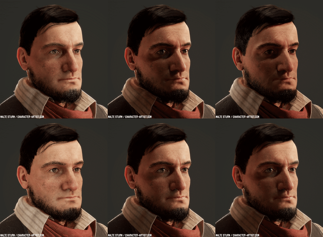
Malte Sturm did a detailed breakdown of his western self-portrait created with several tools and animated with Mixamo, and shared helpful information about texturing and face sculpting he has learned from personal experience.

Introduction

My name is Malte Sturm. I live in Hamburg, Germany and work as 3D Artist at a video-game company. My job there includes creating a wide variety of assets, but mostly spaceships. My next goal is to work as Character artist for games. Like many of you, I started with 3D because I was in awe of games like Morrowind and countless others. Immersion has always been a big part of the fascination I had for games and 3D was a way for me to put all that into something I created on my own.

Wild West Self-Portrait

Idea

I have a strong interest in historical settings for as long as I can think – wild west in particular.
The German author Karl May and his stories of Winnetou and Old Shatterhand are probably to blame for that. When Red Dead Redemption 2 appeared on the horizon, I thought about a way to do something with that tremendous anticipation I had.

Also, I wanted the next project to reflect my love for immersive video games – a reminder for myself why I started working in the industry and where I want to go in the future.

At that time I had done several anatomy studies and finished several courses and wanted to put all the gained knowledge into practice.

All these goals led to a real-time wild west self-portrait.

References

My main references were TV shows like Hell on Wheels, Deadwood and Godless, Classical Western movies like Tombstone, etc. and of course screenshots of RDR2. Paintings from Mark Maggiori, endless Pinterest boards for things like holsters, etc. and the YouTube channel of Hickok45 for research on old weapons proved to be helpful, too. Really digging deep and absorbing every information I can get is part of the fun for me. Sometimes I had to contain myself when I ended up watching videos about the functionality of a revolver or Winchester rifle for hours. But in the end, I think the project benefited from that. For projects like this, I like to also look for references outside the usual web bubble, so I bought a few books about wild west clothing and life back then.

I wanted to imagine what I would look like if I had lived in the golden age of the wild west.

As you can see in the gif below, the concept evolved a little bit over time. As did the quality – It was the toughest project I have ever done so far. The first results were so far away from the quality I had in mind, that I decided to not stop until I get a lot closer to the quality-level I had imagined. By looking at the images below, one can hopefully see some progress between the different iterations.

It took many months of hard work and lots of iterations to get something I was somewhat satisfied with:

working on the clothing, with reference book at hand

First Steps

I would like to avoid repeating technical tips that have been told many times by far more experienced artists than me. Instead, I want to give you a short overview, share personal learnings made during the course of this project and highlight some resources.

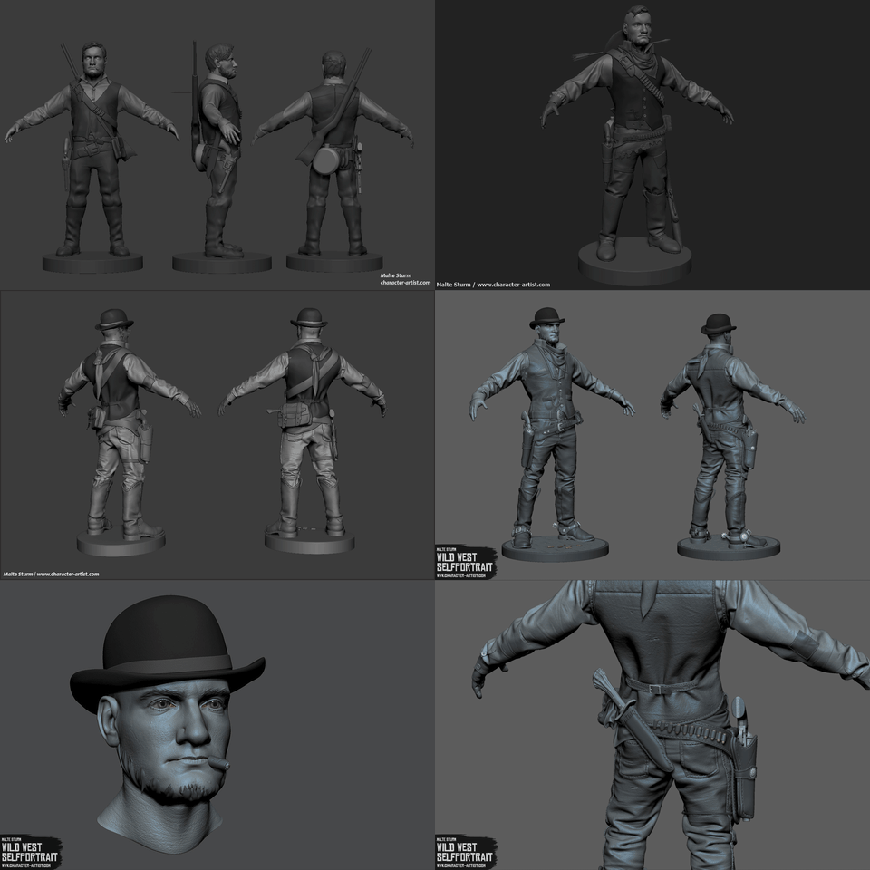
Starting with rough blockouts and simple placeholder objects of my first ideas in ZBrush I could see what works well and in which direction I want to work. I also made screenshots and overpainted them for quick iterations on the idea. Once I had decided on a rough setup, I worked on it piece by piece and replaced the placeholders when I had a new asset ready. It didn’t have to be set in stone, but this approach made sure things work well together later on (e.g. Folds, belt).

Face Sculpt in ZBrush

The face was sculpted entirely in ZBrush from a sphere. No special tricks, just a lot of iterations, feedback, and anatomy. But here are a few personal learnings that might be helpful for some people:

  • Insert actual eyes as soon as possible. Just take 2 spheres and quickly paint on them. It helps a lot to identify areas that need improvement. We as humans are very good at recognizing faces and what might be wrong with them, so the more human the head looks in the beginning, the better. Same goes for hair. A quick blob mesh will do. Also, coloring the lips, eye, and hair helps a lot and makes the process even more fun.
  • Get a makeup mirror and put it next to your workstation. I think it’s just as essential as a good reference. All sorts of sculpts can benefit from that. Sometimes a quick glance in the mirror is better than comparing your sculpt to 2D reference images because it’s a little more like sculpting from life. I also noticed that by using a mirror, I trained myself to look for interesting features in the face (while brushing my teeth in the morning, for example) or on stranger’s faces in the train.
  • Fresh eyes and feedback! It’s crazy how much it helps to get away for some hours (or even days) and get back to your work later. I already knew that, but this project showed me the importance like no other before. I noticed many mistakes I didn’t see previously… Feedback can be a little trickier since it has the potential to distract you from your original goal. But I try to handle it like a spyglass. It gives me the opportunity to see my work through the eyes of a completely different viewer. So even when it evokes negative feelings (which feedback does sometimes – it’s normal), I just use it to observe my work through somebody else’s eyes and make my own conclusions from that.
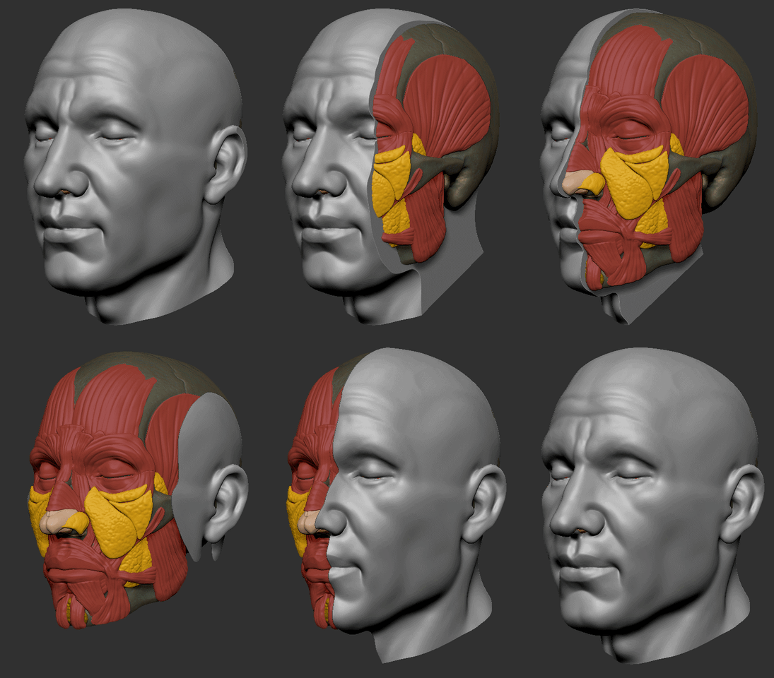
  • Importance of anatomy. I know this seems obvious. And everybody keeps saying it… But this project was proof to me once more. If you only rely on reference, you are completely dependent on its lighting. But if you know what lies underneath, you can confidently say “naah, there is no bump there…must be the light” and sculpt it the way you know it just has to be. I tried to avoid the beginner-anatomy trap by taking anatomy classes and doing several studies before even thinking about making a character. Scott’s classes were very helpful. “Anatomy of facial expression” I found to be very good for refreshing knowledge and looking up things during sculpting. As preparation for my character, I did this little study where I sculpted a skull and put in the muscles and fat pads as good as I could. It’s not very good or accurate, but I think it really helped grasp the underlying anatomy of the face.
  • Take your time. This is a big topic for me. And it goes hand in hand with actually finishing a piece. I think there is a tendency in younger artists to prioritize speed over quality. Because we have been taught things like time is money etc. and everything is moving faster and faster. The tech-heavy 3D industry is no exception here – hell, even a prime example for a fast-moving world with all its new tools and workflows almost every year. For production, taking shortcuts and working fast and efficient is totally fine and necessary. There is much beauty in taking your time for something though. For every step and every act. Especially when starting out, it’s so much better to learn without rush. Steady and calm. Working on spare-time projects, there is no need to hurry. Kris Costa works on his portraits for many months, creates his own skin alphas, hand-sculpts the eye… iterates like crazy. I believe that speed comes with experience. But all that is just my point of view. I’m a persistence-guy by nature and that brings its own issues. I’m facing the opposite challenge: For spare-time projects, I need to learn to call it a day and move on, because sometimes moving on and doing the next project gets you further than iterating endlessly. Whatever type you are, rush-guy or calm-guy, it’s probably good to learn something from the respective opposite. The interview with Alessandro Baldasseroni (below) is gold (the link points to a question interesting for rush-guys, but I totally recommend watching the whole thing).

Somewhat inaccurate study of the facial anatomy, but it helped me a lot:

Check out Kris Costa’s Instagram post showing all skin alphas he created himself for his spare-time project.

Low Poly

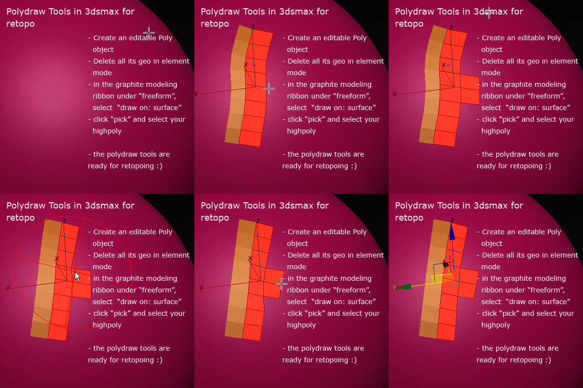
Regarding the low poly: no special tricks either. Just traditional poly by poly retopo in 3ds Max. Retopology can be a pretty tedious and daunting process, so it’s important to find a workflow that gets fast results and enables smooth working. I found that the Polydraw tools in Max work surprisingly well for that. Making yourself a nice shortcut setup can make the process even fun at times. I used Conform, step build, extend, relax and optimize. Quickly lay out your geometry with the tools provided and use relax from time to time. This way you don’t get stuck in endlessly placing perfect polys. In order to stay in my budget of 100k triangles, I roughly calculated the triangle count when I finished an area and thought about what triangle-count I likely would need for other areas. Eventually, I was almost on point with the polycount without many adjustments. For baking, I tried Toolbag for the first time and was really pleased with the results. Its super-fast, with almost instant feedback and it has handy extras like a paintable skew-map.

The PolyDraw tools in 3ds Max work very well:

Clothes

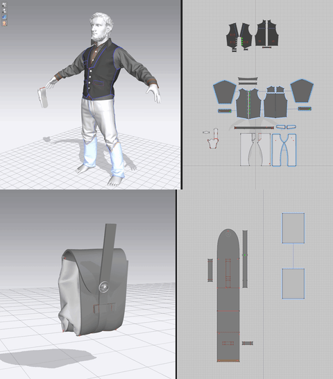
Besides the goals I mentioned earlier, I also wanted to learn several tools I never had used before. Among them was Marvelous Designer which I wanted to learn for a long time. Because I didn’t want my cowboy clothing to be my first crappy MD project, I worked on a test Jacket first. After I figured out how things work, I started looking up actual sewing patterns for the clothing I had decided upon. I also looked up a few videos on traditional sewing to refresh the little knowledge I had about sewing from school back in the days.

Since the character doesn’t have a body, I used a simple basemesh to have something to simulate with.

I think it’s important to not entirely rely on the simulation to make the clothing look visually appealing and realistic. It needs to be art-directed and “sculpted” in a way. I even blended different simulations together in ZBrush because I wanted the best of them in one mesh (there might be smarter ways to achieve that though). Don’t shy away from heavily altering your simulated mesh in ZBrush afterward – enhance it, emphasize folds, smooth artistically unpleasing areas, Sculpt new folds, add memory-folds and adjust volume etc.

I think it’s best to see a mesh from MD as a base for clothing, not as a finished garment.

To get as close to the wanted look as possible in MD already, I tried a few different simulation approaches apart from the usual draping. Applying different simulation properties to the clothing between simulations gave me interesting results. So it would go like this: apply, let’s say, Leather. Simulate only a few seconds, stop the simulation and apply something less rigid, like velvet. Then simulate again for a few seconds. Play around with that and you can get things in between. In this case leather, that is a little less leathery.

Another thing I played with was layer-cloning. Let’s say you have finished a piece of garment, all the big shapes are there and you want to add some more interesting secondary forms. With “layer clone (over)” you can make a copy of the pattern that sits above the original. Freeze the original piece of the pattern below and re-simulate the new one. Try playing with the simulation properties for shrinkage weft and warp. Usually, you want to use a value higher than 100. Applying different fabric presets can also produce interesting results. These are not recipes for great garment, but nice ways to play around.

When draping and simulating, one should not forget to intentionally design and form the Primary and secondary shapes. While MD can produce realistic looking results, they can be boring to look at if you don’t have a nice rhythm in the folds and shapes. Compression and tension of the fabric can be used deliberately to create an appealing piece of garment.

Facial Rig

The facial rig is actually not that complicated. The whole head consists of several objects:

  • Eyes (with 2 spheres each – one for the eyeball and one for sclera/cornea)
  • Eyelashes (simple geometry)
  • Eyebrows (simple floating geo with an alpha map and some additional haircards)
  • Eye-wetness layer (piece of geo between eyeball and eyelid that helps embed the eyeball, transparent material with high gloss value)
  • Eyeshadow (plane with alpha map)
  • Beard (haircards with alpha maps)
  • Hair (same as the beard but with multiple hair strands)
  • Inner mouth (upper and lower gum with teeth, each simple geo, baked from high poly and textured)
  • Tongue (simple geo, textured in Substance)

Most of the components are self-explanatory I think. The eyes are a little more complex though. For that, I highly recommend the eye tutorial by Pete Zoppi. I basically just followed his tutorial. He uses a really neat technique to fake refraction. Check it out.

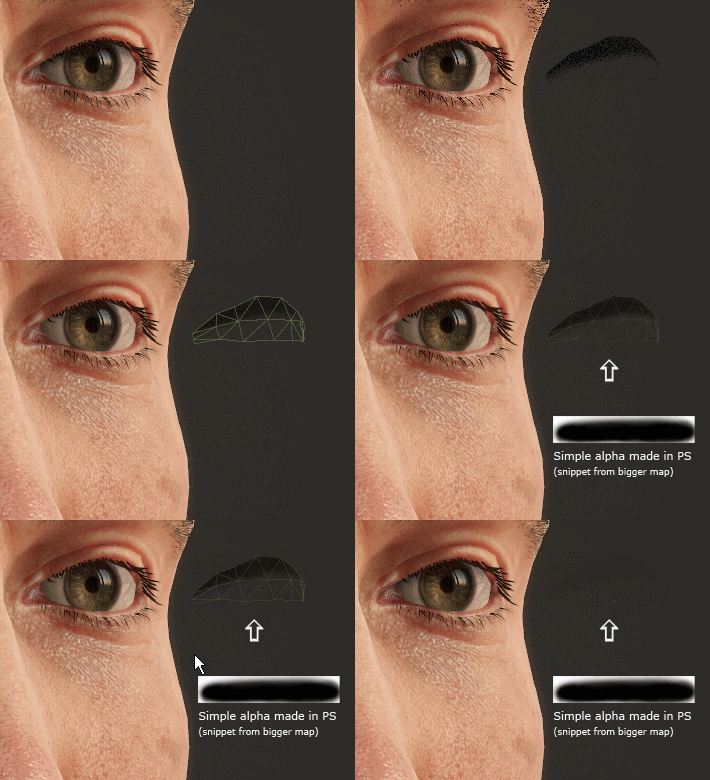
Something I would like to stress in particular is the impact of the eyeshadow. It visually integrates the eyeball into the socket. The lack of it makes characters look very creepy as it makes the eyelids to seem wide-opened and the eyeball to glow. I see many beginners drop the shadow entirely. The problem is that it needs to be faked in real-time – the solution is quite simple though and maybe it helps some if I give a quick overview.

As you can see, the eyeshadow actually is just a simple piece of floating geometry that has been unwrapped and textured with a simple alpha gradient in Photoshop. In Toolbag, just plug the gradient texture into the albedo channel of a material, set transparency to dither, check “use albedo alpha” and you are done.

Fabric Materials

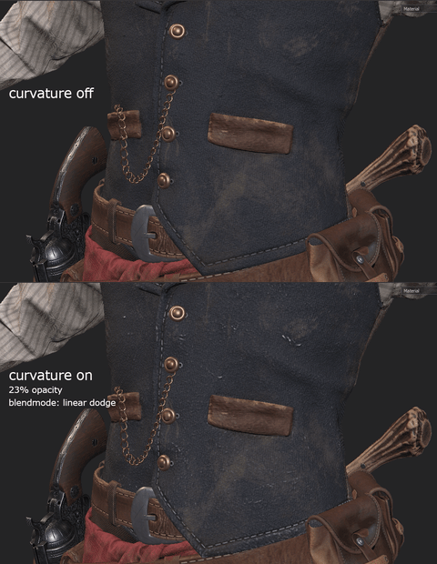
It’s important to decide which material a certain clothing piece is supposed to be made of – already during sculpting and MD phase. This will help tremendously with texturing and believability later. Different fabrics create different folds, according to thickness and structure. Ideally, the type of fabric is already recognizable in the sculpt. Only tertiary details like weave are added during texturing. Sometimes there are reasons to put them in the high poly though. I added some high frequent details in my high poly which I thought would help sell the material. It worked quite well together with a little trick I like to do: using the curvature map with overlay and reduced opacity to give some additional pop.

For the clothing, I also used the curvature map to add subtle wear and tear.

Here are a few general notes on my personal approach to texturing:

  • Think in layers. I’m rather talking about the way of thinking than actual layers here, though actual layers can help. Start with a base that defines color range and scale. Both are key to believability. I like to use fill layers with noise as a base and then play with the UV scale. It’s a good way to set the scale. Then add variation to that and keep building on top of that. For the weave patterns, I mostly used the patterns that get shipped with Substance Painter.
  • Variation. Real-world materials are almost never perfect in any way. Incorporate that by adding variation to the pattern, size, color, saturation, and alignment.
  • Story. When texturing, I constantly ask myself if I could guess the material if I would touch my textured model. Could I feel the cold, heavy metal of the gun? The thin and soft fabric of the shirt? What would the fabric look like after a few days in the field? Sweat, dust, damage, wear and tear – put yourself in the characters position. Think about what he might have done so far and tell it through subtle touches in the texture. E.g. my character has subtle green stains on the butt, suggesting he occasionally sits in the grass or on the ground. It’s not very noticeable, but these things add up to the overall appearance. Damage is a type of story, too. Think about where damage and wear and tear are likely to happen. Think about the ‘why’. The belt, for example, has wear and tear on the front next to the buckle because that’s the area with the most stress.
  • Too much spec. Or “getting the roughness just right”. I made that mistake myself in the past and see many others make the same mistake: Tinfoil armor, soaking wet clothing. The right roughness value is very important for all materials. As long as it is not fully intended to make something look very specular, it hurts the believability a lot. I think that many things are a lot less shiny than we think they are. It often gives things that typical CG look. I tried to pay particular attention to that.

Hard-Surface Props

Like in many areas of this project, I wanted to learn something new at hard-surface modeling, too.
I had done a few test objects with the liveboolean feature in ZBrush, but not a complete asset – so this was the perfect time to dive deeper into it.

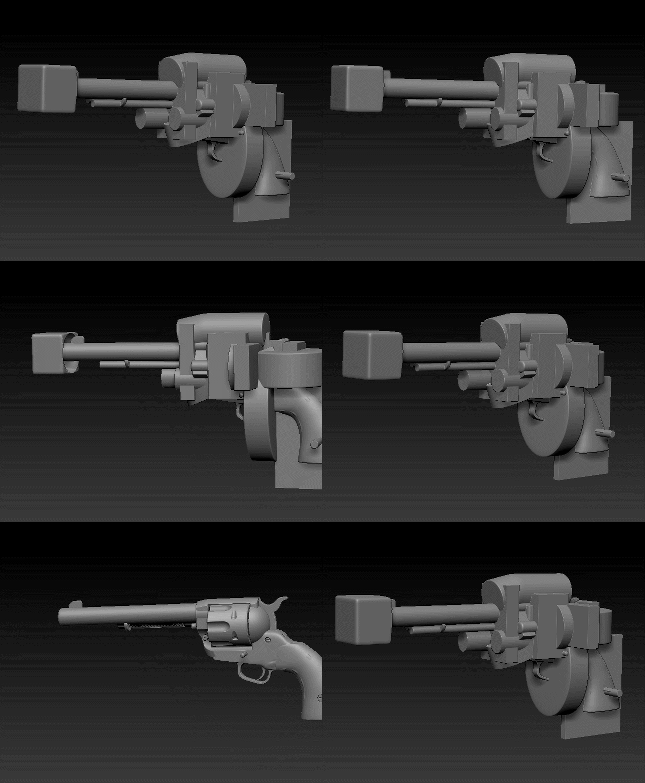
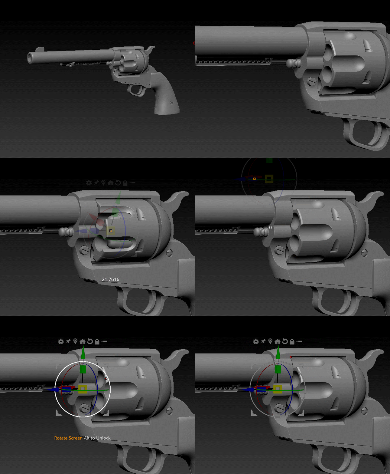
After some research, I started to build up the basic shapes of the revolver with the shadowbox in ZBrush. I found this a good way to get some “meat” to work with. From there, it was mostly subtracting shapes with LiveBooleans. It required some change of thinking. Most modelers are used to build up shapes. However, this approach requires you to think of the shapes you need to make in order to get the right form when subtracted. But I really liked the flexibility, speed and freedom this gave me, especially since I wanted to make my own revolver and not an exact copy of an existing one. I could imagine this approach is not the perfect one when modeling exact copies according to reference, though it is possible of course.

After you have all the basic shapes set, you just keep adding Boolean operators to refine them.

I used them for almost everything: from big shapes, bevels, drills and wholes to the rifling in the barrel. As you can see down below, it can get quite messy but it was a lot of fun and it’s definitely possible to organize things a little more efficient. What I really love about this approach, is that it gives objects a special sense of realism due to the way things get made. It’s pretty close to the way guns and other things are built in the real world compared to subD modeling, etc. as you can see in making-of videos from real guns. Thus, effectively as a by-product, you get most of the separate components that something like a gun has, almost automatically.

The image below shows the boolean operands and the result when switching on LiveBooleans.

Here, the operands are hidden (LiveBooleans switched on). When clicking alt+left click on an intersection, one can select and edit the corresponding operand.

When all the shapes are there, I use the polish features under Deformations tab to make all edges less sharp and more natural round.

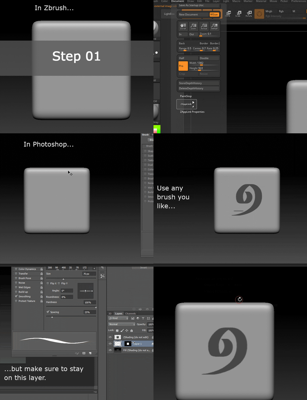
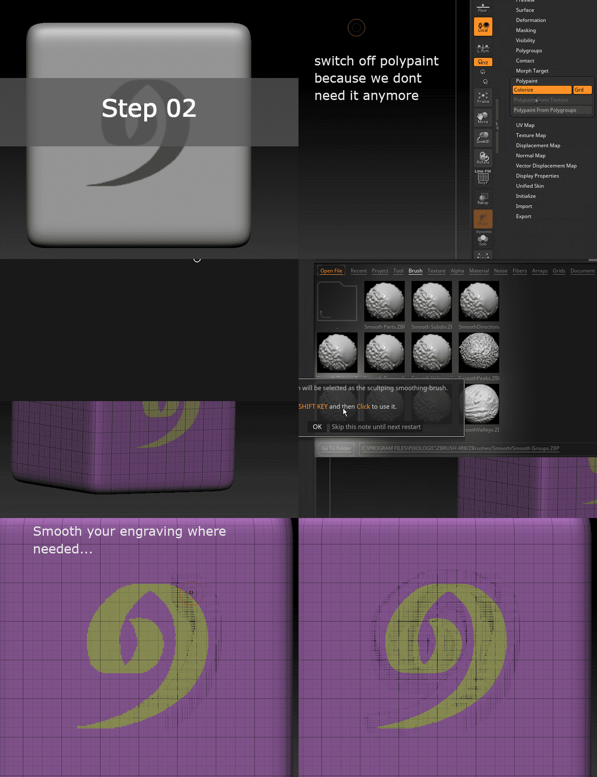
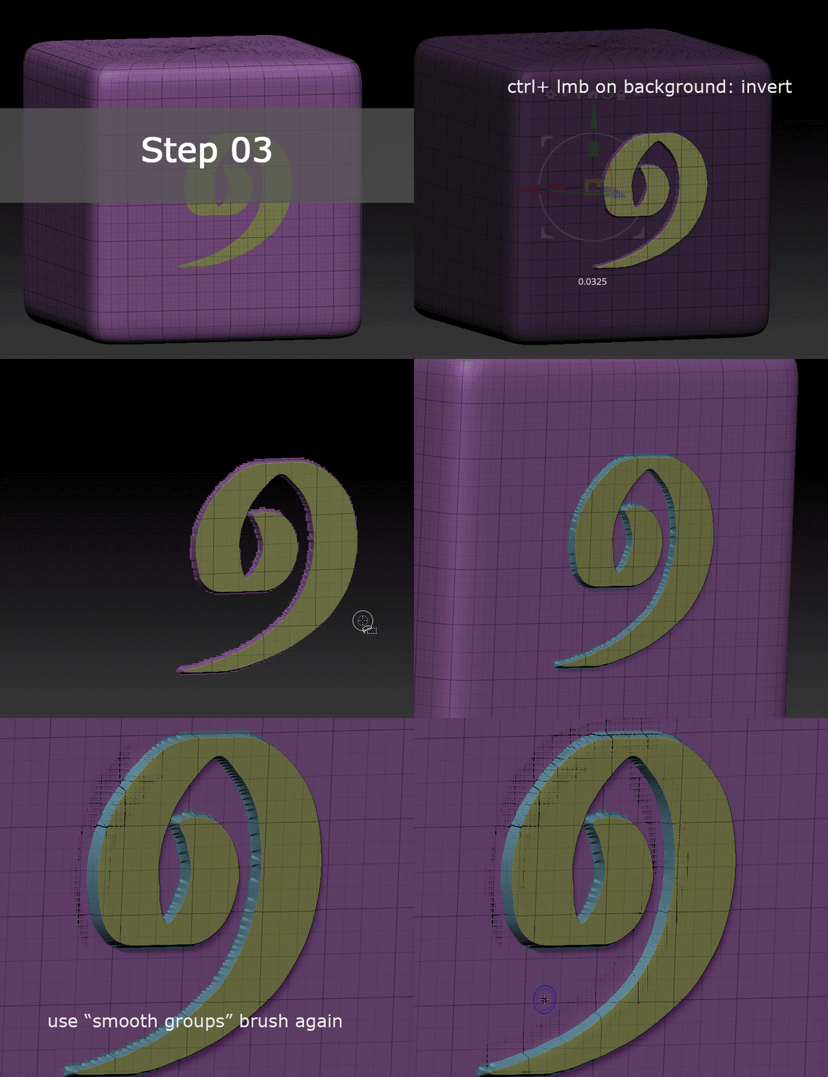
Most of the engravings and other details are hand-sculpted, some are made with noisemaker. A few additional elements I added later on in Substance Painter. For the ornaments, I used the Zapplink feature and Photoshop, which I briefly explain in the images below.

Starting in ZBrush, then switching to Photoshop:

Turning painting from Photoshop into Polygroups:

Extruding the ornament with the transpose tool:

Using the polish features to refine it:

Animation

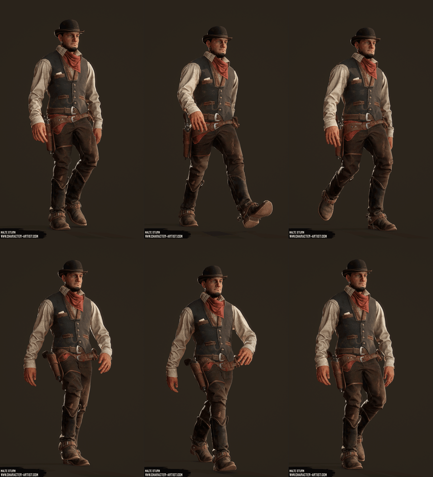
The animation is done with Mixamo and some adjustments in 3ds Max. Just upload the mesh and follow the instructions. It’s actually a really straight forward process – at least as long as you keep one mesh per animation/pose. I tried to have several animations in one sequence and ran into many problems, but this shall not be the topic today.

Marmoset handled the imported FBX with animation very well.

Some weighting adjustments had to be made for the animation to work properly. When downloading the FBX from Mixamo, make sure to select “with skin” so you can easily modify the skinning in your preferred 3D package later on.

I adjusted the weighting for the bags, knife, revolver etc. since the algorithm treated them as parts of the body, which was to be expected of course. Apart from that, only the hands needed some manual work because my character’s t-pose had the arms slightly bend towards the front and the algorithm had problems identifying the wrists, which resulted in hilariously rubbery looking hand-movements. I would suggest avoiding that by keeping the arms straight when you plan to use Mixamo.

Presentation

As for the presentation, I wanted to get away from the typical T-pose as far as possible. I always thought that many exceptionally executed 3D characters literally get killed by a T-pose style presentation. While it may be a good way to showcase the technical elaborateness and level of detail, it shows the character in a way only objects would be presented. That’s why I wanted to only show T-pose shots further down – together with more technical views. The first impression was supposed to be shots that look like they were taken during a typical day in the life of my wild west alter-ego, conveying soul and lifelike behavior. Walking and preparing food seemed fitting for that.

Lighting

Another challenge was the lighting. As the saying goes, a mediocre piece may shine under great light – but a great piece under poor light may not be seen at all (or something like that, totally made this up, haha). To be honest, I really struggled with the lighting. I think the problem was that I wanted too much at the same time: moody light AND great readability of silhouette and details. My advice would be to decide for either one of them(something I will consider for my next project).

I ended up using a skylight (HDRI) as fill light and some additional lights for rim-light and highlights on particular spots:

  • One spot from behind to make sure to have a nice and visible sss effect on the ear
  • A few spots from above to support the hair and highlight the face
  • One directional light for the rim-light

Making sure that Subsurface Scattering gets some light to work with helps to add life to the character.

I hope this was interesting for some people. If there are any questions, feel free to reach out to me on ArtStation!

Malte Sturm, 3D Artist

Interview conducted by Kirill Tokarev

If you found this article interesting, below we are listing a couple of related Unity Store Assets that may be useful for you:


© Daria for 80lvl, 2019. | Permalink | No comment | Add to del.icio.us
Post tags: , , , , , , , , ,

Feed enhanced by Better Feed from Ozh

Outside Link’s House: 3D Scene Breakdown

$
0
0

Joseph Burgan gave a huge talk on his Zelda: Twilight Princess fanart scene Outside Link’s House: prop & tree production, various materials workflows, use of Megascans, struggles, experience with a Game Arts Institute Bootcamp and more.

Introduction

Hello. My name’s Joseph Burgan, and I grew up in a little town called Colne in Lancashire, England, but have been living in Utah, USA, with my family since 2009. I’m a music theory geek, a video game enthusiast, and I love to create 3D video game art.

Path into CG

I haven’t been employed professionally yet for 3D game art, but I’m really hoping that will come very soon! I’m looking for a company that will give me my break into the industry. I live and breathe video games and their creation, and I’d be a happy man if I could work hard on video game art for the rest of my life!

When I found out about the Unity 3D game engine, I realized that I really could be one of those guys who make video games! I started getting into game design and the basics of Unity 3D when I came across a tutorial that talked about an asset they had created in Maya to use for the game they were making in the tutorial. It was a tent, and I got so curious about how they got the textures to line up on the model just right. It blew my mind wondering how someone would go about doing that!

I started learning basic modeling in Maya by following tutorials on YouTube. Shortly, a group of friends got together who wanted to create apps and games, so I offered to help and was excited to contribute.

I wanted to create cool 3D experiences for people to explore, but none of my friends knew how to create a 3D world to put the player into. So… it looked like the 3D modeler had to be me!

Over the next couple years, I was learning pretty much everything in the game design pipeline as I took leadership of the group, from programming to team and project management, and from music composition to 3D modeling.

But as time went on, and I was getting more and more sick of boring jobs that just felt more and more like a prison to be at, taking me away from what I loved doing the most, I decided it was finally time to focus all-in on something to do with game development. So I chose to pursue 3D art.

I didn’t want the debt of college (and I hated school when I was younger), and I trusted my gut feeling that game developers didn’t care if I went to college or not as long as I could produce the work they wanted. So I did all my learning on YouTube and sites like DigitalTutors.com (who are now Pluralsight.com) and did my best to climb that hill by myself, while still making games with my small team that we called Puddygum (you can check some of the month-long prototype projects we did here).

Finally, during this beastly endeavor, I learned about the Game Arts Institute’s Environment Artist Bootcamp that promoted helping their students build a portfolio that made them a candidate for jobs, by meeting one-on-one with the teachers. Ryan Kingslien and Alexis Boyer of BluePoint Games were my teachers. It was very well worth it, and it was the sort of thing I had been wishing I could get for a long time – getting one-on-one mentorship from a professional game artist! With their help, I was able to produce the Twilight Princess environment piece.

Zelda: Twilight Princess – Outside Link’s House

Goals

The reason I decided to do this piece was that I was uncomfortable with modeling and texturing organic things at the time. I also knew I needed to do something I was passionate about finishing because I knew I’d be learning a lot of new and uncomfortable things, and needed a strong motivation to see the project to the end.

Reference & Style

To gather references, I first played the game and explored every nook and cranny of the area. I took screenshots of everything.

I also searched Google for a lot of real-life references like big trees, colored roof slates, wall plaster, rocks, wood, bark, etc.

My goal for style was to make it look close to what you would see in a Pixar film. I’m a huge fan of Pixar, and always have been from as far back as I can remember!

Through studying screenshots of Pixar environments and characters, I found that their textures were usually extremely realistic, with some stylization. But they get most of their cartoony and stylized look from the shapes and colors of their objects, characters, and environments. The above picture is a shot from Pixar’s “The Good Dinosaur”.

That style was something I hadn’t really seen much in video games, and I thought that would compliment Twilight Princess really well. Twilight Princess had a very realistic look, but it was typically the shapes that brought out a unique style to the game, I found.

Blockout

For the blockout, I actually found a ripped (or extracted) file of the original map/in-game location on the internet and studied the placement and scale of the area. This was a great learning experience for me, as I had exactly what was in the game to study from and pick apart.

When I was figuring out how much of the scene to make, it was suggested to me that I only work on the features of the house and tree, and the nearby surrounding elements to create a diorama piece. I went with that idea with the intent to revisit it when I had completed the diorama to complete the scene.

Overall, I wanted to get as close to the original as I could, just with an enhanced look. So I did my best to make sure it was recognizable to fans of the game.

Main Tree Production: Blocking & Texturing

Oh man, creating the main tree was definitely a daunting task at first. I had no idea how to approach it originally!

I started by creating a low poly blockout tree in Blender. Then, I started sculpting and defining the form in ZBrush (after I had the house blocked out, so I knew where the tree had to wrap around the house). Then I pushed the detail further by moving from the large details to the medium details. Like I mentioned before, I wanted the textures to look realistic, but the shape could be pushed to a more stylized look.

Once I was happy with my sculpt, I used ZBrush’s Decimation Master tool to create the game-ready low poly tree. I cleaned up the decimated result in Blender and started to add the UV seams along the flow of the wood. The triangle count for the tree is 17,681 triangles.

I would have reduced the amount of triangles a lot on the top half of the tree, and even more on the very top of the tree, because if this was an asset for the actual game, the camera wouldn’t be able to get close enough to notice the amount of detail that is there in that picture, so I could have saved a lot of triangles without harming the quality from the ground view. But because I wasn’t sure what my final render camera angles would be, I decided to keep the triangle detail the same everywhere.

The tree has two UV channels. The first channel is for the tiling bark textures that will be applied in Unreal Engine 4 later on. I cut seams to create small sections throughout the tree so when I unwrapped it all, I would have minimal UV stretching. I also rotated the UV islands around so that the flow of the wood in the tree object would match the flow of the wood in the textures. I used Blender’s color grid texture to indicate the UV face direction.

I wasn’t concerned about keeping the UV islands within the UV 0-1 space for this UV channel because I just needed the textures to tile – no texture painting needed.  The white area on the picture shows where I applied my second material, which would be the leafy area in front of the door (the first material being the bark).

The second UV channel was unwrapped and packed within the UV 0-1 space, so I could bake normals and ambient occlusion from the high poly to help accentuate the sculpted medium details of the tree’s wood flow. I used Substance Painter to bake those maps.

At this point, both of my UV channels were ready to be combined in Unreal Engine!

I wanted my tree bark textures to look very realistic, so I ultimately decided to use the Megascans library. Megascans is a big collection of the photo scanned textures and materials, so they’re as realistic as you can get.

My tree bark material is made up of 4 different tree bark textures from Megascans. By combining all those textures into one material, you can vertex paint your mesh in Unreal Engine to tell it where to render each texture.

There is a limit to how many textures you can use in one material in Unreal Engine, so it’s important to combine any grayscale (black and white) maps together since they only need one color channel in the image to display the needed information. In Unreal Engine’s material editor, you can assign an image’s color channel to a map output. For example, with an ambient occlusion grayscale map pasted to the red channel in Photoshop, a roughness map pasted into the green channel, and another map pasted into the blue channel, you export them out to a single image and you get away with 3 textures in 1! I used this map combining method for all of my assets.

Here’s an example image using my scarecrow prop textures.

With the 4 bark textures all applied to the tree, the last thing I needed to do with the material was to combine my normal and ambient occlusion bakes with the other textures. I basically used a lerp node (or normal equivalent for the normals) to blend the two UV channels together to define the medium details from the sculpt

Finally, I needed to green it up. I created branch cards from a Megascans texture for the big branches at the top. Then I dressed the tree with fern and vines, trying to get as close to the original as I could and then enhancing the look from there. After all the foliage had been placed, I used Unreal’s decals to stick moss textures all over the tree. It may not have been the best method for the moss, but it still runs very well in real time on my computer, and it gave me a good look that I was satisfied with.

So, that was my process of creating the tree! There was a lot to figure out because it was such a big object, but Alexis had my back in all of this, for which I’ll be forever grateful.

Props: Roof, Door & Horn

I paid close attention to how the objects could have been made if it was a real, physical object. It was a little problematic sometimes because some things just don’t make sense from a realistic/physical point of view. For example, I’m still not even exactly sure how the diagonal branch thing on the front of the door makes sense, but I never thought about it when I saw it in the game before, so I hoped people wouldn’t think too hard on it when I created it!

That was probably the biggest challenge in recreating the props. Trying to make sense of them so people wouldn’t think twice about how it was made, but it would look right.

In all of my props, I tried my hardest to find pictures of real objects that were close to the game props. I looked at a lot of designs of doors, horns, even weird tree formations that made sense.

For the roof tiles, I wanted to see if I could find a reference that was close to the original Twilight Princess roof design. Here is a picture of the original roof.

As I said before, I did my best to find real-life examples of the things I was recreating. I actually did find one picture of a roof with similar colors to the original roof! So I used that as my main reference.

There’s quite a bit more grunge on the original roof, and if I was to go back and touch up some things in the scene, I think I’d add some more grunge to the roof tiles.

Something else that was a bit of a challenge to make was the horn. I found a good picture of a goat with similar colors, so I tried to replicate the look and feel of the horns in the image, but stay true to the original concept.


Background Trees

I modeled the pine trees myself in Blender. I started off by cutting up cards using Megascans atlases.

Then, I made multiple branch section variations using those cards and used those sections to fill up a few long branches.

Finally, I stuck those branches on a tree trunk mesh.

I wanted to know how to make something like this by hand because before doing this project I was very uncomfortable with the idea of making foliage. This really helped break me into learning about how foliage is made.

Use of Megascans

I used Megascans for pretty much all my foliage for two reasons:

  • 1) Megascans were realistic, and that’s what I was going for
  • It would have taken me much longer to sculpt and create textures for every single plant, and I just needed to get it finished in a reasonable amount of time.

As I mentioned earlier, I wanted to play with a style that was similar to what you would see in a Pixar film. I looked at a lot of pictures from The Good Dinosaur because they have a lot of stunning natural landscapes in that film. It looks so realistic with an added Pixar stylized charm. That’s the look I wanted to experiment with. It’s such a visually stunning film!

I figured Megascans would save me time and help me achieve this sort of look. This is the kind of style I’m most attracted to, so this project was to help me practice that style.

In the future, I’d like to try sculpting and painting foliage myself.

Different Material Workflows: Roof Tiles, Door, Pine Bark

I used Substance Painter for my material/texture blending. I used a few other programs for textures, too. I’ll show how I made a few of my textures.

For my roof tiles, I sculpted the high poly in ZBrush. It was really important that I captured the little cracks and things in the slate so that Substance Painter could use them to help make the textures look more detailed.

Then in Substance Painter, I baked my high poly meshes to my low poly meshes and started adding layers. I think it’s common at first to feel uncomfortable and possibly overwhelmed at how to go about building a texture from nothing, but you just work on layer after layer after layer. Bob Ross, the famous painter, taught me that!

Start with the main color, then add a second color that is close to the main one to add variation with a mask made by noise maps. Do a third variation, using noise masks scaled differently. Use the edge wear generator as a base for your edges, and play with the settings to make it fit the feel you’re going for. Think about how your object would get a lot of the marks and wear if it was a real object. What places would be touched or scratched up? If there are areas in the model that wouldn’t get a lot of wear, then get rid of the wear that the generator put there.

I always use fill layers in Substance Painter. I hardly ever, if at all, use standard layers. The reasoning for this is because you have so much non-destructive control of your layer that way. If I use a fill layer with one color, stick a black mask on it, and generate or paint a mask out, then I can still change the color or visual qualities of that layer without having to repaint anything. On a standard layer though, if I wanted to change the color of the layer, I would have to repaint it. It is much easier to use fill layers. That’s part of the power of Substance Painter. So use it!

Once you have your color all figured out, start adding a couple layers of height information. Add a layer of small grain using the height channel and a noise map in the black mask. Then add another height layer of a different scale. Same with the roughness–apply a base roughness value to a layer. On top of that, add some roughness variation using a different roughness value, and a grunge map or something on your black mask. Then one more time if you think it’s necessary.

The key to realistic textures is variation, variation, variation. I’m no master at texturing, but that’s basically how the masters do it!

Another method I used was by using photo textures online. I’ll use the door as an example.

I found a stripped bark texture on Textures.com and then took it into a program called AwesomeBump, which is very similar to the popular tool, CrazyBump. In that program, you can take a color image and a grayscale version of the image, and generate other maps from them, like your normals, height, roughness, ambient occlusion, and metallic maps.

I took in into Substance Painter, and that gave me a great base to start with. But it’s a start, and there’s a lot more to do to give it a better look. I then painted some height information between where wood sections touch, to make them look like separate pieces, along with a wood grain height layer.

After I added those smaller details, I went and added a darker tint to the color, and brought out the edge highlights using the edge wear generator and editing the settings and adding other masks to it from there. I then added the dirt generator and toned it down quite a bit before adding some dirty edge definition.

Then, I really brought out the shape by manually painting some dirt (note: painting the mask for the layer, not the layer itself. I could then change the color and qualities of the dirt easily without having to repaint anything). And finally, just before calling it good, I added some moss by using a mask generator and touching it up with a paint layer (for the mask).

Finally, I’ll explain one more method I used for texturing.

I used Substance Designer for a small number of my materials. In Substance Designer, it’s important to build your shape with height information before you worry about anything else, just like you would with a model made in a 3D modeling program. In this case, though, I will show you an interesting approach on how I made the pine bark, which was made with a combination of programs.

First, I started with a Megascans 3D photo scanned pine trunk asset. I took their high poly scan into ZBrush and decimated it a little to bring the file size down. Then I took it into Blender and created a cylinder of the same size and used the shrink wrap modifier to bring the vertices to the face of the high poly. When I unwrapped the low poly cylinder, I made sure the UVs were straight so I could work with the textures easily to make a tileable texture later. I took the low poly into Substance Painter and baked the high poly model’s detail to the low poly. This left me a texture to work with.

I exported the normals and ambient occlusion maps to Photoshop, where I made sure they tiled fine horizontally by using the Offset filter.

Then I brought them into Substance Designer where I created the Base Colour map using the height information from the normals and ambient occlusion.

I used the ‘Make It Tile’ node to tile the texture vertically.

And that’s what gave me the final result! I was pleased with how it turned out, especially after going about it in a very round-about way.

So in conclusion to the texturing question, I made textures in a lot of different ways, which gave me a lot of experience with all the different methods. At the end of the day, what matters is how it looks and functions. Don’t think you have to do something just one way! Whatever you can do to get a final result you’re pleased with – do it! That can sometimes lead to processes that work better for you. I think you should try multiple ways to get your end results and stick to the ones that you find most effective for you. There are so many tools to use, and, like in a wood workshop or something, use the tool that works the best for your situation.

Challenges: Figuring Out the Scene & New Software

There were a few challenging things in this project.

One of them was trying to figure out how to build this scene in a way that made sense physically, specifically the house. I wanted this scene to be an enhanced version of the original, and as close as I could get it to the original that everyone remembers. Sometimes, that left me stuck, because some of the things they had in the original game didn’t make any sense at all, from a physics point of view.

For example, the exterior of the bottom walls of the house was a wood texture on top of a sort of a mush of polygons, leaving a very undefined shape. Also, the actual wall texture looked like bark, which didn’t make physical sense either. How would someone use bark as a sturdy wall for a house?

I don’t think anyone noticed these things when they played the game. I certainly didn’t, and I’ve played through the game a few times!

Here’s a picture of the original house mesh. Note that on the pictures above, the grain of the wood textures doesn’t even follow the arc shapes on the sides of the house.

I’m sure the original developers had a lot of constraints to work with at the time, so they had to make do. But now, as I needed to take it apart and rebuild it, I had to reimagine how I would go about making this work while keeping the same shape and form. That was challenging, especially when I was trying to be as true as I could to the original.

Should I make some crazy tree formation and keep it all one mesh? Could I make it in a way that made sense, or at the very least not noticeable to the average observer? How would I make this sort of shape if I had only tree trunks to use?

Ultimately, I decided to make tree trunks for the corners with branches that kept the arching shape on the sides. And for the door frame, I actually found that it’s built differently, in a way that makes sense, on the inside of the house in the game, as you can see below.

So I stuck with that idea and made it into what you see on the final images.

Then for the walls, the inside walls of the house looked like plaster (as you can see in the image above with the door) so I used a plaster texture for the outside also.

Another challenge that comes to mind is feeling like I had to use a program I was very uncomfortable with. In the Bootcamp, it was highly suggested that we use Substance Designer for our materials. I had never used Substance Designer before this project and that was an incredibly daunting task. I knew what I wanted my end result to look like, but using something like Substance Designer to get those results?! That was going to be a long journey…

I started watching and following tutorials. I followed along and started to get the hang of things, at a more basic level. My goal, though, was to make a realistic bark material for my door, another one for my roof soffit, sign, scarecrow sticks, and the biggest one – the main tree. The tree was going to be so big that the detail had to be good. It was the main piece! I wanted to follow the advice I was given, but felt very trapped and pinned down because of my lack of experience in creating beautiful and realistic materials in Substance Designer.

I found myself wasting time, procrastinating, just watching YouTube videos and becoming easily distracted. I was completely lost.

This went on for a few weeks, and my enthusiasm for the project dropped. Until I came and talked to Alexis about it. Basically, she said she’s never used Substance Designer before, and that using Megascans would be an excellent way to get the results I was looking for. For her work at BluePoint Games for Shadow of the Colossus (PS4 remake), she said that’s what she did, by taking images from online places like Textures.com and going about it using a method similar to what I demonstrated texturing the door earlier in the interview.

Dumbfounded and surprised at such a simple response, I said, “Oh… well okay then,” and got right into things – excitement and enthusiasm rising again!

I didn’t give up on Substance Designer though, I still worked at it and made a few materials in it so I could have the experience, but I was so relieved knowing I didn’t have to use Substance Designer for everything. Like I said before, use whatever tool you want to get the results you need! Don’t let yourself freeze up on something; find any way you can to move forward! And while you do it, try to broaden your skills and abilities.

I will improve on Substance Designer, and I’m very excited to work on improving my skills in it in the future!

Finally, the last challenge that comes to mind was managing how to go about making an entire environment.

At first, I was doing all of my high poly models before moving onto my low poly models, and then doing all of my low poly models before moving onto texturing, and so on. This is something I was encouraged to try, and while it was good to try it to see if that worked for me, I wouldn’t recommend ever doing an environment like that. It makes sense, but it’s a poor flow, for a couple reasons.

After you block out your entire scene, you know where everything is going to go. The next thing to do is to start seeing what everything needs to look like. And doing things one prop at a time 1) makes it easier to see progress, which also means more dopamine more often! (And who doesn’t want a bit of dopamine to help you stay motivated?!) 2) It helps you get a better idea of the look and feel of the rest of the environment much earlier on, and 3) you can start to tell if certain colors or looks of your props need to be adjusted to help match each other, especially when you start to get it into the game engine.

This is a workflow Alexis helped me to develop. 3D art can be an incredibly overwhelming thing to learn how to do, and if you’re doing it on your own at home with help from online, it can get very discouraging. I went through times like this often when I was first learning.

Having Alexis there to help me was invaluable. That was the most valuable thing I got from the Bootcamp – having someone who knew the whole process, whose work I wanted to emulate, show me the way to go.

Conclusion

I want to help others get past those learning barriers, too. Now I’m helping others who have come to me wanting to make 3D art, but have just felt stuck; not knowing how to go about things, feeling uncomfortable with the process, or just needing guidance. These people are starting to make the progress they’ve wanted to see in their work for a long time now. It gives me such a great feeling of fulfillment to be able to help others out of the holes I found myself in when I was on my own.

If there’s anyone out there who feels like they need a hand or just wants to finally finish something all the way (I know what it feels like), it would be my absolute pleasure to help them out! They can reach me at josephburgan.3D.art@gmail.com or message me via Discord at Joseph Burgan#1531.

I’m also looking for employment in the games industry as an Environment Artist, so email me at the same email address if you need someone to fill your position!

Thank you 80 Level for interviewing me, I was very grateful for this opportunity!

Joseph Burgan, 3D Artist

Interview conducted by Kirill Tokarev

Landscape Auto Material by VEA Games is a flexible auto-painting material for Unreal Engine 4 Landscape component. When you are drawing the topology of your landscape, proper material layers are drawn automatically!

All future updates are included and will be available for download as soon as they are released.

Check the full feature list

Contact VEA Games


© Daria for 80lvl, 2019. | Permalink | No comment | Add to del.icio.us
Post tags: , , , , , , , , , ,

Feed enhanced by Better Feed from Ozh

Character Workflow Tips from Nikita Svechnikov

$
0
0

Nikita Svechnikov showed his character workflow using Forest Nymph and Native American projects as examples: sculpt, props, cloth, feathers, Substance Painter workflow, and rendering in Keyshot.

Introduction

Hi! I’m Nikita Svechnikov. I’m from Ukraine. First, I worked as a freelancer and now for about 5 years, I’ve been an art lead in a small mobile game studio in St. Petersburg.

I didn’t get any professional education. When I was a child I went to a traditional art school and learned some basics which is still very useful. There were no additional courses or schools for game art so I just read and watched lots of tutorials online. Considering the style, I like both cartoon and realistic stuff. And now I’m trying to learn more about anatomy and material details to improve realistic skills.

First Sculpt in ZBrush

First I’m looking for a 2D concepts that I would like to see in 3D. Forest Nymph was inspired by Anna Davinscourt’s amazing concept. While working in ZBrush I mostly focused on shapes. Leaves make great directional lines for the whole picture, and my main goal was to keep the flow of these beautiful shapes. I made a couple of curve brushes with different types of leaves and then just placed them to the right areas. Then I defined each of them with the Move brush.

Crafting Props & Clothes

For the Native American character, my main goal was to make something qualitative, detailed and comprehensive. This work pushed me out of my comfort zone because I don’t like to concentrate on details. For props for this particular project, I looked at lots of works of great traditional artist such as Zhou Shu Liang, who specializes in tribe native American art.

It inspired me to recreate a kind of a shaman ritual scene, so I did some sculpts of a drum, bird skulls, and other artifacts. For rocks and tree trunks I used Quixel Megascan library.

For the clothes, I used Marvelous Designer. I watched a talk by Guerilla Games at ZBrush Summit in which they tell in a very basic and detailed way how to sculpt leather. I think the video is super useful for understanding the difference between fabric materials.

For feathers, I used ZBrush Fibermesh.

  1. I took a cylinder and adjusted it to the feather body, then made a polygroup which became a base for Fibermesh.
  2. Then use a fibermesh with settings on the picture
  3. Made a polygroups for comfortable grooming.
  4. For grooming, I mostly use Move and Pinch brashes, groom brushes do not work for me usually.
  5. Then I polypainted and rendered the feather. I use ZBrush to Photoshop Plugin to export additional maps such as depth, mask, AO, normals and mix them in Photoshop for the final result.

Substance Painter Workflow

I really like Substance Painter and I make all the textures and bakes in it, even hand-painted. Baked Light Filter helps to save a lot of time and not to draw the shadows with your hands – very helpful for mobile assets. I also use it on PBR setup with low opacity to receive more volume and depth.

Usually, I start with baking all the textures. I like to use Match By Suffix where your low poly meshes use suffix _low and high poly suffix _high to bake everything in one step without overlapping. To set suffixes I export all high poly meshes from ZBrush to 3ds Max. Also, I assign all the materials in Max to get the ID map by mesh color in Substance.

Then I start texturing by rolling through the built-in smart material library or try to find missing ones on Substance Share. Then I adjust them for my needs.

Hard Fabrics

  1. I create a base mesh by cutting the polygroup from the jacket and adding thickness to it.
  2. Then I cut it in pieces with SliceCurve to create polygroups. It is important no to intersect the lines.
  3. Then I crease by polygroups.
  4. I create guidelines from polygroup with Frame Mesh by creased edges.
  5. Then I take any curve brush and just click on the guidelines. I use some simple tubes and add fabric details in Substance Painter.

Rendering

For my cartoonish projects, I used Keyshot. I try to create them as fast as possible so I sculpt the characters only for one camera angle and don’t use UVs. ZBrush to Keyshot Bridge feature is a super great and fast way to render models with good quality keeping ZBrush matcap and polypaint. First, I set up the matcaps and choose Group By Materials in ZBrush Bridge settings to easily control materials in Keyshot with etch re-import. Then I adjust materials in Keyshot. I especially like the translucent material type and try to use it as much as possible.

Then I set up the light with HDRI Editor or add meshes with light materials.

For the game characters, I use Marmoset Toolbag.

Nikita Svechnikov, 3D Artist

Interview conducted by Kirill Tokarev

If you found this article interesting, below we are listing a couple of related Unity Store Assets that may be useful for you:


© Daria for 80lvl, 2019. | Permalink | No comment | Add to del.icio.us
Post tags: , , , , , ,

Feed enhanced by Better Feed from Ozh


Car Texturing with Substance Tools

$
0
0

Ronan Mahon shared a lot of details behind his texturing and lighting of the car within X-TAON Art Car competition organized by Allegorithmic. The winners will be announced this month!

Introduction

My name is Ronan Mahon and I’m a freelance artist working on video games.

I was trained in classical 2D hand-drawing and 3D animation and spent a few years in my home town of Dublin, Ireland working in architectural visualization as a 3D artist. What started as a small group of graduates inside a builder’s cabin inside a jam factory (no joke) became a decent studio with a legit office (not in a jam factory). However, it had always been my dream to work in the video games industry and so after 3 years, I made the leap from Ireland, where there was little or no perspective for AAA artists, over to the UK to work as an environment artist.

Career

I worked as an environment artist in Free Radical Design on TimeSplitters 4 and Star Wars Battlefront 4 until the studio unfortunately shut. After the studio closed I moved to Oxford where I had the good fortune to meet my wife and also work at Rebellion Developments. While at Rebellion I met some great artists and worked on Aliens vs Predator, NeverDead and a few other titles.

I have spent the last 7 years working in Rocksteady Studios in London on all things Batman Arkham related. I was fortunate enough to work on some really beautiful video game moments with an awesome team. I was entrusted to create some really iconic environments, places such as Oracle’s Clocktower, the Mad Hatters popup book and classic moments such as recreating The Killing Joke to name but a few.

Working at Rocksteady was a dream that came true. Everyone in the studio, artists included, is expected to bring ideas to the table and then entrusted to follow up by gathering the people and the effort necessary together to see those ideas brought to life. It’s a special studio filled with world-class talent and directed by Sefton Hill and Jamie Walker, two of the most genuine, hard-working and approachable people I’ve ever had the pleasure to work for in my career.

London is like most major cities, however, expensive and a difficult place to raise a young family. My wife and I made the tough decision after 7 years to move to Germany to bring up our two young children and to have more family support around us. I’ve been working freelance as a 3D Artist for the games industry for the last six months and it has opened up a whole new challenge and excitement in my work. My office isn’t quite on par with Rocksteady’s Batcave though!

Midnight Ride

X-TAON Competition

With a young family and a freelance business to run I wanted to enter the X-TAON Art Car competition because I’ve not had the chance to create car artwork before, plus the car model Allegorithmic provided looked like an awesome canvas. I was late to the party but I still had two weeks left in the 3-week deadline. Competitions provide a great learning opportunity and a good atmosphere to push yourself and get inspired by other artists as well as making new contacts. Whenever I’ve had the spare time to enter one I’ve always gotten a lot out of the experience.

The requirements were to create an Art Car textured in Substance Painter. From the entry form: “The art car is a collaboration usually between a car constructor and a famous artist. One of the most iconic art cars was the 1979 BMW M1, painted by Andy Warhol.” The emphasis was on being creative and the theme was wide open to the artist.

Goals

I recently completed a scanning project (Substance Designer and Power Tools) and had really enjoyed getting to know Substance Designer better. My theme for the art car entry was based on the node graph in Substance Designer – how any one node in the graph can be used to create an explosion of art and creativity. My aim was to portray the node graph in a number of ways. Firstly by showing the car transform from something understated and sleek to something loud, neon and colorful. I knew I would be depicting the node graph in an abstract way and I felt like the Outrun/Synthwave mood and aesthetic would really compliment that look. Finally, I wanted to give the car life, a character and a short story to hang the project on so that I would have direction in my thinking beyond the mechanics of making nice materials.

First Steps

I knew that for Midnight I wanted to shoot a short video of the car in Unreal 4 to show its story so getting everything set up in the engine was where I started the project, even before starting to texture. Substance Painter can live link to Unreal 4 so you can paint in Substance and see it instantly update in the engine. With this set up I could see my artwork on location both in iRay and Unreal at the same time and tackle the project from a good vantage point. I feel by viewing your artwork in its final format you end up with fewer surprises and the end result is a more focused and polished piece.

Texturing

As I mentioned the wrap on the car is an abstract representation of the node graph in Substance Designer in an 80’s Synthwave/Outrun style. There are two focal points that represent a “node” on the car. One is the Substance Painter hood logo and the other is the sunset in the abstract city on the roof. Each of them is an origin point on the car from which everything else explodes and flows from. With that in mind, I started drawing lines over the car from these points in order to portray the connections between nodes in Substance Designer.

I soon found, however, that these lines quickly clashed with the inherent shapes and flowing design of the car, or even worse the dominated the car’s beautiful form and became distracting like dazzle camouflage (see early concepts and test renders). After a few attempts of drawing on the car, I went back a step and ended up embracing the forms the car was giving me by running the car’s thickness and ambient occlusion meshmaps through Edge Detect in Substance Designer.

I created a filter which fed either the thickness or AO meshmap into a Posterize node (free on Substance Share by “SomeGuy”) which separates the greyscale gradient of the map into a number of steps, followed by an edge detect node to create lines on the meeting points of the steps. This produced an effect like contour lines running over the car. These lines were nicely concentrated around points of interest and were less present on the bigger, flatter surfaces. I felt like this represented the connections of a Substance node graph well while still being sympathetic to the car. You can download “Contour Lines” for free for Substance Painter and Designer on Substance Share.

The rest of the texturing was a combination of hand-painting in details like the sunset city graph on the back of the car and using generators and masks to build up wear and rain on the bodywork. I didn’t want the car to be a super pristine showroom car – I wanted it to feel like it had just been out for a ride that night and that maybe the owner couldn’t help but take it out again. Building up material layers in Painter is best done chronologically. In Midnight’s case for the bodywork from bottom to top the layer structure was:

  • BaseMetal
  • BaseCarPaint
  • UV emissive paint
  • Dust/dirt and any scratches/weathering
  • Rain and wetness

For the rain and dirt, one of a number of masks I used was a black mask with a “Light” generator shining down the car from front to back. This helped isolate surfaces that would get hit head-on by dirt and rain as the car moves forward and occlude surfaces which weren’t. Another mask I used was a world space normal map to mask. With this, I could mask a small round stationary droplet sitting on an upward facing surface, a rivulet like a streak running down the side of the car as gravity took over and little to no wetness on the undersides of the car surfaces.

Painter Workflow

From working in the video games industry and on environments I’m using as few texture sets as possible for performance reasons, however, the XTAON model came with 6 sets. I wanted to maintain a high enough resolution for the close-ups I had in mind and I didn’t want to resort to shader detailing techniques as the competition is judged predominantly based on your work in Painter. For that reason, I needed to keep each of these 6 texture sets. Having these 6 texture sets to manage was a new challenge for me as I like to work in a way where I have simple single points of control for key aspects of my artwork. This is why I always use Master Materials and parenting in Unreal or instancing in Painter and 3ds Max. If I decide to change the base coat material for the car, for example, I don’t want to have to juggle 4 other sets and change it in each and have them out of sync. I want to change it in one place and have it update the whole car.

I needed about 5 days of texturing the car to realize that my organization had gotten away from me and I was drowning in confusing and out of sync layers across multiple texture sets. I stopped, did a little research and then threw away my scene. Why? I came across this great article on Substance Painter organization by Manuel Armonio.

He makes a couple of really great points – read his article as it explains in more detail. Use groups instead of layers as the equivalent of materials, for example, a group called BaseCarMetal. This allows you to build the detail into the “material” as a group in a much more controlled way than relying on a single fill layer. Here is a key one: instantiate these groups across your texture sets, do not instantiate a single fill layer from within the group. This was one of the mistakes I was making. By Instantiating the group it allows you to keep adding lots of nice detail in your parent texture set and see the result update across the child instances in other sets. Just instantiating a single layer is much more limited in its use and you end up needing to create and maintain a lot more individual instances.

When Painter creates a new instance in another texture set it just puts it on top of the stack of the child texture sets, so you can end up with strange results if your layer hierarchy is out of sync across texture sets. The less individual instances you have to manage the better, and instancing groups helps with this. With Midnight, I probably had 5 or 6 instanced groups across the whole model.

Unfortunately, one of the current limitations of instances in Substance Painter is that you can only hand paint on the Master Instance. However, a trick if you just need to hand-paint a mask on the child instance is to drop the child instance into a new Group on the Texture Set in question. You can now happily paint and mask this new group – or you can add Generators and the usual great Substance Painter masking features and it will mask the child instance. The child instance will still inherit all of the changes from the master. Once I had started again with these organizational best practices in mind it all went a lot smoother and I quickly caught up to where I had left off.

Easter Eggs

There are a couple of little easter eggs in the texturing. The license plate is a replica from the DeLorean in Back to the Future and reads “Generator” – named after the power that Substance generators bring to your texturing. The car’s name “Midnight” is embossed on the tires and so called after the band “The Midnight” that I was listening to so much during this project. I had an idea to turn a sound wave from one of the songs into a pattern but never got the chance to try it!  My wife and two little ones’ names are on the car too.

I find music also inspires me a lot while I work. I’m the happiest when I have a great new album to listen to and a challenge or idea in mind. I try not to get too caught up in technique or the mechanism of making art, but instead focus on the story I’m trying to tell or the mood I’m trying to make the viewer feel. With the art car Midnight, I was unsurprisingly listening to The Midnight – their music is beautiful 80’s Outrun-esque nostalgic Synthwave and it perfectly captured the mood I was going for.

I remember during the project I was working on the car late one night – the golden hours when you have little children and a business to run. I had reached my limits of concentration and just as I fell into bed I posted a work in progress render to Twitter. Cut to 2 AM night feed for my new baby son, I was bleary-eyed and worse for wear only to see The Midnight (the band) see my tweet. They said the car looked awesome and shared it with their followers on their Instagram. Being exhausted and having listened to them on loop for the last few hours – I have to say that was a really surreal but perfect moment!

Ultraviolet Glow

The car comes to life under UV light. I found lots of nice reference for people wearing body paint and blacklight usage and this is the look I went for with the glowing patterns. I wanted to give UV paint a bit more depth and the car to change and morph as you looked at it. To achieve this I multiplied the emissive texture of the materials by a Fresnel node in the material. This makes the glow strongest when viewed faced on and softly falloff as the normals of the surface face away from the viewer. The emissive texture is made up of three layers: a soft and flame-like base (generator and procedural noises), next layer is the hand-painted nodes, pattern and the contour lines (filter) and finally over the top is a blue wash that hides and reveals parts of the pattern (generator and procedural noises).

Base Materials

Midnight features two main base materials: regular car paint and chrome for accents. Early in the project, the car was made of metal but I found that even though it looked great in some angles the car was more difficult to light and that I would lose the highlights and shapes of the car easily. Adding the colored emissive of the UV patterns over the top of the metal would often give a confusing look when transitioning between the metallic and non-metallic parts of the PBR material. In the end, I created deep charcoal with blue mixed by generator car paint. I used the nice Car Solid Paint material that was given out for free by Allegorithmic during the competition – it’s a good idea to pick your battles and the materials in the Painter shelf provide great starting points. Chrome, rubber and a little carbon fiber were used to highlight and accent details in the car. I also added little details like frit around the windows and used the 3D Distance mask to fake a soft gradient like the interior of a car on the opaque windows. Binding it all together is some subtle wear and tear and the rain over the top.

Headlights

The headlights are relatively simple and clean. The lights themselves are a glossy milk-white surface with a slightly blue emissive and a subtle fresnel falloff. I added a dark matt plastic to the light housing so that the lovely square shape of the emissive bulb would stand out from its base. Finally, around the edge, there is a reflective mirror-like material to catch highlights and reflect the light from the bulbs. I added some facet lines with height driven by the Tile Generator to add detail and a rubber trim where the light it meets the glass.

Lighting

What I realized early on in the project is that lighting the cars is difficult! Initially, I tried lighting the car as I would normally light any scene. I’ve always enjoyed lighting, in most companies I’ve worked the environment artist usually gets to set the initial mood lighting.  After stumbling around a bit and not really understanding my lighting issues and getting mixed results I stopped messing around. I realized I didn’t know what I was doing and did a bit of research. I watched some great videos and articles on how real cars are photographed and because I’m working PBR – most of the real world rules apply.

The main takeaway I learned from lighting a car is that you don’t light the car – you light the environment around it. A car is a shiny chrome ball and shining light directly onto it just gives you really bright specular spots and not a whole lot else!

What I found from my research was that to light a car well your key lights should generally be large soft gradient light sources, that you should pay attention to lighting what the car is reflecting and not the car itself.  You should then control these lights and what is reflected in the environment in such a way as to bring out the important curves and the best details of the car. This process is called light shaping by car photographers. As 3D artists, we also have it easier than the real world photographers because we can make anything emissive or bend the world or environment map into any shape. We also don’t cast a reflection on the car, some of the car photography articles I read mentioned having to hide the cameraman’s reflection in the door creases!

Here are a few links I found helpful:

I started with big flat reflectors (nearly white static surfaces) positioned above the car in Unreal to bounce indirect light from spotlights down onto the car. This worked quite well but I started to run into issues with having large cones from the spotlights intersecting the scene in a poor way. I made the switch to an emissive material with soft gradients driven by a mixture of linear gradient nodes in the Unreal material editor. Don’t try to make soft gradients like this with a texture as you will always get banding when you play with the emissive intensity later. As well as that your texture would have to be massive and 16 bit to achieve a gradient nearly soft enough. I  set the emissive meshes to “use emissive for static lighting” and put a lightmass portal around each. The lightmass portal will stop you getting splotchy artifacts from photons and Lightmass will treat these surfaces as a source of light.

As reflection quality is important for a good looking car I bumped the reflection capture cubemap resolution up to 1024 and set the car mesh to “Use High Precision Tangent Basis”. Turning on this option stores the mesh tangents as 16 bits per channel vectors so you get a much more accurate reflection, important for some of the really close shots with dense mesh such as the lights and the subtle plane changes in the bodywork surface.

I also built a 3D “Cyclorama” in Max which is a stage which photographers often use to give a lovely soft infinite horizon to a scene. It also allows you to make it the scene small enough to bounce lots of indirect light around where needed. Think of it as an inside out chamfered box with large soft fillets so that you don’t end up with any harsh lines or shadows in your backdrop.

Although I would be making static still renders, I also knew I was going to make a video so I had to keep this in mind when lighting the Midnight. It’s more difficult to light a car for video than a still image because large light sources and reflectors can end up in the frame while you move the camera around the car. These light sources and reflectors don’t always look appealing and can be a distraction from the car. I was using a combination of screen space reflections and reflection capture actors in my scene. To supplement the visible reflectors/light sources you can use “invisible” ones like an HDRI reflection cubemap (there are several great free HDRI cubemap sources online such as hdrihaven.com) or in my case I used the light shape parameters on spotlights in Unreal.

With the shape parameters on lights, you can give your light source radius and length as well as control the softness of the source. This was great for running a large stripe of the reflected light source along the side of “Midnight” and accentuate the shoulder of the car nicely. These light source shapes are then either picked up by your reflection capture source if the light is set to static or dynamically visible on the car if stationary or movable. Once again you seeing the source of the light reflected in the car’s surfaces and so are concerned about the lighting the world around the car and not the car itself.

Shooting the Video

The second success for me was shooting the story video completely in Unreal. I wanted to make a video to convey the story better than just a still render could. I’ve done a bit more video work recently (see my Fabric video here) but I would usually record individual shots and then edit them together afterward in a program like Adobe Premiere.

This time I wanted to stay in Unreal and so embraced sequencer and learned camera cut tracks, transitions and improved my camerawork. I even named my cameras something other than CineCamAsdf111Final_the realOne! I used 3ds Max to create a looping Handycam effect to layer on my camera’s in Unreal so that they wouldn’t appear too perfect. The effect was made by applying a looping noise to a transform in the curve editor in Max and importing it as a camera anim asset. The Handycam effect is quite strong when initially applied but this allows you to control the effect on your camera keyframes in Unreal by adjusting the Play Scale and Play Rate to something quite subtle. Just remember to deactivate the Handycam camera anim track if you change your camera transform keys as Unreal goes a bit loopy if you don’t! I enjoyed being able to show the story and character of the car coming to life. Because time was short I used whatever was to hand and only worked on what was in the shot – the Unreal mannequin was playing his jump anim while getting into the car (with his head smashed through the roof).

My scene ran at 120fps real-time in Unreal on my 1440p monitors but I wanted to export my video at 4K. In the end, I used the render to movie feature at 30fps in sequencer with the frames rendered as images because for some reason I would get the odd stutter if I rendered to an AVI. I had the music I was using ( “Lake George” – by Will Rosati free from the Youtube Audio Library) on a track in Unreal so that I could compose my shots, however, Unreal doesn’t seem to export audio very well. Instead, I put the image sequence to audio in Adobe Premiere and exported the final movie in 4K from there. After struggling with the right export settings for 4K I came across this awesome playlist of Premiere export settings by Matt Johnson. He does a perfect job of explaining everything in just a few short tutorials.

Feedback

For me, there were three biggest successes of Midnight. Firstly there was what I learned about how to light a car or shiny object. Secondly, it was telling a story through the short video shot in Unreal. Finally, I learned a lot about my Painter workflow and how I could improve it.

Regardless of the outcome of the competition, I feel like it was such a great project to work on. It was short and small enough to be manageable for me while still learning lots of new skills. I came across plenty of great new artists through their submissions – you should check out other cars on Artstation. Big thanks to the guys at Allegorithmic for organizing the competition, car designer Takumi Yamamoto and 3D modeler Frédéric Gasson for creating the car and 80 Level for the honor of a feature.

Links

Ronan Mahon, 3D Artist

Interview conducted by Kirill Tokarev

Simple River Stones by Stan Brown is a procedural material for your environments fully made in Substance Designer. The package includes a fully commented and organized graph for study and customization.

Any future updates are included and will be available for download in case they are released.

See the full description

Contact Stan Brown


© Daria for 80lvl, 2019. | Permalink | No comment | Add to del.icio.us
Post tags: , , , , , , , ,

Feed enhanced by Better Feed from Ozh

Stylized Tiling Texture Workflow

$
0
0

Andrew Harrington showed how he produces stylized tiling textures with ZBrushPhotoshop, and Substance Painter.

Introduction

Ahoy-hoy everyone. I am Andrew Harrington and I am a Lead/Senior Environment Artist. Throughout my time in the industry, as I worked at many studios, I have been able to learn from and be influenced by hundreds of individuals. In the article, I hope to share some of my knowledge and my process of how I go about creating stylized environment textures.

Specifically, I will be going step by step over my process of creating the following tiling texture.

Blocking Out

The first step I do when creating any environment tiling texture is to either draw it out in Photoshop or block it out using flat geo in Max or Maya. If I draw it out in Photoshop, I make sure that it tiles and then I use that as a guide to block out my flat geo. I typically work on an 8mx8m plane because in most cases it will provide the appropriate texel density for use in the game and I can better judge the scale of details in my texture compared to the size of a character.

Once I have my geo blocked out I decide what parts are going to tile over. I typically work right to left and then top to bottom and have my upper right piece as the “4-corner” piece.

Now that I have the tiling figured out it is time to extrude the edges of each block so that I have an edge to sculpt on. It is really important that I don’t extrude the edges straight down at 90 degrees but flare them out and have them overlap the edges of the blocks. This will ensure that I don’t get any negative space when adding edge detail and it will allow me to take away as much of the edge as I want.

The last thing I do is creating an 8mx8m plane and centering it behind my blockout geo. This will be the low poly plane that I will project my high poly mesh onto when I bake out my textures. It will also help me when I go to tile my subtools in ZBrush later on.

Finally, I grab everything including the 8mx8m plane and export it out as one .obj to bring into ZBrush.

Adding Details

When I bring my base mesh into ZBrush it is all one piece. I’ll want each element of the texture to be broken out into its own subtool so that I can sculpt on it individually and crank up the subdivisions without having a big impact on my performance.

The first thing I do is run and “Auto Group” under the “Polygroup” Tab. This will give each element its own group ID and allow me to split them out into their own subtools.

Under the “Subtool” tab, I will then run “Groups Split” which breakouts each element into its own subtool.

I will then select each subtool and run DynaMesh on it to retopologize it, then smooth divide it to either 4 or 5 divisions. That should be enough resolution to add nice detail.

There are many ways to add surface detail that will give you a stylized look. The main idea I work toward when adding surface detail is to give enough information to understand what the material is made of but not too much to avoid making it overly noisy. As one of my Art Directors used to tell me, “Sometimes less is more”. For this piece, I used a method of adding a bunch of detail, then taking them away. I would start with the ClayBuildup Brush to add the detail and then go in with the Planer Brush to take it away.

Note: Using a Square alpha with the Planer bush will give you nice sharp edges. I will then use the TrimSmoothBorder brush to add a bit more definition.

This method works well for this as it gives a nice clean surface with hints of details.

I repeat this method with all the other subtools. Once you do it a few times. the process goes pretty quick. I make sure to pay extra attention to the edges of the blocks. I want them to have a lot of angles so they give more depth. Without them, the texture will look rather flat. I also constantly check the overall look of my texture at a straight on camera angle as this is what it will look like when the texture is baked out.

Once all the subtools are sculpted out I want to add a bit of variation in their rotation and depth to give an extra layer to the texture. I don’t adjust all the subtool though, just a few. If I adjusted all of them it would look pretty unorganized. The variations help to lessen the effect of repeating elements when the texture is tiled.

At this point, I am ready to tile my texture in ZBrush 2.5d.

Tiling in ZBrush

The first thing I do when preparing to tile my geo in ZBrush is to make sure that my document size is set to the same size I want my texture to be. I do this so that when I grab the heightmap with the correct size from 2.5d. Under “Document” I set the size to 2048×2048.

I will then drag my Ztool onto the canvas and select the 8mx8m plane subtool that I exported out of Max with my base geo. Having that selected, I make sure that Dynamic Perspective is switched off, then frame my subtool. ZBrush will frame to whatever subtool you have selected so this is why I used the 8mx8m plane. This way my Ztool fits perfectly within the document size.

With my Ztool framed I can now duplicate the subtools on the edges and then offset them to their opposite sides. If the offsets are not pixel perfect that is ok, I will fix the seams in the next step.

Next, I drop my canvas into 2.5d. You can scroll the texture by holding the “`” key or you can more accurately offset the canvas by going to the Layer Tab and adjusting the “Displace H” and “Displace V” sliders.

Since I know my canvas is 2048×2048, I know that if I offset both H and V by 1024×1024, all the seams will be in the center of the canvas.

With my seam in the middle, I will grab the height map of the canvas by using the “RGBZGrabber” under the Simple Brush options and then clear the canvas by pressing “Ctrl+N”.

I will then use that same 8mx8m reference plane from Max as a high poly mesh to displace geo based on the heightmaps I just grabbed. With my 8mx8m reference plane subdivided, without smoothing, to about 4 million points and my heightmap selected as the “Current Alpha”, I “Mask by Alpha” in the Masking options. This will project my alpha mask onto my 8mx8m plane.

Then I will offset the geo by adjusting “Offset” under the Deformations Options. I typically only adjust the offset to about 5 or 6 as I don’t want a super strong displacement.

I can now clear my mask and polish out any seams. I will repeat the 2.5d steps until the seams are completely removed. Once that is all done, I will export out this geo as my high poly mesh and use the original 8mx8m reference plane as my low poly to do my bakes.

Texturing

For me, the texturing process is the step where I probably spend the least amount of time. I like to keep things pretty loose and simple when working on stylized pieces as I find it helps to make it more readable in game.

I like to have things a bit organized when I start texturing, so I use the legacy DDO plugin for Photoshop to help organize my layers. I only load in the base Normal Map into the plugin and replace the AO and Curvature maps.

When I have the base layers all set up with my baked textures I fill the different elements of my texture with a solid color that is close to the color I am looking for.

It is super important that I set all my color values to work with Liner Rendering (Unreal 4, CryEngine, Marmoset etc). In Liner Rendering, mid point grey is not 127,127,127 but more like 187,187,187. Far too often I see textures that are way too dark and have to be compensated by blowing out the lighting in a scene. An inherently dark texture does not receive light well, so do yourself a favor and keep your color ranges in the upper values.

It’s now time to start layering on some brush strokes and subtle color variations. To do this, I grab a simple pattern brush. In the Brush Properties, I enable the Color Dynamics settings, turn off “Apply Per Tip and give slight values to the Hue, Saturation and Brightness Jitter. Now every time I make a different brush stroke it will pick a color within the ranges.

One more thing to note, I make sure that the flow and opacity on my brush are both set to 50%. This way I can build up the different colors.

I then layer on some smaller subtle details and play around with different color variation using a layer adjustment.

The final step is to use this as a base color texture in Substance Painter and layer on some effects and generate my Metal/Roughness Maps. I keep it pretty simple in Painter, as I don’t want to add a bunch of noise. I am mainly looking to add some information to the Roughness Map and some slight grunge. I like to use the “Bone Stylized” for its Roughness information and then add some color to my AO dirt map to have some fun with it. That is pretty much it. Like I said before, sometimes less is more.

Rendering

My rendering setup is pretty basic inside of Marmoset. I have a three point light set up using Child Lights from one of the Environment maps. Because I used high ranges in my color values when texturing, I am able to get a lot more out of my lighting without having to blow everything out. As said before, it is very important that you use correct color values.

Conclusion

I hope that you have enjoyed getting an inside peek into my process of creating stylized textures. My knowledge and skills are a combination of learning by watching others and A LOT of trial and error. The great thing about stylized art is that there really is no right answer, just have fun with it. Thank you!

Andrew Harrington, Lead/Senior Environment Artist at Airship Syndicate

Interview conducted by Kirill Tokarev

Simple River Stones by Stan Brown is a procedural material for your environments fully made in Substance Designer. The package includes a fully commented and organized graph for study and customization.

Any future updates are included and will be available for download in case they are released.

See the full description

Contact Stan Brown


© Daria for 80lvl, 2019. | Permalink | 2 comments | Add to del.icio.us
Post tags: , , , , , , , ,

Feed enhanced by Better Feed from Ozh

Environment Building in Unigine

$
0
0

Alexander Kolyasa and Mark Kassikhin were kind enough to share a detailed breakdown of their astonishing Racer’s Shelter created in Unigine: working with references, advantages of the engine, modeling, texturing, setting up lighting, and more.

Introduction

Alexander: My name is Alexander Kolyasa, I’m 26 and I have the education of an architect. It’s where I got my first bits of knowledge about 3d.

I got a bachelor degree, but I realized, that games are much more interesting for me. And in 2014 I got my first job at a small local game dev studio. However, I didn’t know anything about UVs, texturing or retopology at that time.

As expected, I was expelled from the further education in my academy because I started going to work and not to classes, but I don’t regret that as I’ve found my passion!

And now, for almost 5 years I have been working in game development, in particular, for 3.5 years I have been working at Plarium Krasnodar as a 3d artist.

In my free time I usually make my own projects and learn something new in 3D, also a huge part of my life is video games, case you always can learn something from it, discover how things are done and find inspiration and some solutions for future works.

Mark: Hey, my name is Mark Kassikhin. I’m 25. When I was 14 I started studying at an art school and I was studying there for the next 4 years, but unfortunately, I graduated from the university with different qualification.

Until CG I was a photographer for about 5 years and after a while, I realized that wedding photo sessions were making me tired and I needed to move on.

I started trying to shoot videos and a little later I discovered 3D. From time to time, when I looked at the dailies I understood that I failed the angle or I didn’t have light sources, so 3D would be an awesome decision for my goals.

Six months later I joined a young company “Gamanoid” LLC.  I had the opportunity to progress and explore software and CG. In two years I joined Plarium and moved to Krasnodar and I’ve been working there for 2,5 years so far. That is where I met Alexander.

Racer’s Shelter

Mark: Looking at other artworks on ArtStation I was inspired by detailed projects. Where you do not just see a picture, like it and scroll down but you can see details, discover a short story or some easter eggs. When an author has a dialogue with a viewer.

I decided to make a huge turbine with many details. I showed Alexander some stages and he came up with a good idea. It would be not just a turbine, it would be an entire environment with a hero asset.

At an early stage, we imagined it as a garage with a turbine being repaired there.

At the texturing stage, I couldn’t decide for a long time how the case should look. I tried different variations and finally, I got a good idea. What if we paint it in a rally car style?

I tried it and called Alexander and asked him – ‘Do you like it?  -Yep’.

I realized It had to be not just a garage. It had to be a story about a racer. When the details could tell the story. The story about an old racer who in his youth set a speed record driving the podracer. And now he is preparing it to set a record again.

We started to develop this idea and discuss what can reveal it to a viewer. Also, we wanted to fill it with something that we like.

Thus souvenir magnets from our hometowns appeared on the fridge door.  Alexander is from the Crimea and I’m from Volgograd.

Stephen Hawking “A brief history of time” inspired me much as well, you can see the book on the table.

Also, we added some references from pop culture of the 90s. The time into a hangar is the 90s too, but 100 years later it can be seen on the calendar with Pamela Anderson. Sega on the table, David Hasselhoff photos on the locker. I hope it can help to make the project better and appeal to the viewer’s feelings.

Choosing Unigine

Alexander: I already had some experience with other popular engines, and already planned to build a project in another engine, but quite by chance I somehow found out about Unigine. I always like to discover new software, so I watched their Superposition movie and I really liked it.

Then I went to their website to find out more about this engine. After reading the information on the website, I clicked the button to request a demo version of the engine for review and the guys kindly gave me it.

First, I really liked the fact that I immediately began to navigate well in Unigine, despite the fact that I opened it for the first time. Also in just one click, it gives you access to many features such as triplanar texture projection, screen space bevels, screen space dirt, parallax texture displacement, volumetric lights, animated vegetation material, and many others.

All this is available and understandable immediately and you don’t need to watch video tutorials to understand how to use it, you don’t need to use scripts, blueprints, or collect large chains of nodes in the shader editor. One check mark and ready! Someone will say that when you create the functionality you need by setting up all nodes by yourself, it’s a more flexible solution, but I just needed it to work.

I had an idea in my head and I wanted to implement it as quickly as possible, without stopping to set up all the features that I need. Sometimes it’s not very easy for artists to understand all these technical nuances, and Unigine was able to help me focus more on creative moments, rather than technical ones.

Also, it understands Cinema 4D’s Null objects and the hierarchy of objects. It helps to manage C4D’s scenes and I was surprised that I can use the relationships of the same objects in the engine. So I exported all objects in groups to easily manage them inside Unigine.

The last thing that finally convinced me to choose this engine is the light baking system. Here you do not need a second channel for the lightmap or even the first channel with UV. Unigine uses voxels to bake light, so you can even take a model from some CAD software and bake light on it without the slightest additional manipulations. You just need to put the Voxel Probe in the scene, define the capture zone and press one button.

I really liked the result of light baking. I made a few tests in different engines with the same block model of the hangar and only in Unigine I did not receive any artifacts.

No black spots at the intersections of geometry, no light leaks. I knew how to fix these artifacts in other engines, but I didn’t want to waste my time on this because there was still a huge amount of more important work ahead. So that’s how I chose Unigine for our project.

Gif. First light baking test in Unigine. Low-resolution voxels, baking time 7 minutes. No UVs

Production

We started our project in early 2018. At first, we had no clear plan, no idea what the end result would look like.

We made the first blocking of the hangar and started making different props, without setting any time limits.

But it turned out that during the first half of the year, most of the time, we either engaged in various freelancing projects or played video games all evenings. Suddenly, by the middle of summer, we realized that half of the year is gone, and we almost didn’t make anything.

Then we decided to make a clear plan for ourselves. We created a shared folder on the Google disk, created a spreadsheet and wrote there everything we needed to do. We marked with color who will make each prop, identified priorities what need to be done first and what can wait.

So we gradually began to immerse into productive work.

As the assets moved to the final stage we marked them with different colors to be able to see at what stages it is right now. We uploaded the finished models and textures to our shared folder so that everyone has access to each other’s models. At first, we worked just on a single asset from beginning to end, but soon we realized that this way you start to devote a lot of time to small details, so we began to break the assets into logical groups depending on the zone and make the whole pack of props at once. For example, a pack of tools, a pack of garbage, a pack of food, etc.

It was easier for us to model and texture 5-10 assets in a group at once, than each individually. This helped to maintain texture detailing at about the same level.

The modeling stage was not something special, we made all our models in Cinema 4D, trying to use as many deformers and generators as possible, they greatly simplify modeling and help to make retopology faster.

For example, sometimes it turned out that in order to low poly model, it was enough just to turn off the bevel deformer and remove several edges on the cylinders.

Another trick that helped us to save our time, is that when there were a lot of repetitive parts in the model, we tried to make high poly and immediately low poly version, then we attached this low poly as a child to hi-poly and duplicated them all together wherever it necessary.

At the stage of retopology, all the high-poly parts were simply hidden and low-poly remained. Also, since we did it all for baking purposes, we tried to actively use floaters where possible.

It allowed not to bother with the topology of the high poly and it can be perfectly baked on the normal map.

We unwrapped our models in RizomUv and UVLayout, baked in Marmoset Toolbag. There were no secrets here, you just need to separate your model properly to different baking groups and models will bake in one click. Also, try to think about the baking process while you at the high-poly stage. When you gain more experience in baking, you begin to understand how most artifacts can be eliminated if you think over high poly correctly.

Texturing was mostly done in Substance Painter, but some tiled textures were made in Substance Designer, using the height map from Cinema 4D for the base and also we used Quixel Mixer a bit with Megascans.

We tried to give a habitable look to each prop.

Make the viewer believe that it’s not just scenery, but someone really used them. This can be achieved through the creation of specific damage. Always try to think about how you would use this prop and what incidents might occur during its use. Perhaps you could drop it out of your hands, or pour something onto it, touch it with dirty hands, etc.

We also liked to add to assets some stickers that say something about the hobbies of our hero, about his leisure and temper.

Texturing stage, probably our favorite in the process of creating props. It is very interesting to analyze references, to determine how the object acquired such an appearance in real life, what affected it.

First, we always think about which layers of materials are present on the object and try to repeat them in textures. Sometimes it can be just a single layer of plastic, but sometimes some objects are created first from polished metal, then covered with paint, with time the paint cracks and moisture gets under it, which begins to destroy the metal layer and create rust between the metal and the paint, also there might be some dust and dirt on top of that layers, paint can fade out, if the object has been exposed to direct sunlight for a long time, etc. Be sure to analyze all this and try to transfer the maximum of this in your textures.

Another tip is about the overall saturation and brightness of albedo. To make assets look holistically in the final composition,  try not to make the albedo of some objects too bright. Turn on displaying of albedo only and defocus your vision. Everything on the screen will blur and try to understand if there are any objects that stand out from the total image. If so, try to reduce the brightness of the albedo for this object. On the other hand, you can use this conversely to add some focus on particular things.

Some project statistics and numbers:

  • 341 unique assets
  • 157 materials
  • 2127 assets in the whole scene (including duplicated assets)
  • 3 165 169 polys
  • 1 682 257 vertex count
  • 4.08 Gb of hard disk space was used for all in-engine assets and textures

The Hero Asset

Mark: After we made the list of props, I needed to decide how the ship must look.

If we show something like a retrospective, some view of past to future, the ship shouldn’t look as super-futuristic, fresh and high-tech. It can definitely drive above the ground surface. To have two engine turbines like a podracers and have a single seat.

The shape has appeared from logical solutions. If it has a separate body, it should have arms that are attached to the turbines. If turbines are deliberately huge, then the ship should have reinforced anchorage.  Also, it should have an extended propellant tank and insulated exhaust.

If the ship stands on the ground, it must have landing gear for supporting.

As it is capable of moving at high speed above a ground surface, then it is likely that it may crashes collide with something (like a rally car), I added a cage for body stiffness.

The funny thing is, the turbine was the first prop, that was the beginning and the ship was the last thing which work was ended. Actually, it was a thoughtful decision. Because when we started the work on the hangar, we had no idea how it would look at the end. And the idea has developed in progress of work.  We didn’t make concepts.

But we understood clearly, that if we can let a little style difference for props, so the ship must look harmoniously in the environment.  And therefore, we didn’t want to limit yourself in the styles, if the ship was designed in any specific style. So we have saved it for the end.

Lighting

Alexander: Initially, we thought about what time of day we would have. It could be night lighting, where man-made light sources would play a major role in the mood of the scene, or daylight natural lighting. After a few quick tests, we enjoyed daylight, because we didn’t want to hide all our details in the twilight of the night hangar.

Each year tools become better and can more and more realistically calculate direct and indirect lighting. Those times are already gone when for a good result you had to use a lot of tricks and fakes, set up a lot of lamps in the middle of the room and imitate the light from the window. Each new light source that creates shadows in the game engine duplicates the number of polygons that it illuminates.

So you can quickly end up with very low fps. Luckily, now I could use one sunlight and it gave me pretty good lighting inside the hangar.

By the way, because of so many windows, in the beginning, it was too bright inside and it was not quite the mood that we wanted to reach. Therefore, I solved this question in a natural way, reducing the amount of incoming light by closing some windows with boards and reducing the number of broken roof sections. After setting up the sun I modeled the small autonomous lanterns with which our racer illuminates his workplace and also I placed a few bunker lights, to highlight certain areas of the hangar. It created an interesting play of light and shadows on the details of the turbine and other assets. Using this light sources I created zones to which we wanted to draw the viewer’s attention.

Also, I always try to position the light sources in such a way to create a good contrast between the light and the shadows in the frame using some basic principles of chiaroscuro modeling. This helps to emphasize the volume and texture of the object.

I try to avoid uniform lighting from all sides because this makes the picture flat. Another tip that should be used when working with man-made light sources, try to slightly change the heat of each source.

After all, in life all the bulbs are different and each can have its own individual color tone. Create contrast between warm and cold light. If you have predominantly warm lighting, add a few cold sources with higher color temperature.

We also had a great opportunity to get in touch with Davyd Vidiger, who, together with other guys from the Unigine team, invent and implements new features in the engine. He gave us some advice and told us the small nuances from the technical point of how the light works in the engine, this helped us understand a little better what the engine offers and how we can use it. Therefore we want to thank him for his help and you can read the article by Davyd, which he wrote for 80 Level describing which technologies help to improve the quality of real-time graphics today.

Advice

Don’t choose easy projects, but search for easy ways to implement them. You will grow faster if you do something that you never did before.

Also, we learned from our own experience that work goes faster and better when you have a clear goal and plan.

No need to put an indefinite time in front of you, like “I’ll make it somewhere in the future” It does not work out, you will always find the reason to spend on this piece of work a bit more time, to remake something, put it off for a week in search of inspiration, but this week can take a month, etc. Set yourself a honest deadline and try to stick to it.

Make a few props of the quality you need, determine the maximum time you need for this and do not spend more time on others. If you have the opportunity to cooperate with your friend and you both like the same idea- do it! You will support each other alternately and you could make more with friend support.

Try to look around you and find inspiration in references next to you. Photos from the internet are good, but it’s way better to find references in real life if you can. While working on our project we went for a bike ride to the industrial areas of our city. We collected references, made some photos, we discovered some ideas.

Alexander Kolyasa and Mark Kassikhin, Artists at Plarium Krasnodar

Interview conducted by Artem Sergeev


© a.sergeev for 80lvl, 2019. | Permalink | No comment | Add to del.icio.us
Post tags: , , , , , , , , , ,

Feed enhanced by Better Feed from Ozh

Crafting a Magician’s Studio Environment in UE4

$
0
0

Salvatore Gambino prepared a detailed breakdown of his Magician’s Studio made in UE4: blockout, circular modular system, ivy, stained glass, marble mosaic, and lighting setup.

Introduction

Hi, my name is Salvatore Gambino, I’m an Environment Artist for games. Originally from Palermo, Italy, I recently moved to Vancouver, Canada, where I pursued a 3D Diploma program at Think Tank Training Centre.

Before Think Tank I mostly worked freelance as a high-poly sculptor for games. However, conscious of my lack of knowledge I wanted to invest in my 3D education and discovered this amazing school.

While studying I’ve been caught with the beauty of making environments finding a way to combine my passion for worldwide cultures and the pleasure of the video games world.

I believe that video games are the last frontier of storytelling and the bridge between modern technology and fine arts: a pleasure for the eyes and an exciting adventure to work with.

The project I will talk about has been done as a demo reel final project at school. Definitely one of the most challenging experiences I had until now and for sure the most educational one.

The goal of this project was to showcase personal concept and architectural design, procedural and hand made texture workflows, as well as modern and traditional lighting techniques.

The Magician’s Studio

Inspiration

Art Nouveau is one of the most significant art styles that Europe has ever seen. Between the 19th and 20th century, it showed a strong representation of nature with an emphasis on flowers and tree patterns.

In Italy, this style, under the name of Liberty, gifted us amazing buildings and fascinating gardens, especially in Palermo, Sicily where I was born.

My project was inspired by the beauty of Palermo’s mansions and Europe’s amazing examples, that I wanted to represent in a dreamlike environment with a taste of nostalgia for the early 20th century and a touch of magic.

Since I was young I have always been fascinated with occult matters, however inserting cliched “magic” elements in such a specific environment ran the risk of detracting from the Art Nouveau aesthetic. I remembered that alchemy had an intense resurgence at the end of the 19th century and elements of it, such as the transmutation of metals and the interest in mythical creatures like the mandrake, fitted perfectly with my ideas.

Reference

The main references that guided me through this journey were four:

  • Villa Igea, Palermo;
  • Livraria Lelo, Lisbon;
  • Petit Palais, Paris;
  • Hotel Tassel, Brussels.

One of the most challenging things I had to do was adapting and redesigning the references to better fit with my idea which I started to blockout.

First of all, I needed a big open space, a place of study and peace, where warm colors and light could transmit this magic /nostalgic feeling. The dome was fundamental, not just as a main light source but also to give this appearance of welcoming and breadth.

From the first frame, I wanted the viewer to feel immersed in the environment, spotting the side rooms around the central Hall.

The central marble mosaic floor is an easily readable symbol containing the essence of the building itself: concentric leaf patterns trying to reach the North Star (often connected with magic rituals).

The choice of two rows of columns (internal and external), transmits the feeling of verticality as well as filling and dividing the space.

The stairs are the arms of this building that invite you to go in and at the same time to spot the magic fulcrum of this Studio: the mandrake trapped in a jail of water and light in what appears an indoor winter garden. For this reason, the pillars and metal structures of the stairs have been designed to guide the viewer’s sight.

Without breaking the idea of a circular environment, nor distracting the player from the main topics, I wanted to add 4 Library recesses that add a lived in, messy appeal to this place of knowledge and strong elegant details capable of giving character to the environment.

Design & Blockout Workflow

I generally work with the metrical system, a 1m grid unit, using a human scale reference of 1.75m.

It’s really important to experiment with shapes and volumes before making a definite choice, always remembering to keep an architectural consistency. In my case, I wanted to experiment with two different spaces.

The first was a small and cozy studio, divided into two layers showcasing three main spaces: a library, a laboratory and the mandrake area. The issues with this first attempt were two:

  • small spaces are hard to show in a demo reel context
  • there was a camera design problem because most of the main spaces (the Mandrake and laboratory area) were hidden in the first frame

The second blockout, fixed all of the mistakes made in the previous attempt. I wanted to add a library corridor decorated with wooden carvings and windows that could guide the player to the main Hall.

The Hall had really basic cylindrical shapes in the first blockout, the only exception was the Mandrake Garden where I opted for a pentagon instead to give variation and to bring out the typical shape of the alchemic transmutation.

The Laboratory and Mandrake area were at the beginning interconnected using a grate and various pipes. My first intention was to show the mandrake as an experiment in the hands of the alchemist, however, due to a rigid deadline and to make the main areas as beautiful as possible, I decided to hide both the Corridor and Laboratory.

Having chosen the perfect blockout I cleaned it, once or twice, depending upon the projects. Most of the time the third blockout phase is directly done before the asset modeling one.

Blocking-out the materials using the material ID color in Maya is extremely useful in understanding how many basic materials need to be generated in Substance Designer.

After finishing the blockout of the main elements in Maya, I start to import the rough models into Unreal Engine 4 to understand how the light interacts with the volumes and the basic materials. Light in my opinion defines 60% of an environment’s beauty.

The third blockout phase is less architectural but more stylistic and here is where I experiment with the asset’s shapes and try to find the perfect harmony between the elements.

When I work with curvy and complex shapes, it is really easy to work with Paint Effects in Maya. It gives you the opportunity to generate fluent and clean shapes procedurally, changing polygon density, scale, and other features. This allows easy transitioning between the blockout and modeling phase, always keeping the deformation proprieties attached to the curves.

This is how I created the columns, stairs, library recesses, and winter garden metal structures.

Forged metal is a constant feature in Art Nouveau buildings, and a fundamental element needed in my environment.

In all my forged metal assets I wanted to represent a clean stylized representation of trees, mostly branches, extending through the assets in a gentle and delicate way.

I avoided adding leaves to the branches, to not overwhelm the viewer with too many details in the same spots.

In all of the environment, I tried to avoid as many hard shapes as possible, everything has been shaped to be rounded and comfortable. Thanks to the metal I could define arches capable of hiding the corners of the corridor between the Mandrake garden and the main hall.

This idea has been extended into the main hall where the pillars and dome structure blend into the ceiling with flow and continuity.

One of the most common questions people asked me about this project is how I dealt with such large numbers of shapes, especially in the blockout phase. For me, the blockout is just an outline needed to establish volumes and environment layout. All the minor props such as books, lamps or chairs (especially without a defined concept) would be added as I developed individual spaces. Importing the rough blockout and setting up a few lights in UE4 definitely helps an understanding of what needs to be added or subtracted.

Radial Modular System

One of the biggest problems of my environment is that the volumes and layout are almost circular. That is a big issue if you have repeatable structural assets which need to be precisely snapped between each other.

Generally speaking the modular scene assembly for buildings in engines, needs assets snapping in the grid or at least between the borders of each piece, a truly difficult approach for my kind of assets.

My assets are curvy and intricate shapes. For this reason, I wanted to cover as much space as possible reusing objects, saving memory and time. In many cases, I just needed to simply duplicate using the radial and grid snap in UE4. This has been the case for the glass dome, the columns, the ceiling, and many others.

My major challenge was the recesses of the library, which are half cylinder volumes in the boundaries of a major circular area. Each recess has a modular column and a library shelf unit that need duplicating within its own circle. Moreover, UE4 has a bad grouping pivot management system that does not allow a permanent relocation of the pivot.

To solve this problem, I started my blocking in Maya marking the volumes of the areas with cylindrical caps. I took one for the radius of the main hall and four for the secondary recess areas, one of them snapped to the center of the scene.

It’s important to separate the various texture UV or tileable materials UV with different material IDs before importing it into UE4.

In UE4 the first thing I do before scene assembly is to shade my assets to correctly visualize shadows and reflections, then I change the lightmap resolution (in this case reaching an overall green color). And finally, I pushed the column and the library shelf to perfectly align with the base shape.

To radially snap the assets to their correct position I needed to permanently move the pivot to the central vertex of the base shape. With the highlighted object, I activated Set as Pivot Offset, remembering to click on the Grid Snap button to precisely move the pivot.

Symmetrical objects can be mirrored activating the Snap Scale button to 1.

After duplicating the assets with a grade snap of 5, I needed to make an overall group asset to snap each recess to the corresponding area. To do so I needed to make a dummy actor (a cube) snapped at the center of the base shape and Attach to the cube each recess asset.

Now through the cube actor, I can snap the entire group to the center of the secondary shapes.

It is not possible to duplicate this kind of group. Instead:

  • first, duplicate the cube actor
  • secondly, duplicate and attach the recess assets to the new actor.

To make the dummy actors and the base reference shapes invisible in render and editor, go to Details> Rendering, unflag Visible and flag Hidden in Game.

Assets:

The Ivy

The ivy has been generated with Paint Effects too, using the preset Ivy brush. It made it extremely easy to deal with procedural polygon intensity and distribution. Moreover, the tool will generate individual ID materials to separate the leaves from the branch textures.

Combining the game meshes of ceiling, columns and dome, it’s possible to get a live snap mesh for the curves.

Using the same curve it is possible to attach multiple strokes, in my case I used the ivy brush together with the default brush to achieve the central branches.

I scaled the diameter of the branches to 3 polygons and the leaves to no more than 4 polygons which I  procedurally banded to achieve a better realism.

It is important to save the changes made to the ivy preset, to save a lot of time.

Reducing the brush and leaves density is important to easily get a good baked light map in Unreal, otherwise, the self-shadows between the leaves will give you black ivy.

Once the strokes are editable it is possible to delete all the leaves or branches which are going into the shells. It will take some time but it will save the poly count.

Probably one of the greatest features of Paint Effects is the UV management. If the Ivy preset has been chosen the branches will be packed for a tileable texture, and the leaves will occupy the space 1-0, to share a single leave.

It’s clear that if you want more texture variation it would be wise to add alternative ID materials to the leaves.

To get a better lightmap in UE4, I would advise generating a second UV set instead of the automatic one in UE4.

I used Unfold U and V, to avoid overlapping vertices, as it is important to be able to straighten them with Straighten UV. Good Light maps need to be as straight as possible – it will avoid bugs and give better compatibility with the engine.

Finally, use Layout UV to pack the shells and fill gaps. It is important all the shells are inside the space 1-0.

The foliage material in Unreal is pretty straight forward. I generated a master material for my dead leaves, the grass and the ivy. It just contained some parameters to better handle opacity, emissive and translucency maps which are useful after light baking, in case they appear too dark.

The design of the Ivy is a compromise between natural wild growth and sinuous shapes which emphasize the beauty of the dome and ceiling. Indeed the ivy is like the spiraling extension of the pillar structures. The origin of these branches is metal vases hanging from the pillars, giving an overall feeling of elegance.

The Marble Mosaic

The Hall’s marble mosaic texture was a created by using both Photoshop and Substance Designer.

Inspired from the beautiful mosaic in Hotel Tassel, Brussels, I wanted to outline an alpha through the vectorial pen tool in Photoshop, filling the main shapes with RGB colors to easily import and split in Designer.

I found working in Photoshop with complex shapes, faster and easier instead of blending thousands of base shapes in Designer.

This graph shows the mask system which is the key element. From three bitmaps I could extract 8 masks which are necessary to separate the roughness and color variation of the various elements and outline the copper framing.

The Designer graph showcases the blending of two main materials: copper and marble.

The marble has four color and roughness variations. I chose to use the complementary color of the environment to give a sense of continuity.

The Roughness intensity is based on the subject – the stars are the smoother, followed by the leaves and the cream background.

To bring more life to this mosaic I wanted a defined copper outline, so I used the same masks to get the normal.

Stained Glass

I always found stained or painted glass fascinating. It’s probably the most magical thing which can be shown in a building. For this reason, I could not miss it in my demo reel, plus Art Nouveau is full of it.

The first thing I had to do were find good references for both wall glass and lamps.

One of the most exquisite examples of Nouveau luminaries is the Tiffany style, showing multicolor pieces of stained glass in flower or animal patterns.

For my lamp I wanted to adapt this beautiful reference I found with a dragonfly, trying to achieve the shape of a stylized bellflower which is more rounded and capable of generating a wide cone of light.

The texturing program I used for the glass work was mostly Painter.

The workflow for this asset, minimized the use of procedural nodes or filters favoring instead a handmade approach.

It is important to start drawing the metal first, using the standard brush with the maximum hardness and 100 opacity.

Generate a fill layer with color (white) as a work background, then create a new layer with a black mask which will be the metal. In the black mask layer add a paint function and start to draw the layout. The distance tool has been extremely useful to delay the stroke and get fluent lines.

Once the shape is defined, add an anchor point to the mask to attach it to the height output and control it with levels.

In the emissive layer change the brush with a dirt alpha and random angle jitter, reduce the opacity to 60, and it will enable dynamic color intensity to be defined.

With the smudge tool blend the colors or gradients to achieve this kind of watercolor effect on the glass surface.

Add an anchor point to the emissive layer to transfer the color in the color information into a layer at the top of the emissive one.

Lastly, remember to activate opacity and add a paint tool in the emissive layer to erase any unnecessary mesh.

I used a basic surface material with editable parameters such as emissive or color intensity in UE4 to achieve the actual result.

This is the main workflow I used for my stained glass, however, in some cases, it’s been necessary to have a much more complex approach, as in the case of the Main Door.

For the main Door, I needed to design the entire piece based on the reference of the blooming alchemy tree I found on the internet.

The entire structure of the door tries to catch the base shapes of a tree and in the top section the opposites of day and night influence the color palette of the glass. A tree (the main symbol of the alchemy) is standing in the middle, crowned with the 5 main elements of the alchemy. The door shows the continuation of the tree roots, showing flatter colours.

In Painter, I adopted the same hand painted approach for the lamp with the difference that I wanted to separate the metal into different layer masks for better organization. The resulting metal alpha was exported to Designer.

One of the main characteristics of the stained glass is an inconsistent angle between the glass pieces. Through the extracted alpha and the node ‘fill flood random grayscale gradient’, I could get a greater normal variation.

This kind of glass material in UE4 has been new and challenging. I wanted to fake a directional light based on the normal channels.

I split and isolated detail and normal channels, in editable parameters.

Similarly to the Door, the Mandrake Jail showed not just fake light based on normals, but an even better separation of metal and translucent material via Material Attributes.

Material Instance:

The Dome has been made with the door instanced material.

Lighting Setup

The main goal of the light in this project was to achieve a nostalgic feeling, a dreamlike quality, with soft light defining clear contrast between highlights and shadows but without falling into the trap of white or black extremes.

The second goal was a technical one, I wished to use volumetric lights and shadows without overwhelming the scene.

One of the most problematic characteristics of the volumetric light is the presence of the Height Fog that can easily hide whatever is in or behind the cones of light, giving a desaturation effect that can destroy the composition.

First of all, it is fundamental to introduce Post Process Volume into the scene with automatic exposure set to 1 for Min and Max values, otherwise, the light constantly changes based on camera position.

Secondly, it is necessary to have a Light Importance Volume covering all the area, and as many Lightmass Volumes as numbers of emissive lights and windows in the scene. It will give a smoother and correct propagation of the photons in the surrounding areas.

Thirdly, add a Direct Light, Height Fog and Skylight.

The reason why I’ve set up a lot of lights in the scene, is to use the Scene capture function in Skylight, which will reduce the shadows intensity. Avoid big intensity values otherwise, the light will start to feel flat.

The Direct Light is the most important in my scene, it is highly depended upon the Height Fog as well as having an important value called Volumetric Scattering Intensity which manages the overall density and colour of the volumetric emission.

Height fog manages the proprietes of the volumetric fog in a scene. It possesses some really tricky values such as Scattering Distribution, Extinction Scale and Static Lighting Scattering Intensity. Through days of practice, I found the perfect balance for what I needed: no fog in the shadowed areas and soft gentle God rays in the exposed areas.

A characteristic of the volumetric light is the presence of overexposed dust from the strong sun intensity.

The particle dust I used is based on the Epic dust ambient sample. I managed the dust texture to make it noisier and I changed the emissive value giving the overexposed effect I mentioned. I also changed the size to make it more visible from a far point of view and confined the dust volumes to the space covered with the volumetric rays. Other changes are minor ones altering life spawn and particle speed.

Frequently, the overall appeal of an environment is not only from major “natural” light sources but also with added fake lights capable of emphasizing or improving areas.

In the Library recesses, I needed to enhance the elements of the ceiling and metal structures through the use of a point light exactly in the middle of the half dome, which continued the natural shaft of the sun and created new shadows.

In the Hall, I wanted to use the Tiffany lamps to create 2 contrasting light sources, one bluish and one yellowish, based on the glass color.

The blue cold complementary lights of the smaller lanterns, break the overall presence of green and yellow tones, brightening dark corners and giving a sense of freshness.

At the same time, I needed some lamps at the top of the stairs giving a sophisticated warm appeal.

I designed these lanterns to be as close as possible to the reference of Livraria Lelo, Lisbon.

The Mandrake has been lit using a classic 3 point lighting technique, capable of outlining forms and silhouettes, combined with a photometric bottom spot light to improve the drama of the scene, and the reflection in the glass.

The 3 point lights, however, are not casting shadows to avoid over complex shapes in the same space.

To conclude the light set-up section, it is important to understand the power of the Post Process Volume, capable of adjusting the mood of the environment.

The first major element is color correction. There is a slight reduction of the overall warm saturation and the addition of bluish tones to both global gamma and shadow gamma.

I did not want to massively change the lens effect in the post process, relying instead on the major changes to the single cinematic cameras.

Conclusion

I am definitely happy with the final result of my demo reel. I would like to have done more with both the Corridor and Laboratory, but considering that this was a personal concept and my first major environment, I did not have time. Cutting those areas has been a necessary move.  “Few but Good”. Probably in the future, I’ll continue working on them because there are a lot more magical things happening.

I learnt to create my personal workflow, helping me save time and achieve good results and the ability to see the world with a much more critical eye to analyse references in future projects.

Thanks to:

  • My mentors Johnny Malcom and Jude Godin, they gave me access to an extraordinary amount of knowledge and I’ll be forever grateful to them;
  • Think Tank Training Centre for a year of great opportunities;
  • Sir. Taylor Shorten and Mr. Tomer Meltser, for lots of technical advice.
  • Douglas McLean and Gill Hersee for the great support and wisdom.

Special Thanks to 80.lv for giving me the honor of being part of this beautiful site.

Salvatore Gambino, Environment Artist

Interview conducted by Kirill Tokarev

Simple River Stones by Stan Brown is a procedural material for your environments fully made in Substance Designer. The package includes a fully commented and organized graph for study and customization.

Any future updates are included and will be available for download in case they are released.

See the full description

Contact Stan Brown


© Daria for 80lvl, 2019. | Permalink | 4 comments | Add to del.icio.us
Post tags: , , , , , , ,

Feed enhanced by Better Feed from Ozh

Tutorial: Stylised Tileable Texture Creation

$
0
0

Pierrick Picaut has shared a new free guide on YouTube. His latest guide will give you tips on creating object-based tileable textures for games in ZBrush, Substance Painter, and Blender. You will also learn how to simulate height map blending with Blender EEVEE.

“Learn my tips to create object-based tileable textures for game and how to simulate heigh map blending with blender EEVEE,” states the description.

Don’t forget to subscribe and follow the artist on Twitter. If you like the artist’s work, consider visiting his Gumroad store where you can find nice packs and some other free guides.

Did you find the guide useful? Discuss the video in the comments below and share other useful tricks.

Simple River Stones by Stan Brown is a procedural material for your environments fully made in Substance Designer. The package includes a fully commented and organized graph for study and customization.

See the full description

Contact Stan Brown


© a.sergeev for 80lvl, 2019. | Permalink | No comment | Add to del.icio.us
Post tags: , , , , , , ,

Feed enhanced by Better Feed from Ozh

Prop Art Workflows from Joe Seabuhr

$
0
0

Joe Seabuhr talked about prop art and his workflows including high & low poly, Substance Painter, presentation.

Introduction

My name is Joe Seabuhr, I’m a freelance artist currently residing in Sheffield. I am in my final year of university and after that, I plan to make my own game asset marketplace in order to sell high-quality game props to whoever wants them.

I got into 3D modeling on a whim. I didn’t know what I wanted to do after high school, I scored badly in a lot of my subjects because my brain isn’t wired for exams. I know I needed a college education and I thought picking games design would be a fairly easy, laid back course. I was wrong. I then got addicted to learning 3D art and it has consumed my life over the past 3 years. I absolutely love it.

About Prop Art

I think the most important part of a game prop is the roughness map. Without a convincing roughness map, you cannot really sell a prop’s realism. I care more about that channel than any other when creating props. I think creating a small prop requires the same amount of love as say a vehicle or weapon personally. It can add so much to an environment and really tell a great story without needing obvious story prompts like blood on the ground, bullet holes, broken glass. You can tell with the Fire extinguisher that the landlord of the building is probably very poor, and the upkeep of this extinguisher is poor, too. What can this say about the rest of the interior? Each job is worthy for its own merits no matter what the size is.

Prop Production Workflow

I follow a fairly standard prop pipeline: Blockout, High poly, Low poly, UV, Bake, Texture. I make sure each step is done as well as I can make it before moving onto the next one. I used subD modeling to create high poly for the Fire Extinguisher prop as I plan to sell it as part of a pack further down the line and give people the option of using the high poly. SubD modeling is simply the most universal technique for creating high polies and is used in nearly all 3D related fields so knowing how to effectively use it is an important skill to have. That being said I struggle when making organic forms with this technique so I’m still focused on learning as much as possible.

I currently use 3ds Max to model my work however I want to make the move to Blender soon. When it comes to baking I use Marmoset, which is the best program out there to bake models in my opinion. It’s fast, user-friendly and I have never had trouble with it. Bringing realism into my props comes down just to having brilliant reference to the things I’m making and a good understanding of PBR values: knowing how metallic surfaces work with non-metallic surfaces, knowing the correct albedo values for metallic surfaces, that sort of things. With that knowledge, I look at my reference and portray what I see as accurately as possible.

High & Low Poly

As I’m using a blockout/sub division high poly I can take a lot of my low poly from the blockout and the highpoly with 0 subdivisions. With the high poly, however, I typically make the number of cylinders divisible by 4 for if I need to change the density or revert the density to fewer sides: 8, 16, 32, 64 etc. Sometimes that doesn’t cut it for low poly and I might need 13 sides for a cylinder so I would just remake the piece. This being said, I make everything in the high poly as I’m still learning. I stamp normals very rarely and usually do it only for saving time. An example of this would be the CE mark on the metal part of the extinguisher, making that type of detail sub d is a waste of time.

Substance Painter Workflow

My Substance Painter workflow is extremely simple, somewhat laughable compared to some people’s workflows but it works for me. I’m not a technical person, I just like making art, and my workflow shows this. I use smart masks, fill layers, and alphas, that’s it. I have a lot of alphas that I make for each project and then some that are universal for other props. I make almost all of my alphas looking on Google and other image sites for grunge maps with resolutions higher than 4MP. I color select the scratches, inverse the selection, delete that selection, then use a color overlay and make it white, then throw it in an alpha channel. I then keep plucking away at the texture until I’m satisfied with the result. I think that’s my main secret for how I make the textures look so real. It’s just adding a lot of grunge and scratches that look natural and knowing the fine balance between good readability/interest and making things too noisy.

Adding the Details

I have 3 main steps when I make textures: I start with a series of smart masks to see if I can get any interesting shapes formed with them playing with the sliders until something peaks my interests. Once I have a good base down I’ll use a series of fill layers with some grunge alphas that I use from project to project. These can help get somewhat finer detail like dust specs or subtle rusting. I will establish those shapes more with a brush on the mask. Something I often do when making wear like rust is duplicate the layer and mess with the levels so the original mask becomes a border to the duplicated mask giving a good wear effect when looking from far away.

Through this process, I am constantly tweaking layers to see what I can bring out. I’ll have a ref up for the way materials are formed but often it can be guessed. However, it’s important to be able to back up an argument of why you textured that bit of grunge like that. If I can show reference that can support my statement then that’s fine. If I can’t I should get rid of it and start again. That happened many times with this Fire Extinguisher as there were very few references for the wear level. Fire extinguishers were either brand new or completely ruined so it was somewhat a fun challenge to get in the middle.

Presentation

As this prop would eventually be in Unreal Engine, in the Substance Painter viewport I used Brian Leleux’s ACES LUT for Unreal Engine 4 in order to get an accurate portrayal of what the Prop will eventually look like when imported into the engine. In Toolbag, I used the ACES tone mapping and had an exposure of 1.45 to get a similar result in Painter. From there I chose a nice HDRI found on Google. I’ve learned that something with blue, purple, and orange tints always works well if you want to show off metal. From there I added lighting to compliment the HDRI. I use lighting similar to what is used in a 3-point lighting setup: a key light, a fill light, and a rim light. This gives the best results. Each shot has different lighting to best compliment the final image.

Joe Seabuhr, Prop Artist

Interview conducted by Kirill Tokarev

The goal of the ClearCut courses is to teach you a solid workflow that is used in the AAA game industry. The first episode covers the process of creating an AAA fire hydrant from start to finish.

Any future updates are included and will be available for download in case they are released. Next episodes are not included.

Check the full description

Contact Emiel Sleegers


© Daria for 80lvl, 2019. | Permalink | No comment | Add to del.icio.us
Post tags: , , , , , ,

Feed enhanced by Better Feed from Ozh

CGMA Student Project: Snowy Village in UE4

$
0
0

Yuko Yokoi took CGMA course Organic World Building in UE4 led by Anthony Vaccaro and shared the production details of her Snowy Village scene.

Introduction

Hi everyone! My name is Yuko Yokoi. Currently, I work as a Senior Environment Artist at DigicPictures in Hungary, Budapest. DigicPictures is mainly involved in the production of game cinematics. Recently, I was involved in the production of cinematic movies such as Call of Duty: WWII,  Destiny 2 – Forsaken, League of Legends – the Climb, and the latest movie is League of Legends – AWAKEN.

When I was in college, I studied graphic design and wanted to work for a game company ever since I was a child. So, after I graduated, I learned 3D software and I started my career as a 3D artist. At first, I started working for a small company, then transferred to Kojima Production at Konami Digital Entertainment and was involved in the Metal Gear Solid series as an Environment Artist and Technical Artist. After that, I worked on the TV series “Ronja, the Robber’s Daughter” as a Character Supervisor and “Street Fighter V” as an Environment Artist at Polygon Pictures Inc. Thereafter, I also worked at SQUARE ENIX.

As an artist, I love studying to improve my artistic level as well as get involved in great works of others. No matter how busy I get, I always find time to study. While studying on my own, I discovered CGMA and decided to take Anthony Vaccaro‘s Organic World Building in UE4 class because, at that time, I was just getting interested in studying UE4.

Snow Village

The theme and the concept of this work was a snowy village in the Japanese countryside. The course lasted 10 weeks, so in order to finish every task, time-management was extremely important. I am a full-time worker, so I spent around 3 hours after work and weekends to complete the tasks. I made a to-do list as I was limited in time.

Asset Production

I work efficiently utilizing my past experiences. Basically, I re-use various models. Even when producing singular assets such as houses, ground textures, cliffs, trees, plants, and rocks, I produce these works efficiently by re-using various works.

The thing to be careful when re-using models is not to exaggerate its uniqueness, otherwise, it’ll be obvious that you re-used something. It is best to approach re-using easier (moving, scaling and so forth) and also to create shapes that don’t look obviously repeated by focusing on the overall balance.

House

It is most effective if you block the model of a house in advance and have each texture and material assigned, organized and ready to go.

First, prepare textures such as a wooden wall one. Then, in ZBrush, create a large model which would be the basic wooden board. Lastly, overlay it with grain texture.

Once the materials are completed, you can easily proceed with texturing in Substance Painter.

Cliff

The cliff model was sculpted in ZBrush from scratch. First, I choose the basic concept and then analyze the picture. During this step, I think of the possibilities of re-usage and sculpt silhouettes and details that will be the easiest to use.

Avoid making the ratio between the plain surface and the surface with detail equal for all the surfaces. Just like the one in the picture, make the ratio to be 50:50 for one surface and 80:20 for the opposite surface. You can select them for later layout.

Although it is easy to get carried away and create many details during this stage, it is best to keep the details on the mid-level.

It is most efficient to place a fine subnormal on the surface in UE4. This also helps to reduce LOD.

Finally, remesh the polygon with Decimation Master to create the final low polygon model. Bake from low to high model and create a necessary map such as a normal map.

I also made two kinds of seamless textures to be used on rocks and cliffs that I mentioned above. One is for detailed surfaces such as rocks and stones, and the other is for a basic ground surface.

Rocky Mountain

A rocky mountain by the riverside was also sculpted from scratch in ZBrush. I decided that I would the re-usage there, so I produced it in the same way as the cliffs. To make the production more efficient, I first made several kinds of rocks that I’d re-use. The textures were created using Substance Painter.

At the final stage, using the above mentioned fine seamless textures as subnormal, I have assigned them on top of the rocks in UE4.

Vegetation

In this project, I have created a type of conifer tree and a withered tree, both with snow, and reused them in the layout.

The important aspect of this work was how to put withered weed on top of the snow. I have made several kinds of weed. I have created several kinds of weed different in length and applied them on in UE4 while being conscious of the compositional balance.

For conifer tree, I have created one tree trunk and three types of basic shape branches with low polygons. The combination of them ended with ten different kinds of branches in total. High polygons were used for the lowest part of the tree which is the closest part to the player. For the section that is the furthest from the player, I only applied one layer of low polygon branches. This way, I was efficiently arranging them to reduce the number of polygons. Always be conscious of the height and perspective of the player, it will allow you to approach the assets efficiently in terms of polycount. This is the fundamental aspect of game production.

I saved production time by reusing the withered trees I have already created in the previous project. They were created with ZBrush and transferred to low poly with Decimation Master.

The withered weed model was created out of a texture from Quixel Megascans. After that, I checked the behavior of wind in UE4.

As for tips when applying grass, it is best to consider the player’s perspective and to think about where you would like to lead the player to. This way, you can narrow down the specific area where you need to apply the grass. It’s also best to consider storytelling. For example, you can apply bushes in areas where you think the players won’t go as often or reduce the amount of grass where you want to exaggerate the snow. What is also important is to balance the positive and negative spaces.

Snow & Soil

The snow and soil were created procedurally with Substance Designer. Here, I referred to the tutorial by Daniel Thiger for making the snow shader. I learned the basics from it. created my snow shader and arranged it.

I used a winterly landscape that’s full of snow as a reference, but the surface is made with a bit of exaggeration. Knowing that in later stages, I will be making adjustments for the lighting. I adjusted the volume of surface information using NormalMap. I have also utilized SpecularMap to apply glittery white particles on the surface. Without this step, the finished work would be very different.

I made the conscious decision not to work too hard on arranging the soil since I knew that the main focus would be the snow. Using the soil, grass and snow layers I’ve created, the paint was applied with a mask in UE4.

Lighting

I created this kind of lighting because I wanted to express the atmosphere of the morning in the winter time. I also wanted to express the icy coldness in the air and the beautiful view of the morning sun.

The lighting process was very simple. I used Skylight and Directional Light and later used Post Process Volume. The snowy landscape with plenty of snow on the ground is full of white color which often has little information thus creating a feeling of loneliness. I have added the shadows on the ground which increased the amount of information.

The things I especially focused on while creating the winter scene were shadows, bounced lights and fog. If you take a look at the reference image, you can see that the color of the shadow is reflecting blueish purple colors of the blue sky. It’s possible to create and express a winterly atmosphere by adding a tiny bit of blue to the lights and shadows. To do this, I first selected the area I needed to adjust and used the post effect to do the readjusting. In this work, I was also dealing with sunrise so I have added a few warm colors to achieve a more complex coloration.

The usage of light bounced off the snow was also very important. For this, I have made adjustments in post effect as well.

When doing the lighting, it is best to study the reference image and analyze what and how much of the elements are missing. I believe that narrowing down these necessary elements should be arranged and applied appropriately rather than simply guessing.

Feedback

This project gave me a great opportunity to learn UE4 functions as I had a chance to work through up to lighting in it even though I had some experience at work. Also, I created the expression of snow and cold season for the first time, and that was very challenging. Since I could learn various things, I enjoyed creating them very much. Anthony has taught me the fundamental methods to use and gave tips on what to be aware of when creating a game project, I learned a lot from him. There’re different engines, but UE4 is easy to get started for anyone and it would be optimal for studying the basics of game production.

I’ve noticed that in recent years, the boundary between cinematic and real-time movies was small. Real-time technology will continue to evolve and receive attention and, personally, I would like to get involved in real-time projects in the future. Therefore, I would like to keep studying this field.

Yuko Yokoi, Senior Environment Artist at DigicPictures

Interview conducted by Kirill Tokarev

For more information on CG Master Academy and the Organic World Building course, please visit the CGMA website, or email 3d.registration@cgmasteracademy.com.

Landscape Auto Material by VEA Games is a flexible auto-painting material for Unreal Engine 4 Landscape component. When you are drawing the topology of your landscape, proper material layers are drawn automatically!

All future updates are included and will be available for download as soon as they are released.

Check the full feature list

Contact VEA Games


© Daria for 80lvl, 2019. | Permalink | One comment | Add to del.icio.us
Post tags: , , , , , , , ,

Feed enhanced by Better Feed from Ozh


Substance Source Sportswear Winter 2019

$
0
0

The Substance team released a new collection of 20 technical fabrics on Substance Source! Composed of scanned, procedural, and hybrid materials, they allow for infinite variations thanks to the exposed parameters, and a great learning opportunity thanks to the graphs!

The new collection offers two kinds of materials. The first is composed of scans with modifiable parameters to play with. These materials are based on real-world data, but you still have the ability to synthetically modify several aspects of the material, such as color, scale, and more.

The team has also added entirely procedural fabric armors. These materials are said to reproduce plain twill weaving and simple knit structures. You have absolute freedom here as every single brick that comprises the material is modifiable.

You can get more details on the news here.


© a.sergeev for 80lvl, 2019. | Permalink | No comment | Add to del.icio.us
Post tags: , , , , ,

Feed enhanced by Better Feed from Ozh

Teen’s Room Interior Production

$
0
0

Jonathan Hemmens shared the details behind his recent work in progress Will’s Room (Teen’s Bedroom) inspired by Cassie’s Room from Uncharted 4. 

Introduction

My name is Jonathan (Jonjo) Hemmens, and I’m a 3rd-year student at Falmouth University, UK. I’ve spent the past two years specializing in Environment art and I hope to find a stable position in the industry after graduation in a few months time. I’ve mostly focused on man-made scenes, but want to push my knowledge to pick up some organic skills.

Whilst studying at University, I’ve been lucky enough to work with some other incredibly talented friends and developers creating games. I’ve also had the privilege to work with the lovely people at Antimatter Games on Rising Storm 2: Vietnam as an Environment Art Intern which was a fantastic experience.

Will’s Room 

Will’s Room is a personal project I’ve been working on for the past 7 weeks now. Most of my projects before this had focused on the big picture which was something I wanted to change. I decided to pick a project that focused on more attention to detail on a much smaller scale. The project is still a work in progress, so please come give me some feedback on Polycount! I apologize in advance for any inconsistencies in the screenshots, the images were taken at different stages of development.

Project Goals & Inspiration

Before I started this project, I had stumbled across some incredible pieces of art I wished to study. Joakim Stigsson’s Mountain Lodge was a big inspiration for me. The scene demonstrated stunning prop modeling and environment modeling. It motivated me to start working on some props of my own, such as the drawers and the wardrobe to try to achieve a similar level of quality.

Another inspiration would be Clinton Crumpler‘s King Wash Laundromat. The materials and mood lighting in this scene are stunning, PBR is utilized in a beautiful way. He has also given the scene a lot of personality through lots of little details like posters, signs, and refuse.

However, my main inspiration became Cassie’s Room, from Uncharted 4, which I found on Boon Cotter’s Artstation. The modeling and texturing in this room demonstrate expert use of color and lighting to create a sense of who the character is and visually demonstrate a personality for them. I was motivated to try to hit the quality bar set by this scene.

To summarise, my goals of the project were;

  • Create high-quality individual props
  • Learn Photogrammetry techniques
  • Create interesting color and lighting throughout the scene
  • Have a variety of interesting materials
  • Create a believable room for a teenage character

Scene Layout

The shape of the room evolved throughout the development of the project. I had initially modeled a rectangular room, but as pointed out by users on Polycount, the layout was really boring. It was too wide, it didn’t provide enough set dressing restrictions, and each side of the room felt the same.  I got some great advice from Carrie Sloane on Polycount to transform the space into an attic room. I coupled this with some architectural elements from my childhood bedroom, such as a chimney space and an odd corner.

These changes were really impactful and helped add so much to the scene. The chimney wall helps give space for the wardrobe to rest. It also provides a nice lighting contrast between it and the wall next to the door. It also helped restrict some of the space in the room allowing me to place assets around it naturally instead of just leaning them against a flat wall. Having the attic styled wall helped make the room feel more enclosed and comforting.

Modeling Challenges

The biggest modeling challenges I’ve encountered in this project would be creating the bedding and the desk plant.

The jeans and the bed were both interesting challenges as I pushed myself to jump into Marvelous Designer to create some more realistic cloth materials. I wanted the individual who occupied the room to be really messy and unkempt. Living as and with other students helped me gather plenty of reference for this!

The bedsheet was the first thing I made, as it was by far the simplest looking part of the set. I consulted my good friend, Dom Marriott, who gave me some good feedback on my bed sheet and suggested better simulation methods. Having his expertise helped me build lots of confidence really quickly with the tool. After this, I did the pillows by following a tutorial online and then felt confident enough to tackle the duvet by myself.

My biggest pitfall when creating the duvet was a reliance on the pressure tool. The tool inflates the center of the fabric the most, but leave the corners flat. This looks great for the pillows, but most duvets are a lot flatter. After a few attempts, I ended up reducing the pressure to almost nothing and just added a couple of layers underneath the top layer, which added a nice thickness and removed the bubbly look.

The plant was a bit of a challenge because I’ve not had much success doing foliage in the past. I’ve tried a couple of times before, but not had any good results. A few months back I stumbled across a post made by Peyton Varney where he breaks down how he approached modeling foliage for his final year project, Protégé. Following this tutorial helped me understand the workflow and shader setup that had eluded me for so long. I’d fully recommend this tutorial to anyone struggling in the same way.

Photogrammetry

With this project, I’ve pushed myself to learn more about photogrammetry and put it to use in my projects as it’s becoming clear how influential it’ll be on future realistic games. I don’t really have the money for a decent set-up, so I’m using a Lumix DMC-FX150 which isn’t really a camera meant for photogrammetry. The images are occasionally a little noisy and it has a low battery life, but it has 14 megapixels and can shoot pretty high res. I also have no studio set-up and have to take photos in my back garden on a sheet of paper.

Before starting, I only really knew the basics of the tools. I did my first scan of a set of DVD cases but immediately learned about the issues of glossy and reflective surfaces interfering with the scan data. I instead tried with my shoes which had no reflective surfaces at all. The first result was good, however, the images were far too dark and I had to up the exposure in RAW to give Agisoft more information to work from. I also found that I needed to capture more images of the areas around the laces as they are very detailed and this is where the mesh had the most holes and errors.

I then took the mesh into ZBrush to clean it up for the highpoly as the mesh export was very bumpy. The low poly was done through ZBrush decimation master which is very lazy and I should really manually re-top in Maya, especially for production assets! Then I baked in Xnormal and cleaned up some texture errors in PS using the clone stamp tool. I did the exact same process for the rucksack but had a lot better results with this.

Neither of these was entirely error-free in the end, I’ve highlighted some of the most egregious ones on the backpack for your amusement. However, a lot of this can be solved by taking more photos and spending more time cleaning up in ZBrush and PS.

I’ve also gone a step further and used photogrammetry for the rubbish in the bin and for a dirty plate on the desk. The results weren’t as good as the rucksack, but the time saved overall with photogrammetry is very useful.

Lighting

As I mentioned in my goals, I wanted to create a quality of lighting that was comparable to the lighting from Cassie’s room from Uncharted 4. However, I wanted to have a different ambiance to that of the friendly and ambitious character Cassie. I felt that the room should be darker and a bit hazier. I wanted to get the feeling of really intense mid summer light pouring in through the window, leaving those almost physical shafts of light. I tried to use some reference I found in my parents home to support this.

My parents living room on a spring day (without all the floating dust)

My lighting set-up for this project is super simple! I’ve been using Luoshuang’s GPULightmass which uses the GPU to build lighting rather than the CPU. The tools strip away the ability to alter most lighting settings in the engine but produce excellent quality light bakes. It also speeds up light builds ridiculously if you have a good GPU.

The scene with Lighting only enabled

I had some great tips for the bedside lamp from Harley Wilson (check out his lighting tutorials, they are amazing). He suggested I use two static spot-lights to simulate the lighting effect of a lamp shade. I combine this with two point lights, one which casts shadows but doesn’t cast a light on the lamp, and another that does not cast shadows, but affects the light. I’ve done this to get the nice SSS effect on the lamp without weird looking cast shadows.

For the sunlight, I have a directional light with a high indirect lighting intensity. This helps the light fill the room very naturally. I also have a rectangular light on the ceiling to fake a bounce (another great Harley Wilson tip!). I’ve added exponential height fog to utilize the nice volumetric fog to simulate the harsh summer light. I plan on coupling this with some dust PFX to help the room feel a bit dirtier.

Composition

As I developed the scene, I wanted to create a different feeling for each side of the room. There is a lighting contrast from the window to the wall, but equally, there is color contrast from the bed wall to the desk wall. I wanted to create a sense of peace and harmony on the bedside to show that this was a place for rest. I tried to use no red colors (aside from the alarm clock!), but use more blues, greens, and yellows. The yoga mat and the neutral bed colors helped support this.

This is contrasted by the color and mood on the work side of the room. The desk is covered in red colors and has messy placement of objects to signify the chaos and action that happens there. The coffee spill, music equipment, and the dark red posters add to this sense of urgency. Dirty plates and random post it notes start to seem a lot more intentional!

Materials

As I mentioned earlier, the material definition was something I really wanted to nail in this project to show I understood how to use PBR materials. To create all the materials by hand would take me quite a lot of time, and with my graduation coming up shortly, I decided to just focus on using them properly in an environment. However, the knowledge I’ve picked up from using Designer in previous projects, was still useful when I needed to create the bubbling and overlapping effect on the wallpaper and when I wanted to create the coffee stain decals.

The carpet and wood planks (used on the exterior buildings) were picked up from Substance Source. I also used a couple of wood materials exclusively inside painter for things like the dresser, desk, and wardrobe. These materials looked great and would have trumped anything I could have made within the scope of the project. For the skateboard, I pinched a board design by Rami Niemi. I’ve also been using Mario Dalla Bona’s amazing Wood Smart Materials in combination with my own wood materials and the stuff from source (they’re free, go get them here). Aside from this, I’ve mostly just used the base Substance Painter materials to texture most of the props in the scene.

My material set-up in this project has been fairly primitive. I have a couple of master materials for my posters, decals, and tilables which I instance to simplify the project. For my wallpaper, I have the option to switch between different tiling alphas, alpha intensity, and normal intensity. Most of the props in the scene such as the curtains, bedding, door, nightstand, etc. have been set up with a hue shift so I can alter their colors on the fly as I hadn’t really decided which colors I wanted for them initially. This helped give me some extra freedom in which colors would work best with the surrounding objects.

With great power comes great responsibility…

Masked Prop Experimentation

Whilst working on some of the smaller props in the scene, I came across some assets that would require significant geometry to model. These were the hairbrush and the set of keys. To tackle these props, I decided to use masked materials with planes rather than model the assets in a conventional high to low poly workflow that I have used for a lot of the assets in the scene.

Masked materials are textures with a one-bit alpha channel that mask out certain parts of the mesh when rendered in engine. These are pretty cheap to use in engine and if used correctly have a great effect.

Keys are quite detailed shapes as they have a cylindrical head with a hole and a jagged tooth. To model this and give it thickness would probably cost a couple of hundred tris and would still look pretty blocky. Therefore, I decided I would model the keys, key ring, and the bottle opener onto flat planes.

After I did this, I added an opacity mask in Substance Painter during the texturing phase and assembled the keys in Maya. The mesh was still a little high poly because of the car key fob, but I saved a lot of geometry by using the masked planes. To remove the flat look of the keys, I stacked some of the planes on top of each other to create a sense of depth. I was really happy with the result of these, and even though in-game, the player would probably never get this close to the asset, I’m happy with the effect regardless and could see this being scaled up on more assets.

I used a similar workflow to create a hair brush. Most modern hair brushes have plastic bristles with thick rounded ends. Just like the keys, modeling these would be incredibly expensive as they are rounded shapes and would look very blocky if I tried to keep a reasonable tri-count.

I opted instead to bake a high poly bristle onto a plane and assemble two of the bristle planes crossed together at 90-degree angles. This helped ensure that the illusion wouldn’t be broken if the model was viewed from the wrong angle.

The pros of this workflow are that you save a lot on geo. This might become more and more unnecessary as hardware improves, but I feel like it’s worth saving where you can to spend the geo on more meaningful assets. It’s also pretty quick to set up and can have some really good results.

The cons are that the quad overdraw which comes from overlapping translucent materials. It might be worth to add some extra geo in places to cut down on this, but for my specific scene, it wasn’t really necessary as I don’t have much overdraw. The illusion can also be broken quite easily if the player looks at the mesh from the wrong angle, meaning you’ll need to think about how and where exactly you’ll use the planes to keep it looking consistent and 3D.

Substance Painter

Substance Painter has been an incredibly useful tool for creating this project. I wanted to create realistic assets with a slight painterly feel, which I feel is a really easy effect to achieve in Painter. My process starts with baking my high poly mesh, then exporting the textures so I can quickly re-import the textures into UE4 whenever I want to check how the materials look in-engine as the painter viewport is sometimes a little deceiving. Next, I create folders for the different materials I plan to use on the asset and creating folders for each of them.

I then began testing materials, seeing how they work together and if they feel physically accurate. This is where strong reference gathering really helps. The next step is to start adding wear and tear. It’s really easy to go too little or too much with this part of the process, as the mask generators in Substance have very varying levels of strength. Applying some basic edge wear to assets always looks nice, regardless of age. The generators are also really great for adding roughness variation so you get nice light bounces off your assets.

I usually save height information for the end of the texturing process. This is because it’s the most destructive part of the process and can more often than not have a more negative impact. Try to use small height values, and keep track of where they’re placed in your folders as it’s very easy for materials to have subtle height changes which could interfere with the rest of the height information.

Feedback

The biggest thing I’ve learned throughout this project would be the photogrammetry techniques and getting to grips with Marvelous Designer. They’ve both contributed massively to the quality of my scene and neither tool had a large learning curve. Even though it was my first time using them, it saved me lots of time. 

I’ve learned a lot about lighting and about how sometimes less can be more. Achieving the effect I wanted with as few lights as possible really helped simplify my lighting process. I also want to push myself further and do an evening version of the room with some different night lighting.

If you’re interested in seeing more of my work, you can find it here at my Artstation. If you want to follow my continued development on this project, you can find it here on Polycount. I’d love to get some feedback as the project comes to a close.

Thanks for reading!

Jonathan Hemmens, Environment Artist

Interview conducted by Kirill Tokarev

The goal of the ClearCut courses is to teach you a solid workflow that is used in the AAA game industry. The first episode covers the process of creating an AAA fire hydrant from start to finish.

Any future updates are included and will be available for download in case they are released. Next episodes are not included.

Check the full description

Contact Emiel Sleegers


© Daria for 80lvl, 2019. | Permalink | No comment | Add to del.icio.us
Post tags: , , , , , , , , , ,

Feed enhanced by Better Feed from Ozh

Substance Day at GDC: Save the Date!

$
0
0

We’re just a month away from GDC and annual Substance event in San Francisco. The team has prepared a special new edition of Substance Day at GDC on Tuesday, March 19 – a full day of talks and presentations from industry veterans.

Please note that the event will take place in room 3009 in the Moscone Center West, 3rd floor. It is said to be open to all attendees with an Expo Plus pass and above. Also, don’t miss the after-party to meet the Substance team and the speakers along with food, drinks, and fun!

Here are three of the upcoming talks to get you interested:

10:00 AM – KEYNOTE

Sébastien Deguy will kick off the event by sharing some updates on the latest news in the Substance world. This session is said to highlight upcoming features for Substance Painter and Substance Designer, and will also share news about Substance Alchemist.

11:20 AM – THE DIVISION 2: A WORLD OF MATERIALS

This talk will be about The Division 2’s material creation workflow and tools pipeline. The Ubisoft team will discuss their philosophy of creating a curated library of materials from scratch using Substance Designer.

12:30 PM – MARVEL’S SPIDER-MAN: A DEEP DIVE INTO THE LOOK CREATION OF MANHATTAN

Matt McAuliffe, Brian Mullen, and Ryan Benno will show how each department handled the creation of materials, textures, models, set dressing and lighting across the entire city of Manhattan, and how all of these assets came together.

You can get more details here.


© a.sergeev for 80lvl, 2019. | Permalink | No comment | Add to del.icio.us
Post tags: , , , , , , ,

Feed enhanced by Better Feed from Ozh

Hard-Surface Prop Production For Games

$
0
0

Jack Williams gave a talk on hard-surface prop production for games and did a breakdown of his recent model Emperor made with ZBrushMayaSubstance Painter, and Toolbag.

Introduction

My name is Jack Williams, born and raised in the heart of London and I come from a creative family. I spent much of my childhood fascinated by games and their inner workings. On my tenth birthday, I bought the Pokémon Colosseum Gamecube which included the Zelda collector’s edition. I didn’t know how, but it was then that I decided I was going to make games.

I’ve spent my last three years chasing that dream, by studying 3D game art at Falmouth University, where I recently graduated. During my time at Falmouth University, I specialized in creating props and environments for games.

Having graduated, I’m now seeking opportunities in the games industry.

I love conveying story elements through 3D art, and Imagining how the prop I’m working on might have been used, in what conditions, the environment it’s in, and how that might be displayed physically.

Emperor

Goals

I started my project “The Emperor” with the goal of creating both a functioning game asset and a visually pleasing portfolio piece within a set time frame. This proved to be a real challenge, as it had to look great up close, but also be well optimized for real-time use. I set myself a target of one week to completion, including presentation.

Inspiration

I’m a huge fan of the science fiction genre, specifically cyberpunk for its style of gadgets, technology, weaponry. Films like Blade Runner, Alien, and Ghost in the Shell are hugely influential for me. I believe movies offer a great foundation for the inception of game art visuals.

Before starting this project, I knew that I wanted to develop my hard surface skills. So when searching for ideas, I just couldn’t resist this concept by Peterku of a chunky, Sci-fi Energy Revolver, what an absolute hand cannon!

My approach to starting any project is, first and foremost, gathering plenty of reference material, the more the merrier usually. References are key to building a strong concept, which ultimately, will contribute to creating a more authentic piece.

When searching for references, I gather images that will answer any visual queries I may have throughout development.

PureRef is my choice of software here, it’s lightweight and offers lots of useful features. It’s also free, so I would highly recommend occupying your second monitor with it during your next project.

Modeling

The 3D package I use is Maya 2018.

I start off my project by blocking out basic forms. My main focus here is to nail both silhouette and proportion before moving on.

I approach creating the handle and stock of the revolver with the use of subdivision modeling. I usually start off with my reference in the scene and a proxy smoothed plane in an orthographic view, which I shape to capture the silhouettes. I found that working with fewer verts gave me more control. Maintaining edge flow in the pre subdivided mesh was also important in order to avoid pinching.

Once I was happy with the flat shape, I extruded my plane to give it some thickness, smoothed it and then removed any unnecessary geometry to optimize, while being careful not to facet the silhouette.


I had set myself a time constraint of one week for this project, so finding areas where I could economize time was paramount.

To quickly generate High-Poly components, I individually exported my low poly elements to ZBrush where I made use of the Zremesher and polish features. Using this method, I was able to produce seriously fast, top quality results. Some custom tweaking per mesh was required to achieve the most desirable result.

Once I was happy with the High-Poly, all that was left for me to do was decimate the mesh and bring it back into Maya.

Generating my High-Poly through this method allowed me to dodge time-consuming topology and edge flow corrections, that would have been necessary if I were creating my High-Poly through subdivision modeling. I saved a lot of time with this solution, leaving me much more time for the texturing process. Win.

When working with lots of components in Maya, it’s important to stay organized. I do this by grouping my High-Poly and Low-Poly components in the Outliner, and then assign my High-poly and Low-poly groups to two separate layers. The layers make it easy to hide/show my High-Poly/Low-Poly, and the grouping will come in handy later when baking.

UVs

Before starting this project, I knew I wanted my repeating geometry to share UVs.
This would help achieve high texel density on objects like the screws, rails, and barrels while also saving valuable UV space.

There are UV stacking tools in Maya for this, but I found that the results weren’t always 100% accurate. My approach to solving this was to unwrap objects as I worked. Unfolding UVs, straightening, and then later duplicating objects produced pixel perfect shell stacks.

Baking

My texturing software of choice is Substance Painter.

One of my favorite features in Substance Painter is the option to ‘Bake by mesh name’, it’s a really useful option which allows users to bake assets with many individual parts separately, removing the need to “explode” the mesh.

To organize group structure within Maya in accordance with the Substance naming convention (or a custom convention of your choosing) follow the example here and make sure you export your groups as FBX files.

This was the final High Poly that I baked from, and as you can see it’s quite simple. It serves mostly to provide smooth bevels for the harsh edges of my Low-Poly.

I aim to apply the vast majority of my details at a texture level in Substance. Having texture based details is my preferred approach, as it provides a great deal of flexibility to my workflow. Allowing me to iterate quickly on ideas, and any time saved now is an opportunity for refinement later.

I briefly mentioned stacking UV shells earlier in order to save space in my texture sheet, below you can see that I set aside duplicates of my repeating objects (which have stacked UVs) to be baked singularly. a screw, a barrel and one of the rail pieces.

Texturing

To begin my texturing process, I started by creating a materials reference sheet. My goal here was to replicate these in Substance Painter for later use as my base materials.

Most of my references present clean materials with very little wear and tear. I wanted the Emperor to look slightly worn, so it was important once creating the base material to then add a little wear and tear around the edges. Substance makes adding wear really easy with its range of grunges and masks.

For the handle of the gun, I created a plastic base material. I fashioned a grip pattern by tri-planar projecting a hexagonal pattern onto a mask, which drove height and AO through a fill layer. I tilted the tri-planar projection slightly to mitigate some warping happening due to the curved surfaces of the handle. The seam groove in the handle and where the hex pattern terminates is hand drawn in. Enabling the lazy mouse really helped me out here.

I painted the bolts into a mask on a height layer, just like the hexagonal pattern. I do most of my details like this, as it allows me to make adjustments if needed later on down the line.

Specular breakup is an important aspect of any believable material, one way I achieved this is by adding a dirt layer.

I propagated my dirt through an AO driven mask, which I then added variance to with the help of a multiplied grunge mask.

Presentation

I presented The Emperor using Marmoset Toolbag 3.

My aim in Marmoset was to set up a three-point lighting system that would capture and embellish the bevels of the Geometry and Normal map, and highlight specular breakup in the materials.

I approach setting up my toolbag scene by first finding an HDRI that works well with my prop. In this case, I set my sky brightness to a low value (0.3 in this case) and had it serve as my fill light. I then found my camera angles and finished off my three-point light setup with a couple of rim lights and a key light.
Don’t be afraid to add a few point lights to accentuate specular details and reflections. As an added side note, I found it was worth playing around with the width of my point lights, this helped soften shadows and greatly minimized shadow artifacting.

Afterword

Thank you for reading! Hopefully, you’ve enjoyed learning about my process and found something useful that you can take away and use in your next project. I initially started The Emperor as a way to further develop my skills as an artist, and I can say with confidence that I’ve certainly learned a thing or two.

I really enjoyed this project, and I’m seeking to maintain the momentum I’ve built up while working on it. I’ve caught the Sci-fi bug now, and I’m looking to dive straight into my next project, so expect to hear from me again soon!

If you’d like to check out some of my other work, or keep an eye out for my latest projects, feel free to check me out on Artstation.

Special thanks to:

David Croft-Sharland for providing artistic feedback throughout my project.

80.lv and Kirill Tokarev for recognizing my work and offering me the opportunity to contribute to one of my favorite sites.

Jack Williams, Environment & Prop Artist

Interview conducted by Kirill Tokarev

The goal of the ClearCut courses is to teach you a solid workflow that is used in the AAA game industry. The first episode covers the process of creating an AAA fire hydrant from start to finish.

Any future updates are included and will be available for download in case they are released. Next episodes are not included.

Check the full description

Contact Emiel Sleegers


© Daria for 80lvl, 2019. | Permalink | No comment | Add to del.icio.us
Post tags: , , , , , , , , ,

Feed enhanced by Better Feed from Ozh

Sculpting Destiny-Style Characters in ZBrush & Substance

$
0
0

Eduard Oliver gave a little talk on the way he created his Casmir character using ZBrush, Substance Painter, and Marmoset Toolbag.

Intro

My name is Eduardo Oliveira, and I live in Brazil – São Paulo. I started designing when I started playing some games of the season online. I am currently working in the area of games as a character artist. I have worked on Evasion, a VR game. There are others that have not been published, but unfortunately, I cannot talk about them due to NDA.

Casmir

I wanted to do Casmir because of an interesting and aesthetic concept behind it (this concept was made by Jarold Sng and Sergey Vasnev). The references that I used are from games similar to the concept like Destiny, Titanfall, and others that has this style.

The main sculpt always starts from a sketch, first I need to find the shape and silhouette of the character, usually start with a basic shape (sphere), pulling and modeling.

Many of the character’s parts are symmetrical, and I use symmetry to save time. The biggest challenges is about finding the right shape, silhouette, and everything that makes the project look aesthetic.

I made the textures in Substance Painter, starting with basic colors and adding variations, dirt and wear for more details. For personal work, I like to create everything, observing and comparing the materials to achieve the best result.

The lenses were made with separate materials, to obtain a better refractive and transparency result using the Marmoset preset and playing with the material values. I always start with some Sky light to get the reflections of the environment, then I add KeyLight, RimLight and FillLight.

For the rendering part, I used Marmoset Toolbag. I just painted the textures that determine how materials react to light.

Eduard Oliver, Character Artist

Interview conducted by Kirill Tokarev

Sponsored

Adobe Photoshop CC

All Above the Sky, by Erik Johansson

Whether you’re looking for everyday edits or total transformations, this legendary graphic design software offers a complete set of professional photography tools to turn your snapshots into works of art. Adjust, crop, remove objects, retouch, and repair old photos. Play with color, effects, and more to turn the ordinary into something extraordinary.


© a.sergeev for 80lvl, 2019. | Permalink | No comment | Add to del.icio.us
Post tags: , , , , , , ,

Feed enhanced by Better Feed from Ozh

Viewing all 507 articles
Browse latest View live